A.3 Building a Simple Plot
ggplot2 has a simple requirement for data structures: they must be stored in data frames, and each type of variable that is mapped to an aesthetic must be stored in its own column. In the simpledat examples we looked at earlier, we first mapped one variable to the x aesthetic and another to the fill aesthetic; then we changed the mapping specification to change which variable was mapped to which aesthetic.
We’ll walk through a simple example here. First, we’ll make a data frame of some sample data:
dat <- data.frame(
  xval = 1:4,
  yval=c(3, 5, 6, 9),
  group=c("A","B","A","B")
)

dat
#>   xval yval group
#> 1    1    3     A
#> 2    2    5     B
#> 3    3    6     A
#> 4    4    9     B
A basic ggplot() specification looks like this.
This creates a ggplot object using the data frame dat. It also specifies default aesthetic mappings within aes():
x = xvalmaps the column xval to the x position.y = yvalmaps the column yval to the y position.
After we’ve given ggplot the data frame and the aesthetic mappings, there’s one more critical component: we need to tell it what geometric objects to add. At this point, ggplot2 doesn’t know if we want bars, lines, points, or something else to be drawn on the graph. We’ll add geom_point() to draw points, resulting in a scatter plot (Figure A.7):
If you’re going to reuse some of these components, you canstore them in variables. We can save the ggplot object in p, and then add geom_point() to it. This has the same effect as the preceding code:

Figure A.7: A basic scatter plot
We can also map the variable group to the color of the points, by putting aes() inside the call to geom_point(), and specifying colour = group (Figure A.8):
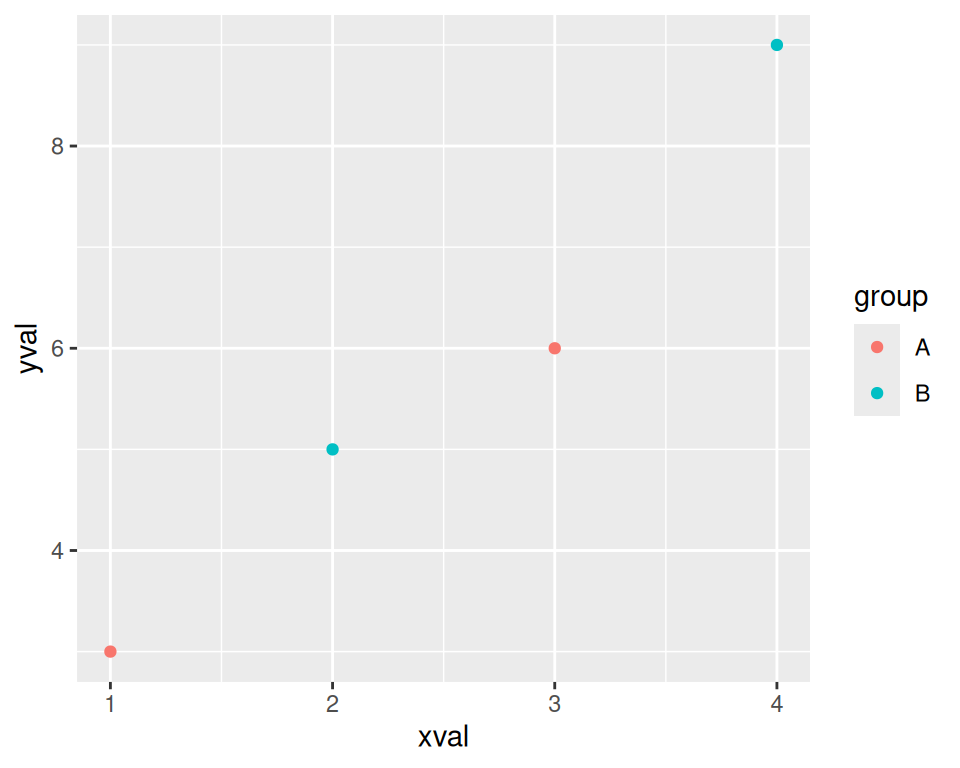
Figure A.8: A scatter plot with a variable mapped to colour
This doesn’t alter the default aesthetic mappings that we defined previously, inside of ggplot(...). What it does is add an aesthetic mapping for this particular geom, geom_point(). If we added other geoms, this mapping would not apply to them.
Contrast this aesthetic mapping with aesthetic setting. This time, we won’t use aes(); we’ll just set the value of colour directly (Figure A.9):
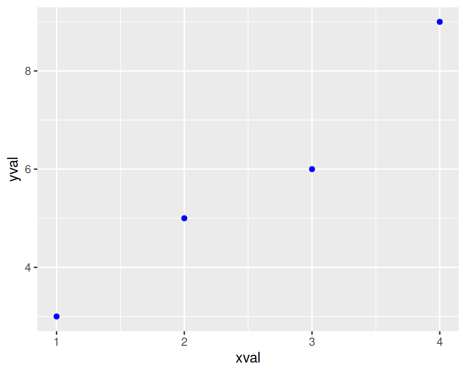
Figure A.9: A scatter plot with colors set instead of mapped
We can also modify the scales; that is, the mappings from data to visual attributes. Here, we’ll change the x scale so that it has a larger range (Figure A.10):
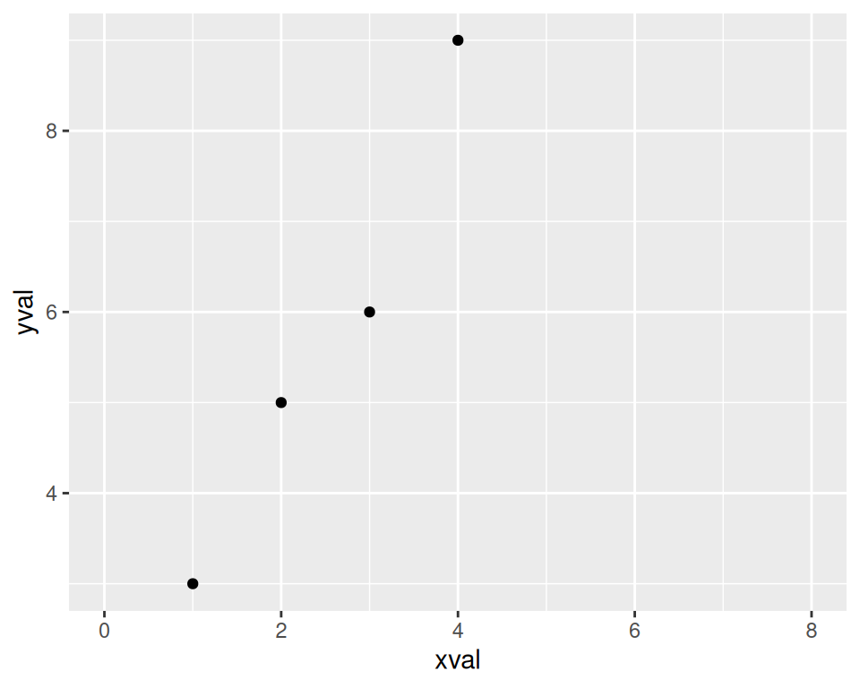
Figure A.10: A scatter plot with increased x range
If we go back to the example with the colour = group mapping, we can also modify the color scale:
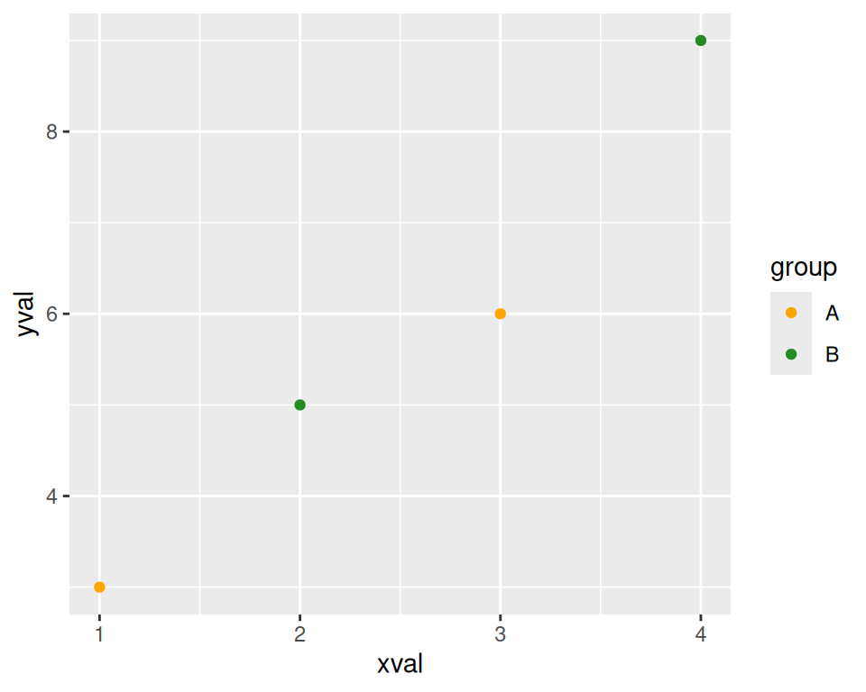
Figure A.11: A scatter plot with modified colors and a different palette
Both times when we modified the scale, the guide also changed. With the x scale, the guide was the markings along the x-axis. With the color scale, the guide was the legend.
Notice that we’ve used + to join together the pieces. In this last example, we ended a line with +, then added more on the next line. If you are going to have multiple lines, you have to put the + at the end of each line, instead of at the beginning of the next line. Otherwise, R’s parser won’t know that there’s more stuff coming; it’ll think you’ve finished the expression and evaluate it.