3.7 Making a Stacked Bar Graph
3.7.2 Solution
Use geom_bar() and map a variable fill. This will put Date on the x-axis and use Cultivar for the fill color, as shown in Figure 3.16:
library(gcookbook) # Load gcookbook for the cabbage_exp data set

ggplot(cabbage_exp, aes(x = Date, y = Weight, fill = Cultivar)) +
  geom_col()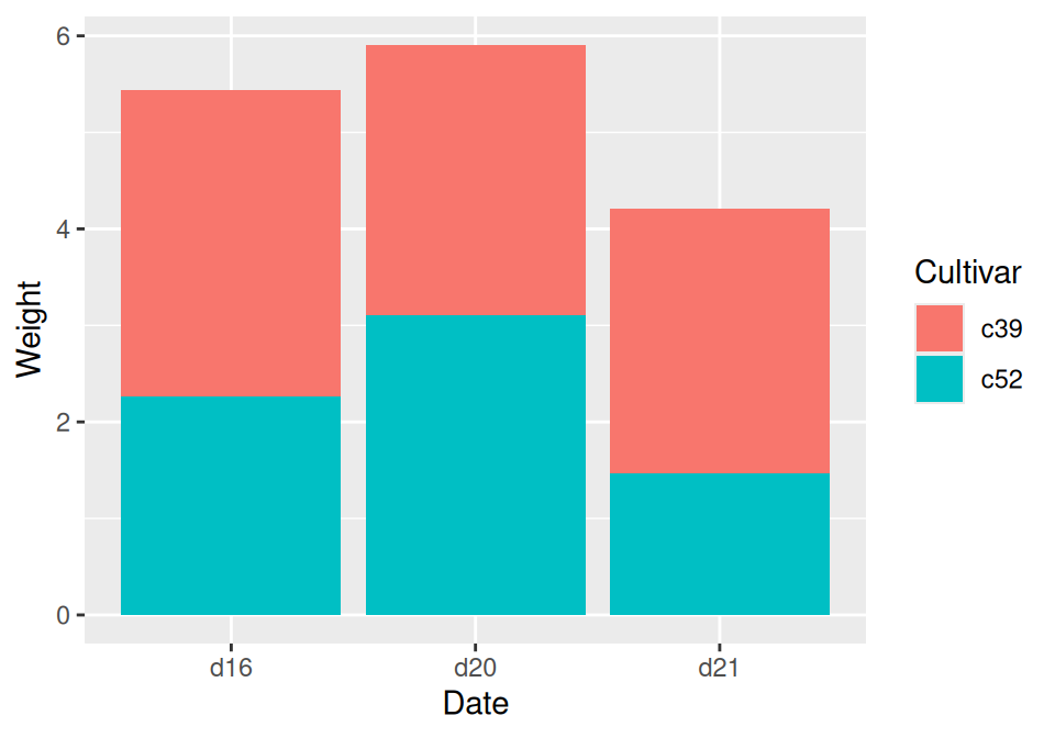
Figure 3.16: Stacked bar graph
3.7.3 Discussion
To understand how the graph is made, it’s useful to see how the data is structured. There are three levels of Date and two levels of Cultivar, and for each combination there is a value for Weight:
cabbage_exp
#>   Cultivar Date Weight        sd  n         se
#> 1      c39  d16   3.18 0.9566144 10 0.30250803
#> 2      c39  d20   2.80 0.2788867 10 0.08819171
#> 3      c39  d21   2.74 0.9834181 10 0.31098410
#> 4      c52  d16   2.26 0.4452215 10 0.14079141
#> 5      c52  d20   3.11 0.7908505 10 0.25008887
#> 6      c52  d21   1.47 0.2110819 10 0.06674995
By default, the stacking order of the bars is the same as the order of items in the legend. For some data sets it might make sense to reverse the order of the legend. To do this, you can use the guides function and specify which aesthetic for which the legend should be reversed. In this case, it’s fill:
ggplot(cabbage_exp, aes(x = Date, y = Weight, fill = Cultivar)) +
  geom_col() +
  guides(fill = guide_legend(reverse = TRUE))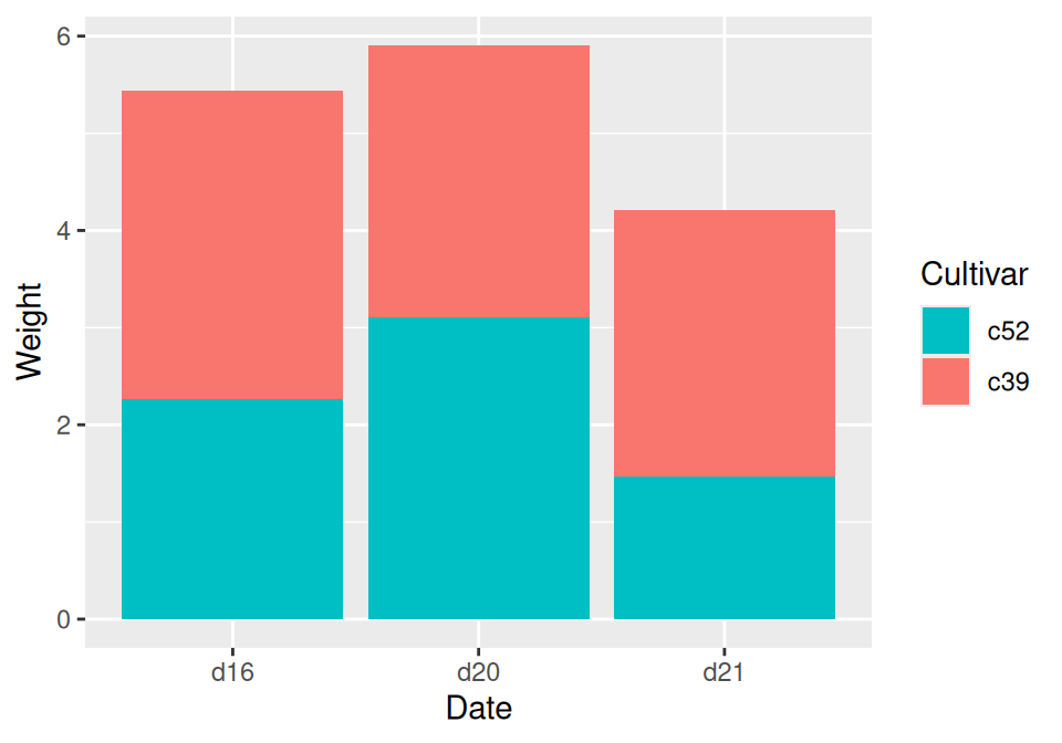
Figure 3.17: Stacked bar graph with reversed legend order
If you’d like to reverse the stacking order of the bars, as in Figure 3.18, use position_stack(reverse = TRUE). You’ll also need to reverse the order of the legend for it to match the order of the bars:
ggplot(cabbage_exp, aes(x = Date, y = Weight, fill = Cultivar)) +
  geom_col(position = position_stack(reverse = TRUE)) +
  guides(fill = guide_legend(reverse = TRUE))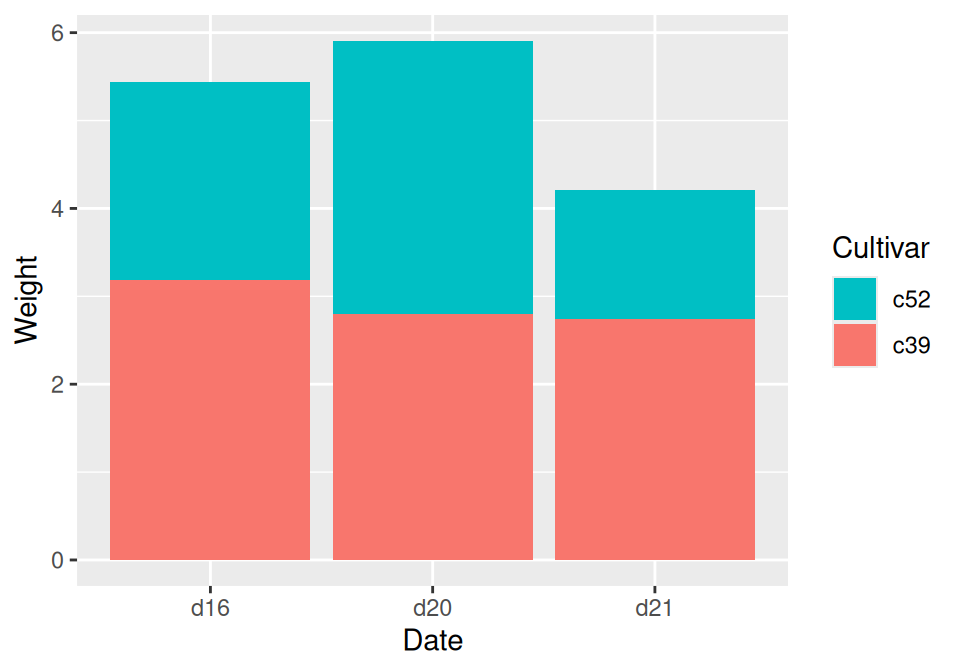
Figure 3.18: Stacked bar graph with reversed stacking order
It’s also possible to modify the column of the data frame so that the factor levels are in a different order (see Recipe 15.8). Do this with care, since the modified data could change the results of other analyses.
For a more polished graph, we’ll use scale_fill_brewer() to get a different color palette, and use colour="black" to get a black outline (Figure 3.19):
ggplot(cabbage_exp, aes(x = Date, y = Weight, fill = Cultivar)) +
  geom_col(colour = "black") +
  scale_fill_brewer(palette = "Pastel1")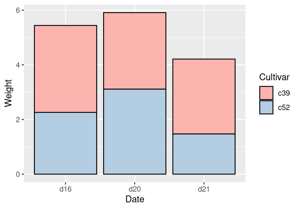
Figure 3.19: Stacked bar graph with reversed legend, new palette, and black outline