6.8 Adding Means to a Box Plot
6.8.2 Solution
Use stat_summary(). The mean is often shown with a diamond, so we’ll use shape 23 with a white fill. We’ll also make the diamond slightly larger by setting size = 3 (Figure 6.21):
library(MASS) # Load MASS for the birthwt data set

ggplot(birthwt, aes(x = factor(race), y = bwt)) +
  geom_boxplot() +
  stat_summary(fun.y = "mean", geom = "point", shape = 23, size = 3, fill = "white")
#> Warning: The `fun.y` argument of `stat_summary()` is deprecated as of ggplot2 3.3.0.
#> ℹ Please use the `fun` argument instead.
#> This warning is displayed once per session.
#> Call `lifecycle::last_lifecycle_warnings()` to see where this warning was
#> generated.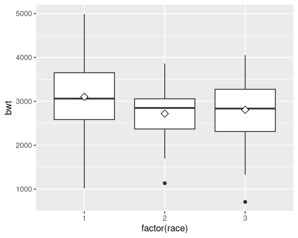
Figure 6.21: Mean markers on a box plot