6.3 Making a Density Curve
6.3.2 Solution
Use geom_density() and map a continuous variable to x (Figure 6.8):
If you don’t like the lines along the side and bottom, you can use geom_line(stat = "density") (see Figure 6.8, right):
# expand_limits() increases the y range to include the value 0
ggplot(faithful, aes(x = waiting)) +
  geom_line(stat = "density") +
  expand_limits(y = 0)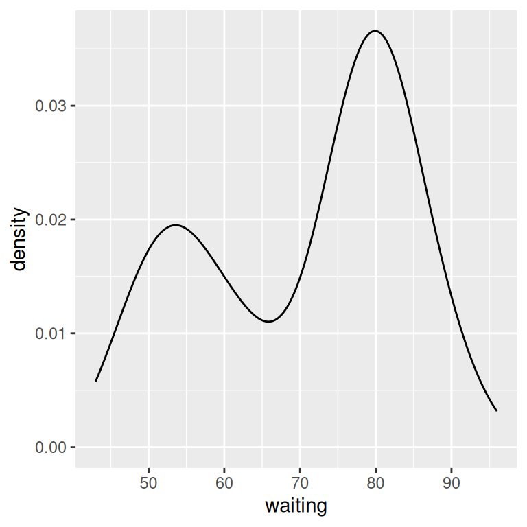
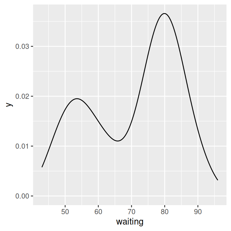
Figure 6.8: A kernel density estimate curve with geom_density() (left); With geom_line() (right)
6.3.3 Discussion
Like geom_histogram(), geom_density() requires just one column from a data frame. For this example, we’ll use the faithful data set, which contains two columns of data about the Old Faithful geyser: eruptions, which is the length of each eruption, and waiting, which is the length of time until the next eruption. We’ll only use the waiting column in this example:
faithful
#>     eruptions waiting
#> 1       3.600      79
#> 2       1.800      54
#> 3       3.333      74
#>  ...<266 more rows>...
#> 270     4.417      90
#> 271     1.817      46
#> 272     4.467      74
The second method of using geom_line(stat = "density") tells geom_line() to use the “density” statistical transformation. This is essentially the same as the first method, using geom_density(), except the former draws it with a closed polygon.
As with geom_histogram(), if you just want to get a quick look at data that isn’t in a data frame, you can get the same result by passing in NULL for the data and giving ggplot a vector of values. This would have the same result as the first solution:
# Store the values in a simple vector
w <- faithful$waiting

ggplot(NULL, aes(x = w)) +
  geom_density()
A kernel density curve is an estimate of the population distribution, based on the sample data. The amount of smoothing depends on the kernel bandwidth: the larger the bandwidth, the more smoothing there is. The bandwidth can be set with the adjust parameter, which has a default value of 1. Figure 6.9 shows what happens with a smaller and larger value of adjust:
ggplot(faithful, aes(x = waiting)) +
  geom_line(stat = "density") +
  geom_line(stat = "density", adjust = .25, colour = "red") +
  geom_line(stat = "density", adjust = 2, colour = "blue")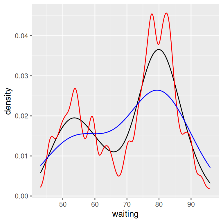
Figure 6.9: Density curves with adjust set to .25 (red), default value of 1 (black), and 2 (blue)
In this example, the x range is automatically set so that it contains the data, but this results in the edge of the curve getting clipped. To show more of the curve, set the x limits (Figure 6.10). We’ll also add an 80% transparent fill, with alpha = .2:
ggplot(faithful, aes(x = waiting)) +
  geom_density(fill = "blue", alpha = .2) +
  xlim(35, 105)

# This draws a blue polygon with geom_density(), then adds a line on top
ggplot(faithful, aes(x = waiting)) +
  geom_density(fill = "blue", alpha = .2, colour = NA) +
  xlim(35, 105) +
  geom_line(stat = "density")
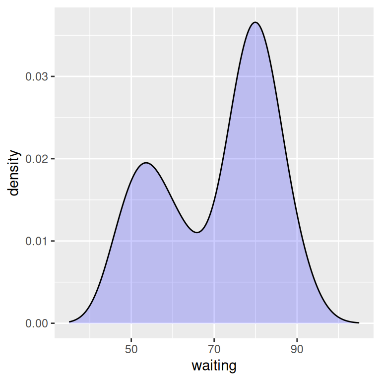
Figure 6.10: Density curve with wider x limits and a semitransparent fill (left); In two parts, with geom_density() and geom_line() (right)
If this edge-clipping happens with your data, it might mean that your curve is too smooth. If the curve is much wider than your data, it might not be the best model of your data, or it could be because you have a small data set.
To compare the theoretical and observed distributions of your data, you can overlay the density curve with the histogram. Since the y values for the density curve are small (the area under the curve always sums to 1), it would be barely visible if you overlaid it on a histogram without any transformation. To solve this problem, you can scale down the histogram to match the density curve with the mapping y = ..density... Here we’ll add geom_histogram() first, and then layer geom_density() on top (Figure 6.11):
ggplot(faithful, aes(x = waiting, y = ..density..)) +
  geom_histogram(fill = "cornsilk", colour = "grey60", size = .2) +
  geom_density() +
  xlim(35, 105)
#> Warning in geom_histogram(fill = "cornsilk", colour = "grey60", size = 0.2):
#> Ignoring unknown parameters: `size`
#> Warning: Removed 2 rows containing missing values or values outside the scale range
#> (`geom_bar()`).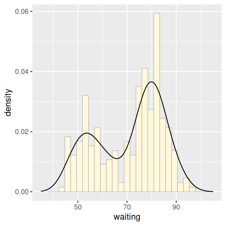
Figure 6.11: Density curve overlaid on a histogram
6.3.4 See Also
See Recipe 6.9 for information on violin plots, which are another way of representing density curves and may be more appropriate for comparing multiple distributions.