6.5 Making a Frequency Polygon
6.5.2 Solution
Use geom_freqpoly() (Figure 6.15):
6.5.3 Discussion
A frequency polygon appears similar to a kernel density estimate curve, but it shows the same information as a histogram. That is, like a histogram, it shows what is in the data, whereas a kernel density estimate is just that – an estimate – and requires you to pick some value for the bandwidth.
Like with a histogram, you can control the bin width for the frequency polygon (Figure 6.15, right):
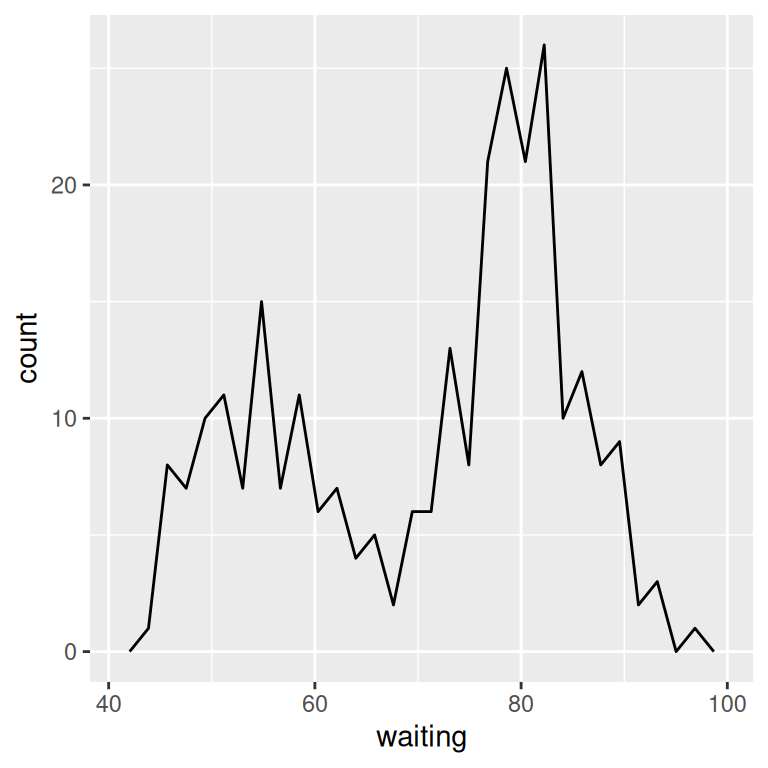
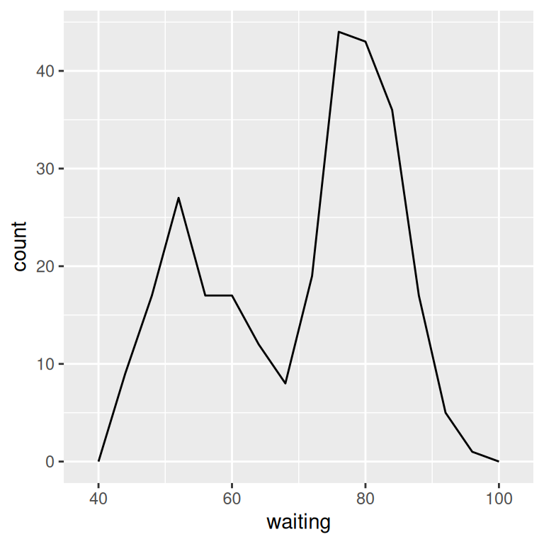
Figure 6.15: A frequency polygon (left); With wider bins (right)
Or, instead of setting the width of each bin directly, you can divide the x range into a particular number of bins:
6.5.4 See Also
Histograms display the same information, but with bars instead of lines. See Recipe 6.1.