13.12 Creating a Vector Field
13.12.2 Solution
Use geom_segment(). For this example, we’ll use the isabel data set:
library(gcookbook) # For the isabel data set
isabel
#>                x        y      z        vx        vy          vz         t
#> 1      -83.00000 41.70000  0.035        NA        NA          NA        NA
#> 2      -83.00000 41.55571  0.035        NA        NA          NA        NA
#> 3      -83.00000 41.41142  0.035        NA        NA          NA        NA
#> 156248 -62.12625 24.09679 18.035 -11.39709 -5.315139 0.009657148 -66.99567
#> 156249 -62.12625 23.95251 18.035 -11.37965 -5.275015 0.040921956 -67.00032
#> 156250 -62.12625 23.80822 18.035 -12.16637 -5.435891 0.030216325 -66.98057
#>           speed
#> 1            NA
#> 2            NA
#> 3            NA
#>  ...<156,244 more rows>...
#> 156248 12.57555
#> 156249 12.54281
#> 156250 13.32552
x and y are the longitude and latitude, respectively, and z is the height in kilometers. The vx, vy, and vz values are the wind speed components in each of these directions, in meters per second, and speed is the wind speed.
The height (z) ranges from 0.035 km to 18.035 km. For this example, we’ll just use the lowest slice of data.
To draw the vectors (Figure 13.21), we’ll use geom_segment(). Each segment has a starting point and an ending point. We’ll use the x and y values as the starting points for each segment, then add a fraction of the vx and vy values to get the end points for each segment. If we didn’t scale down these values, the lines would be much too long:
islice <- filter(isabel, z == min(z))

ggplot(islice, aes(x = x, y = y)) +
       geom_segment(aes(xend = x + vx/50, yend = y + vy/50),
                    size = 0.25)   # Make the line segments 0.25 mm thick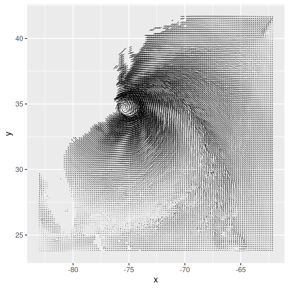
Figure 13.21: First attempt at a vector field. The resolution of the data is too high, but it does hint at some interesting patterns not visible in graphs with a lower data resolution
This vector field has two problems: the data is at too high a resolution to read, and the segments do not have arrows indicating the direction of the flow. To reduce the resolution of the data, we’ll define a function every_n() that keeps one out of every n values in the data and drops the rest:
# Take a slice where z is equal to the minimum value of z
islice <- filter(isabel, z == min(z))

# Keep 1 out of every 'by' values in vector x
every_n <- function(x, by = 2) {
  x <- sort(x)
  x[seq(1, length(x), by = by)]
}

# Keep 1 of every 4 values in x and y
keepx <- every_n(unique(isabel$x), by = 4)
keepy <- every_n(unique(isabel$y), by = 4)

# Keep only those rows where x value is in keepx and y value is in keepy
islicesub <- filter(islice, x %in% keepx  &  y %in% keepy)
Now that we’ve taken a subset of the data, we can plot it, with arrowheads, as shown in Figure 13.22:
# Need to load grid for arrow() function
library(grid)

# Make the plot with the subset, and use an arrowhead 0.1 cm long
ggplot(islicesub, aes(x = x, y = y)) +
    geom_segment(aes(xend = x+vx/50, yend = y+vy/50),
                 arrow = arrow(length = unit(0.1, "cm")), size = 0.25)
Figure 13.22: Vector field with arrowheads
13.12.3 Discussion
One effect of arrowheads is that short vectors appear with more ink than is proportional to their length. This could somewhat distort the interpretation of the data. To mitigate this effect, it may also be useful to map the speed to other properties, like size (line thickness), alpha, or colour. Here, we’ll map speed to alpha (Figure 13.23, left):
# The existing 'speed' column includes the z component. We'll calculate
# speedxy, the horizontal speed.
islicesub$speedxy <- sqrt(islicesub$vx^2 + islicesub$vy^2)

# Map speed to alpha
ggplot(islicesub, aes(x = x, y = y)) +
    geom_segment(aes(xend = x+vx/50, yend = y+vy/50, alpha = speed),
                 arrow = arrow(length = unit(0.1,"cm")), size = 0.6)
Next, we’ll map speed to colour. We’ll also add a map of the United States and zoom in on the area of interest, as shown in the graph on the right in Figure 13.23,using coord_cartesian() (without this, the entire USA will be displayed):
# Get USA map data
usa <- map_data("usa")

# Map speed to colour, and set go from "grey80" to "darkred"
ggplot(islicesub, aes(x = x, y = y)) +
    geom_segment(aes(xend = x+vx/50, yend = y+vy/50, colour = speed),
                 arrow = arrow(length = unit(0.1,"cm")), size = 0.6) +
    scale_colour_continuous(low = "grey80", high = "darkred") +
    geom_path(aes(x = long, y = lat, group = group), data = usa) +
    coord_cartesian(xlim = range(islicesub$x), ylim = range(islicesub$y))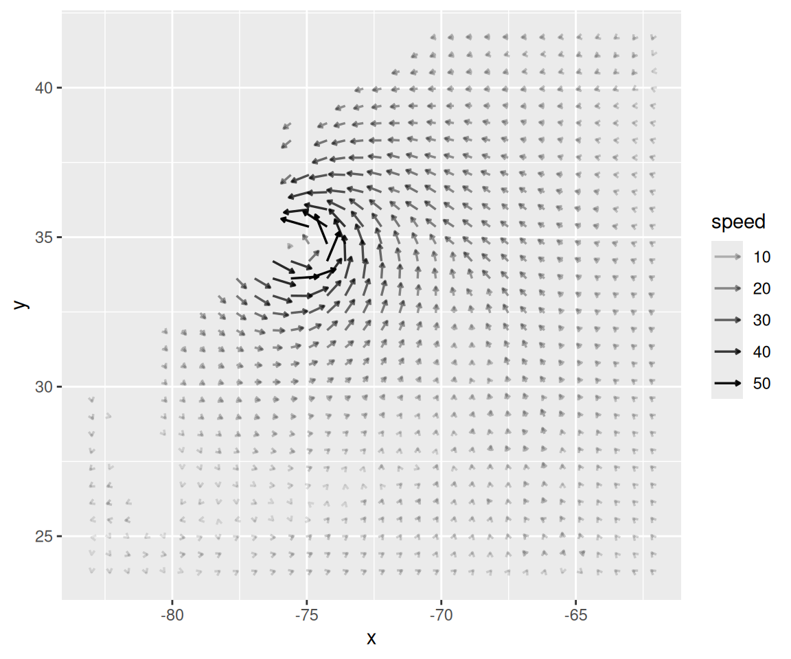
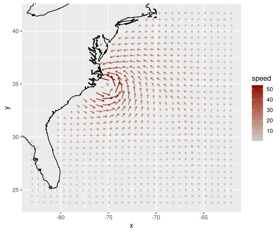
Figure 13.23: Vector field with speed mapped to alpha (left); With speed mapped to colour (right)
The isabel data set has three-dimensional data, so we can also make a faceted graph of the data, as shown in Figure 13.24. Because each facet is small, we will use a sparser subset than before:
# Keep 1 out of every 5 values in x and y, and 1 in 2 values in z
keepx <- every_n(unique(isabel$x), by = 5)
keepy <- every_n(unique(isabel$y), by = 5)
keepz <- every_n(unique(isabel$z), by = 2)

isub <- filter(isabel, x %in% keepx  &  y %in% keepy  &  z %in% keepz)

ggplot(isub, aes(x = x, y = y)) +
    geom_segment(aes(xend = x+vx/50, yend = y+vy/50, colour = speed),
                 arrow = arrow(length = unit(0.1,"cm")), size = 0.5) +
    scale_colour_continuous(low = "grey80", high = "darkred") +
    facet_wrap( ~ z)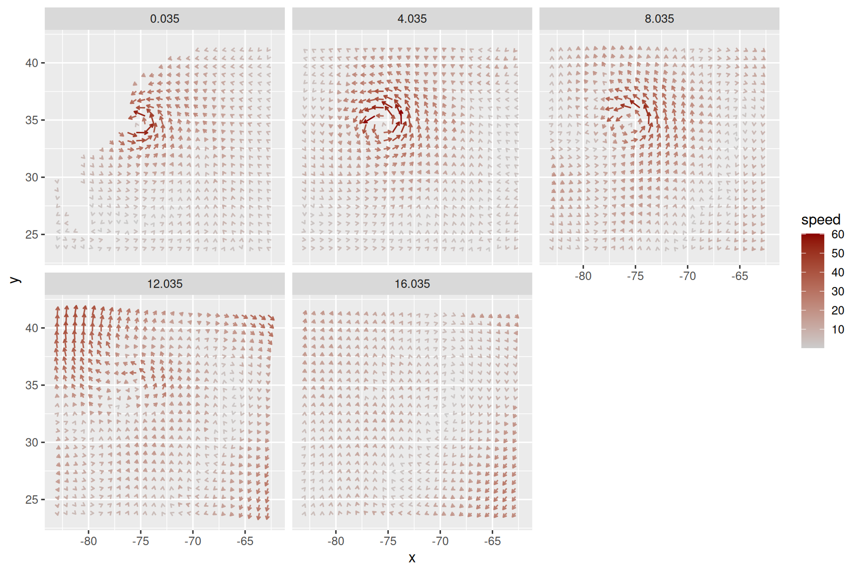
Figure 13.24: Vector field of wind speeds, faceted on z