2.4 Creating a Histogram
2.4.2 Solution
To make a histogram (Figure 2.8), use hist() and pass it a vector of values:
hist(mtcars$mpg)

# Specify approximate number of bins with breaks
hist(mtcars$mpg, breaks = 10)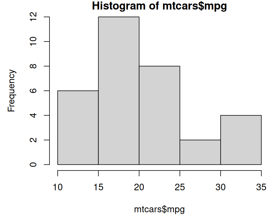
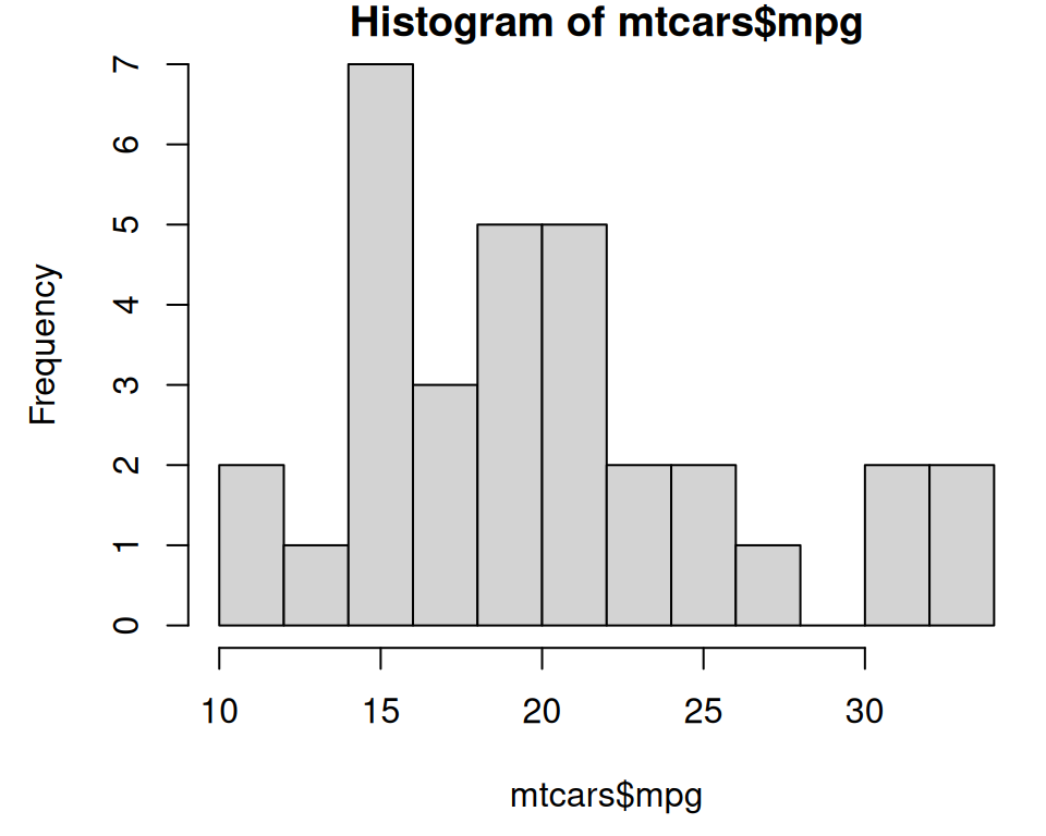
Figure 2.8: Histogram with base graphics (left); With more bins. Notice that because the bins are narrower, there are fewer items in each bin. (right)
With the ggplot2, you can get a similar result using geom_histogram() (Figure 2.9):
library(ggplot2)
ggplot(mtcars, aes(x = mpg)) +
  geom_histogram()
#> `stat_bin()` using `bins = 30`. Pick better value with `binwidth`.

# With wider bins
ggplot(mtcars, aes(x = mpg)) +
  geom_histogram(binwidth = 4)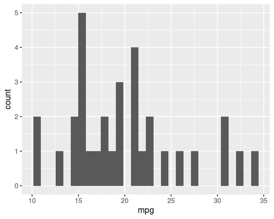
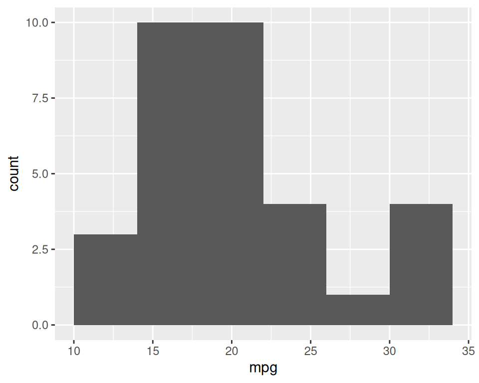
Figure 2.9: ggplot2 histogram with default bin width (left); With wider bins (right)
When you create a histogram without specifying the bin width, ggplot() prints out a message telling you that it’s defaulting to 30 bins, and to pick a better bin width. This is because it’s important to explore your data using different bin widths; the default of 30 may or may not show you something useful about your data.