5.5 Dealing with Overplotting
5.5.2 Solution
With large data sets, the points in a scatter plot may overlap and obscure each other and prevent the viewer from accurately assessing the distribution of the data. This is called overplotting. If the amount of overplotting is low, you may be able to alleviate the problem by using smaller points, or by using a different shape (like shape 1, a hollow circle) through which other points can be seen. Figure 5.2 in Recipe 5.1 demonstrates both of these solutions.
If there’s a high degree of overplotting, there are a number of possible solutions:
- Make the points semi-transparent
- Bin the data into rectangles (better for quantitative analysis)
- Bin the data into hexagons
- Use box plots
5.5.3 Discussion
The scatter plot in Figure 5.12 contains about 54,000 points. They are heavily overplotted, making it impossible to get a sense of the relative density of points in different areas of the graph:
# We'll use the diamonds data set and create a base plot called `diamonds_sp`
diamonds_sp <- ggplot(diamonds, aes(x = carat, y = price))

diamonds_sp +
  geom_point()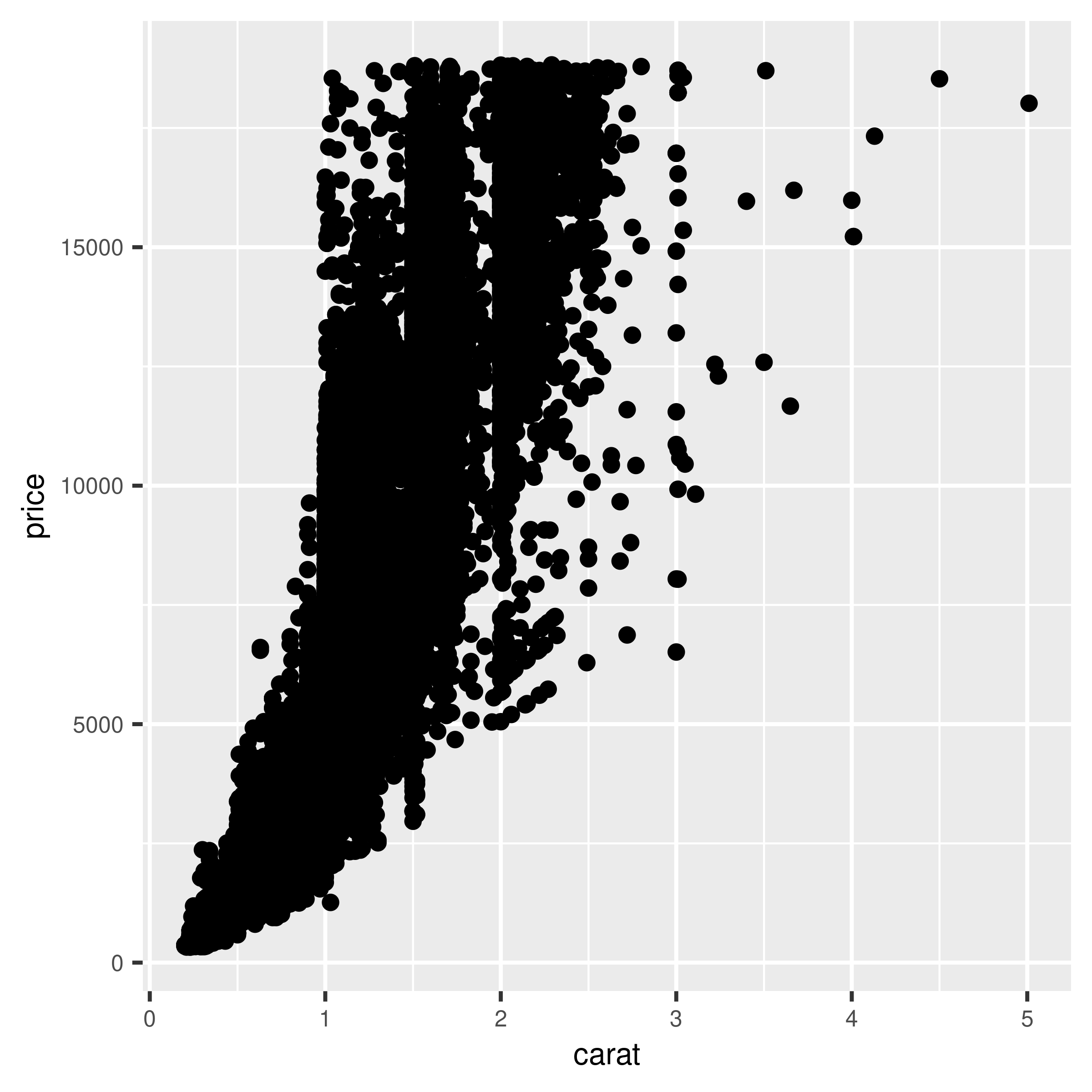
Figure 5.12: Overplotting, with about 54,000 points
We can make the points semitransparent using the alpha aesthetic, as in Figure 5.13. Here, we’ll make them 90% transparent and then 99% transparent, by setting alpha = .1 and alpha = .01:
diamonds_sp +
  geom_point(alpha = .1)

diamonds_sp +
  geom_point(alpha = .01)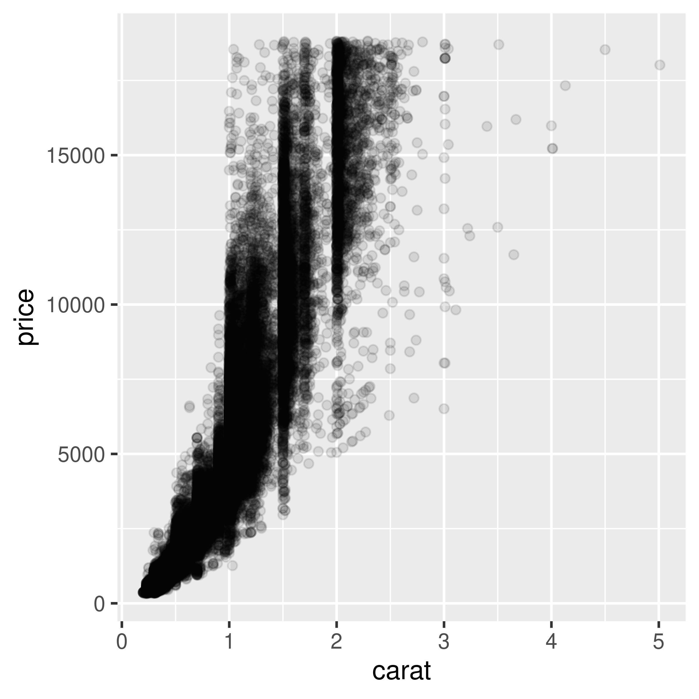
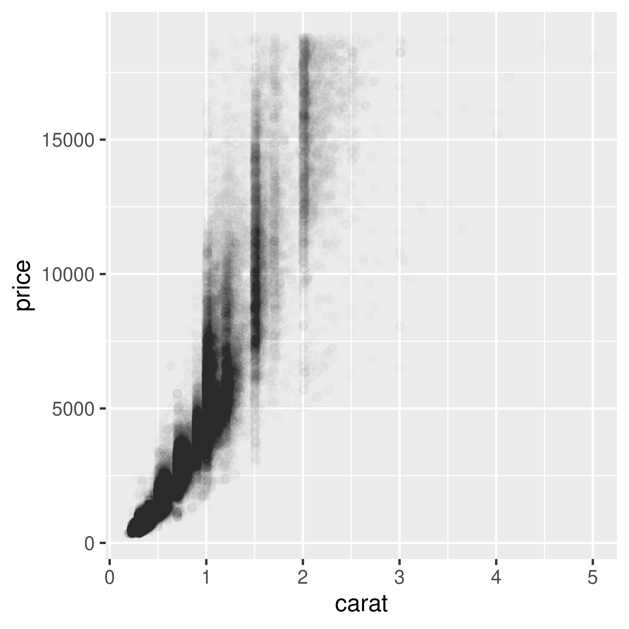
Figure 5.13: Semitransparent points with alpha=.1 (left); With alpha=.01 (right)
Now we can see that there appear to be vertical bands at nice round values of carats, indicating that diamonds tend to be cut to those sizes. Still, the data is so dense that even when the points are 99% transparent, much of the graph appears black and the data distribution is still somewhat obscured.
Note
For most plots, vector formats (such as PDF, EPS, and SVG) result in smaller output files than bitmap formats (such as TIFF and PNG). But in cases where there are tens of thousands of points, vector output files can be very large and slow to render – the scatter plot here with 99% transparent points is a 1.5 MB PDF! In these cases, high-resolution bitmaps will be smaller and faster to display on computer screens. See Chapter 14 for more information.
Another solution is to bin the points into rectangles and map the density of the points to the fill color of the rectangles, as shown in Figure 5.14. With the binned visualization, the vertical bands are barely visible. The density of points in the lower-left corner is much greater, which tells us that the vast majority of diamonds are small and inexpensive.
By default, stat_bin_2d() divides the space into 30 groups in the x and y directions, for a total of 900 bins. In the second version, we increase the number of bins with bins = 50.
The default colors are somewhat difficult to distinguish because they don’t vary much in luminosity. In the second version we set the colors by using scale_fill_gradient() and by specifying the low and high colors. By default, the legend doesn’t show an entry for the lowest values. This is because the range of the color scale starts not from zero, but from the smallest nonzero quantity in a bin – probably 1, in this case. To make the legend show a zero (as in Figure 5.14, right), we can manually set the range from 0 to the maximum, 6000, using limits (Figure 5.14, left):
diamonds_sp +
  stat_bin2d()

diamonds_sp +
  stat_bin2d(bins = 50) +
  scale_fill_gradient(low = "lightblue", high = "red", limits = c(0, 6000))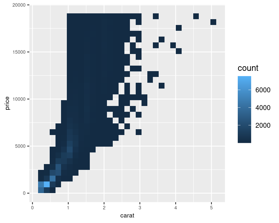
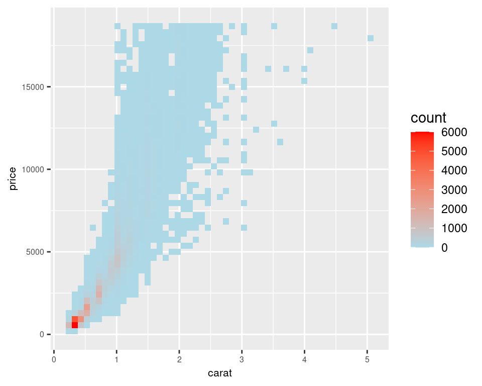
Figure 5.14: Binning data with stat_bin2d() (left); With more bins, manually specified colors, and legend breaks (right)
Another alternative is to bin the data into hexagons instead of rectangles, with stat_binhex() (Figure 5.15). It works just like stat_bin2d(). To use stat_binhex(), you must first install the hexbin package, with the command install.packages("hexbin"):
library(hexbin) # Load the hexbin library to access stat_binhex()

diamonds_sp +
  stat_binhex() +
  scale_fill_gradient(low = "lightblue", high = "red", limits = c(0, 8000))

diamonds_sp +
  stat_binhex() +
  scale_fill_gradient(low = "lightblue", high = "red", limits = c(0, 5000))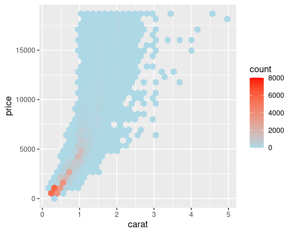
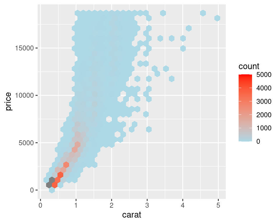
Figure 5.15: Binning data with stat_binhex() (left); Cells outside of the range shown in grey (right)
For both of these methods, if you manually specify the range and there is a bin that falls outside that range because it has too many or too few points, that bin will show up as grey rather than the color at the high or low end of the range, as seen in the graph on the right in Figure 5.15.
Overplotting can also occur when the data is discrete on one or both axes, as shown in Figure 5.16. In these cases, you can randomly jitter the points with position_jitter(). By default the amount of jitter is 40% of the resolution of the data in each direction, but these amounts can be controlled with width and height:
# We'll use the ChickWeight data set and create a base plot called `cw_sp` (for ChickWeight scatter plot)
cw_sp <- ggplot(ChickWeight, aes(x = Time, y = weight))

cw_sp +
  geom_point()

cw_sp +
  geom_point(position = "jitter")  # Could also use geom_jitter(), which is equivalent

cw_sp +
  geom_point(position = position_jitter(width = .5, height = 0))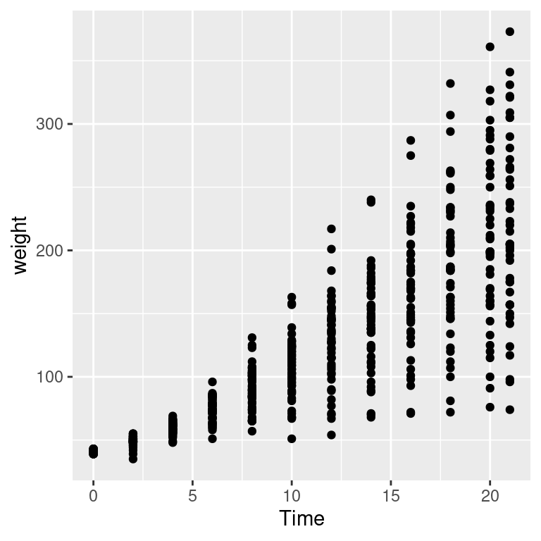
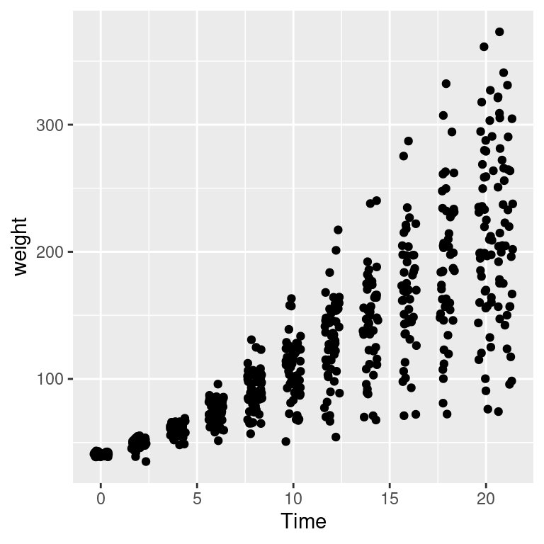
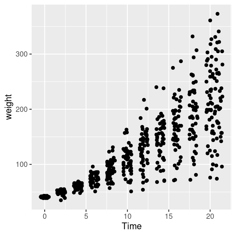
Figure 5.16: Data with a discrete x variable (left); Jittered (middle); Jittered horizontally only (right)
When the data has one discrete axis and one continuous axis, it might make sense to use box plots, as shown in Figure 5.17. This will convey a different story than a standard scatter plot because a box plot will obscure the number of data points at each location on the discrete axis. This may be problematic in some cases, but desirable in others.
When we look at the ChickWeight data we know that we conceptually want to treat Time as a discrete variable. However since Time is taken as a numerical variable by default, ggplot doesn’t know to group the data to form each boxplot box. If you don’t tell ggplot how to group the data, you get a result like the graph on the right in Figure 5.17. To tell it how to group the data, use aes(group = ...). In this case, we’ll group by each distinct value of Time:
cw_sp +
  geom_boxplot(aes(group = Time))

cw_sp +
  geom_boxplot()  # Without groups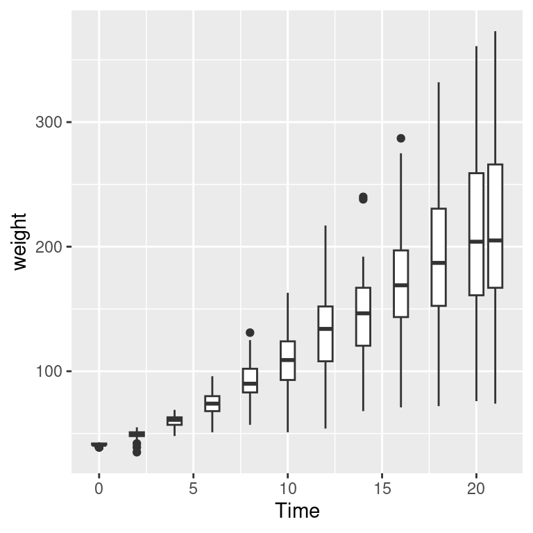
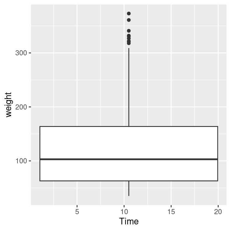
Figure 5.17: Grouping into box plots (left); What happens if you don’t specify groups (right)
5.5.4 See Also
Instead of binning the data, it may be useful to display a 2D density estimate. To do this, see Recipe 6.12.