3.5 Coloring Negative and Positive Bars Differently
3.5.2 Solution
We’ll use a subset of the climate data and create a new column called pos, which indicates whether the value is positive or negative:
library(gcookbook) # Load gcookbook for the climate data set
library(dplyr)

climate_sub <- climate %>%
  filter(Source == "Berkeley" & Year >= 1900) %>%
  mutate(pos = Anomaly10y >= 0)

climate_sub
#>       Source Year Anomaly1y Anomaly5y Anomaly10y Unc10y   pos
#> 1   Berkeley 1900        NA        NA     -0.171  0.108 FALSE
#> 2   Berkeley 1901        NA        NA     -0.162  0.109 FALSE
#> 3   Berkeley 1902        NA        NA     -0.177  0.108 FALSE
#>  ...<99 more rows>...
#> 103 Berkeley 2002        NA        NA      0.856  0.028  TRUE
#> 104 Berkeley 2003        NA        NA      0.869  0.028  TRUE
#> 105 Berkeley 2004        NA        NA      0.884  0.029  TRUE
Once we have the data, we can make the graph and map pos to the fill color, as in Figure 3.11. Notice that we use position=“identity” with the bars. This will prevent a warning message about stacking not being well defined for negative numbers:
ggplot(climate_sub, aes(x = Year, y = Anomaly10y, fill = pos)) +
  geom_col(position = "identity")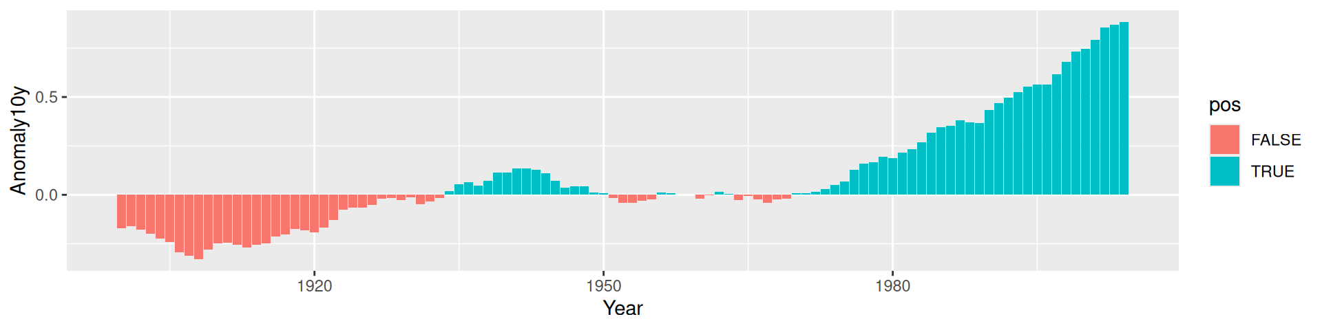
Figure 3.11: Different colors for positive and negative values
3.5.3 Discussion
There are a few problems with the first attempt. First, the colors are probably the reverse of what we want: usually, blue means cold and red means hot. Second, the legend is redundant and distracting.
We can change the colors with scale_fill_manual() and remove the legend with guide = FALSE, as shown in Figure 3.12. We’ll also add a thin black outline around each of the bars by setting colour and specifying size, which is the thickness of the outline (in millimeters):
ggplot(climate_sub, aes(x = Year, y = Anomaly10y, fill = pos)) +
  geom_col(position = "identity", colour = "black", size = 0.25) +
  scale_fill_manual(values = c("#CCEEFF", "#FFDDDD"), guide = FALSE)
#> Warning: Using `size` aesthetic for lines was deprecated in ggplot2 3.4.0.
#> ℹ Please use `linewidth` instead.
#> This warning is displayed once every 8 hours.
#> Call `lifecycle::last_lifecycle_warnings()` to see where this warning was
#> generated.
#> Warning: The `guide` argument in `scale_*()` cannot be `FALSE`. This was deprecated
#> in ggplot2 3.3.4.
#> ℹ Please use "none" instead.
#> This warning is displayed once every 8 hours.
#> Call `lifecycle::last_lifecycle_warnings()` to see where this warning was
#> generated.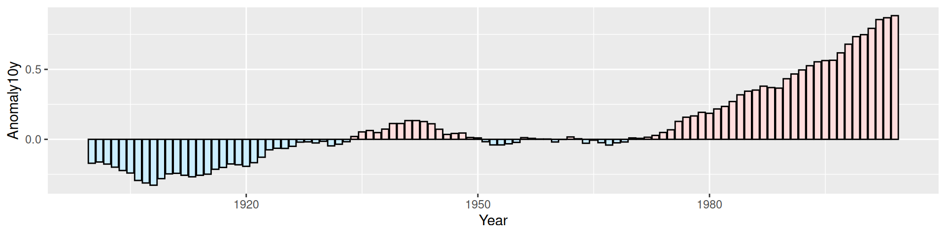
Figure 3.12: Graph with customized colors and no legend