4.1 Making a Basic Line Graph
4.1.2 Solution
Use ggplot() with geom_line(), and specify which variables you mapped to x and y (Figure 4.1):
ggplot(BOD, aes(x = Time, y = demand)) +
  geom_line()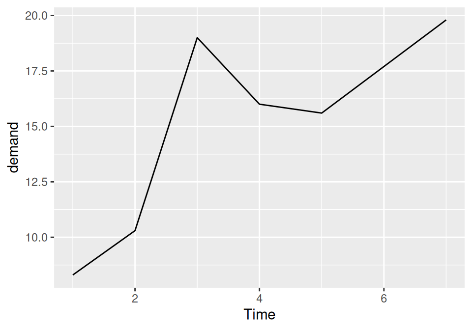
Figure 4.1: Basic line graph
4.1.3 Discussion
In this sample data set, the x variable, Time, is in one column and the y variable, demand, is in another:
BOD
#>   Time demand
#> 1    1    8.3
#> 2    2   10.3
#> 3    3   19.0
#> 4    4   16.0
#> 5    5   15.6
#> 6    7   19.8
Line graphs can be made with discrete (categorical) or continuous (numeric) variables on the x-axis. In the example here, the variable demand is numeric, but it could be treated as a categorical variable by converting it to a factor with factor() (Figure 4.2). When the x variable is a factor, you must also use aes(group=1) to ensure that ggplot knows that the data points belong together and should be connected with a line (see Recipe 4.3 for an explanation of why group is needed with factors):
BOD1 <- BOD  # Make a copy of the data
BOD1$Time <- factor(BOD1$Time)

ggplot(BOD1, aes(x = Time, y = demand, group = 1)) +
  geom_line()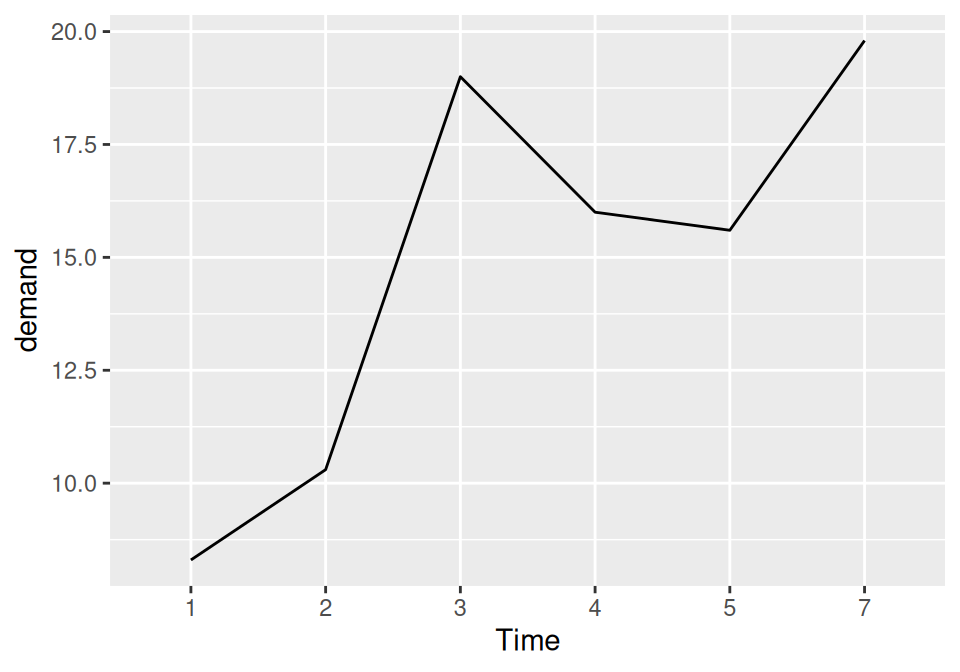
Figure 4.2: Basic line graph with a factor on the x-axis (notice that no space is allocated on the x-axis for 6)
In the BOD data set there is no entry for Time = 6, so there is no level 6 when Time is converted to a factor. Factors hold categorical values, and in that context, 6 is just another value. It happens to not be in the data set, so there’s no space for it on the x-axis.
With ggplot2, the default y range of a line graph is just enough to include the y values in the data. For some kinds of data, it’s better to have the y range start from zero. You can use ylim() to set the range, or you can use expand_limits() to expand the range to include a value. This will set the range from zero to the maximum value of the demand column in BOD (Figure 4.3):
# These have the same result
ggplot(BOD, aes(x = Time, y = demand)) +
  geom_line() +
  ylim(0, max(BOD$demand))

ggplot(BOD, aes(x = Time, y = demand)) +
  geom_line() +
  expand_limits(y = 0)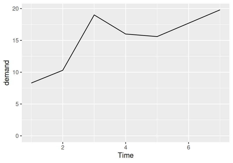
Figure 4.3: Line graph with manually set y range
4.1.4 See Also
See Recipe 8.2 for more on controlling the range of the axes.