6.10 Making a Dot Plot
6.10.2 Solution
Use geom_dotplot(). For this example (Figure 6.27), we’ll use a subset of the countries data set:
library(gcookbook)  # Load gcookbook for the countries data set
library(dplyr)

# Save a modified data set that only includes 2009 data for countries that
# spent > 2000 USD per capita
c2009 <- countries %>%
  filter(Year == 2009 & healthexp > 2000)

# Create a base ggplot object using `c2009`, called `c2009_p` (for c2009 plot)
c2009_p <- ggplot(c2009, aes(x = infmortality))

c2009_p +
  geom_dotplot()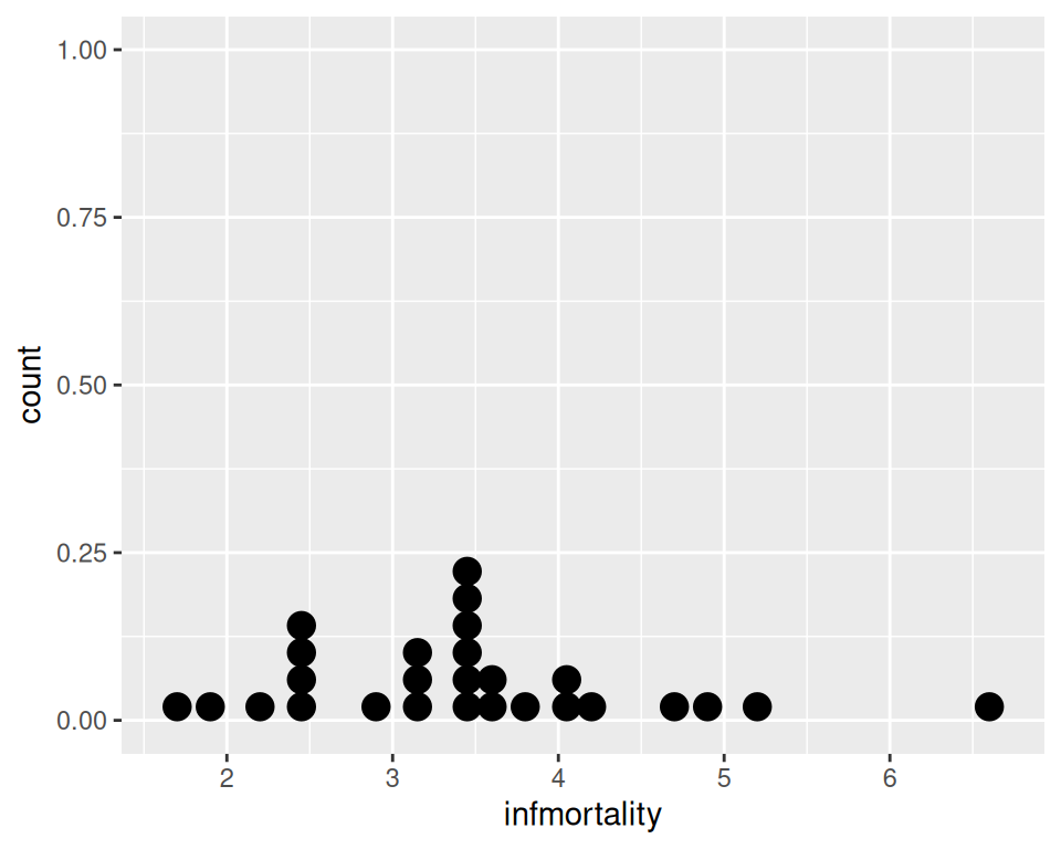
Figure 6.27: A dot plot
6.10.3 Discussion
This kind of dot plot is sometimes called a Wilkinson dot plot. It’s different from the Cleveland dot plots shown in Recipe 3.10. In these Wilkinson dot plots, the placement of the bins depends on the data, and the width of each dot corresponds to the maximum width of each bin. The maximum bin size defaults to 1/30 of the range of the data, but it can be changed with binwidth.
By default, geom_dotplot() bins the data along the x-axis and stacks on the y-axis. The dots are stacked visually, and due to technical limitations of ggplot2, the resulting graph has y-axis tick marks that aren’t meaningful. The y-axis labels can be removed by using scale_y_continuous(). In this example, we’ll also use geom_rug() to show exactly where each data point is (Figure 6.28):
c2009_p +
  geom_dotplot(binwidth = .25) +
  geom_rug() +
  scale_y_continuous(breaks = NULL) +   # Remove tick markers
  theme(axis.title.y = element_blank()) # Remove axis label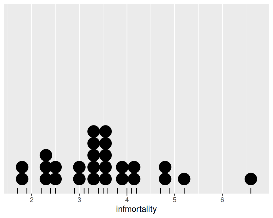
Figure 6.28: Dot plot with no y labels, max bin size of .25, and a rug showing each data point
You may notice that the stacks aren’t regularly spaced in the horizontal direction. With the default dotdensity binning algorithm, the position of each stack is centered above the set of data points that it represents. To use bins that are arranged with a fixed, regular spacing, like a histogram, use method = "histodot". In Figure 6.29, you’ll notice that the stacks aren’t centered above the data:
c2009_p +
  geom_dotplot(method = "histodot", binwidth = .25) +
  geom_rug() +
  scale_y_continuous(breaks = NULL) +
  theme(axis.title.y = element_blank())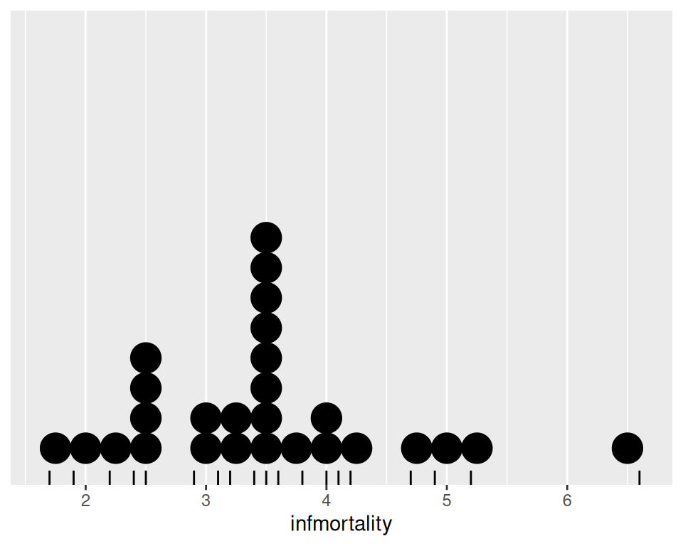
Figure 6.29: Dot plot with histodot (fixed-width) binning
The dots can also be stacked centered, or centered in such a way that stacks with even and odd quantities stay aligned. This can by done by setting stackdir = "center" or stackdir = "centerwhole", as illustrated in Figure 6.30:
c2009_p +
  geom_dotplot(binwidth = .25, stackdir = "center") +
  scale_y_continuous(breaks = NULL) +
  theme(axis.title.y = element_blank())

c2009_p +
  geom_dotplot(binwidth = .25, stackdir = "centerwhole") +
  scale_y_continuous(breaks = NULL) +
theme(axis.title.y = element_blank())Figure 6.30: Dot plot with stackdir = “center” (left); With stackdir = “centerwhole” (right)
6.10.4 See Also
Leland Wilkinson, “Dot Plots,” The American Statistician 53 (1999): 276–281, https://www.cs.uic.edu/~wilkinson/Publications/dotplots.pdf.