6.12 Making a Density Plot of Two-Dimensional Data
6.12.2 Solution
Use stat_density2d(). This makes a 2D kernel density estimate from the data. First we’ll plot the density contour along with the data points (Figure 6.34, left):
# Save a base plot object
faithful_p <- ggplot(faithful, aes(x = eruptions, y = waiting))

faithful_p +
  geom_point() +
  stat_density2d()
It’s also possible to map the height of the density curve to the color of the contour lines, by using ..level.. (Figure 6.34, right):
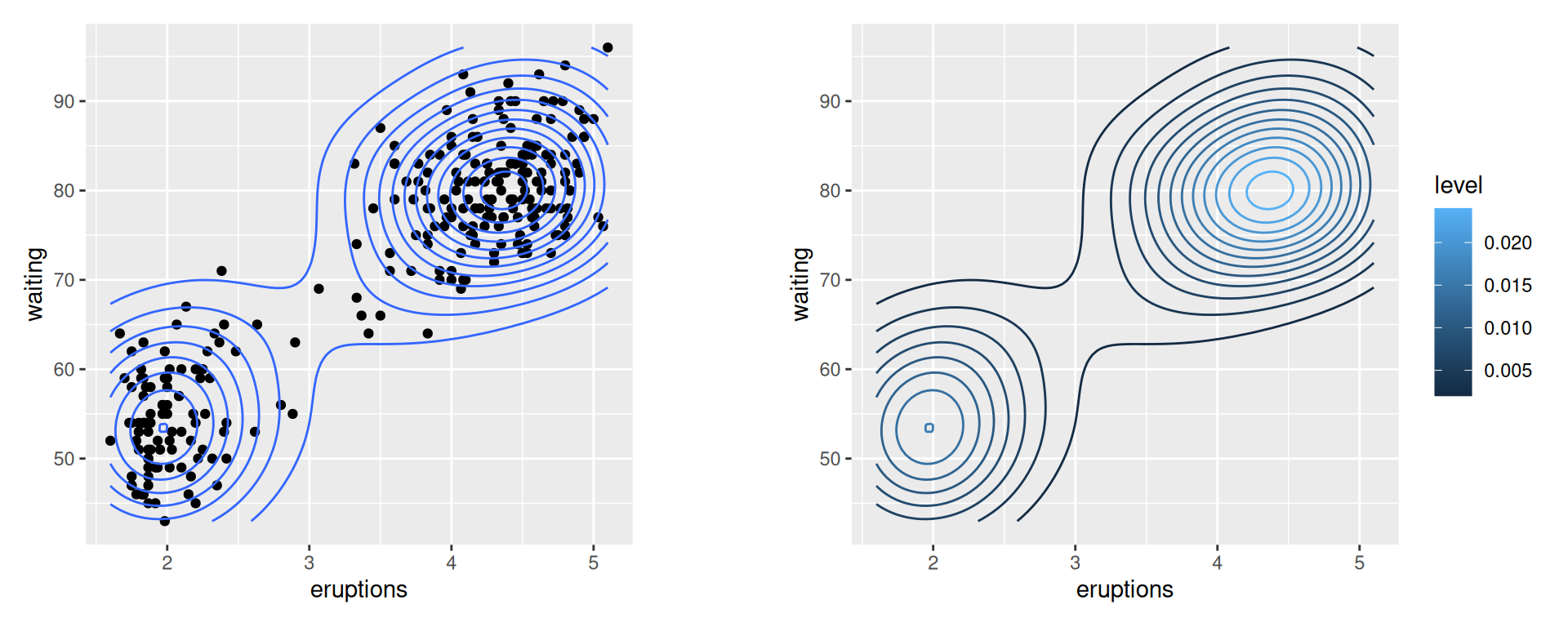
Figure 6.34: Points and density contour (left); With ..level.. mapped to color (right)
6.12.3 Discussion
The two-dimensional kernel density estimate is analogous to the one-dimensional density estimate generated by stat_density(), but of course, it needs to be viewed in a different way. The default is to use contour lines, but it’s also possible to use tiles and to map the density estimate to the fill color, or to the transparency of the tiles, as shown in Figure 6.35:
# Map density estimate to fill color
faithful_p +
  stat_density2d(aes(fill = ..density..), geom = "raster", contour = FALSE)

# With points, and map density estimate to alpha
faithful_p +
  geom_point() +
  stat_density2d(aes(alpha = ..density..), geom = "tile", contour = FALSE)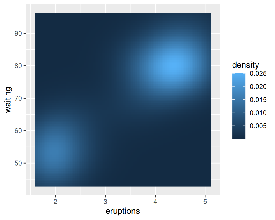
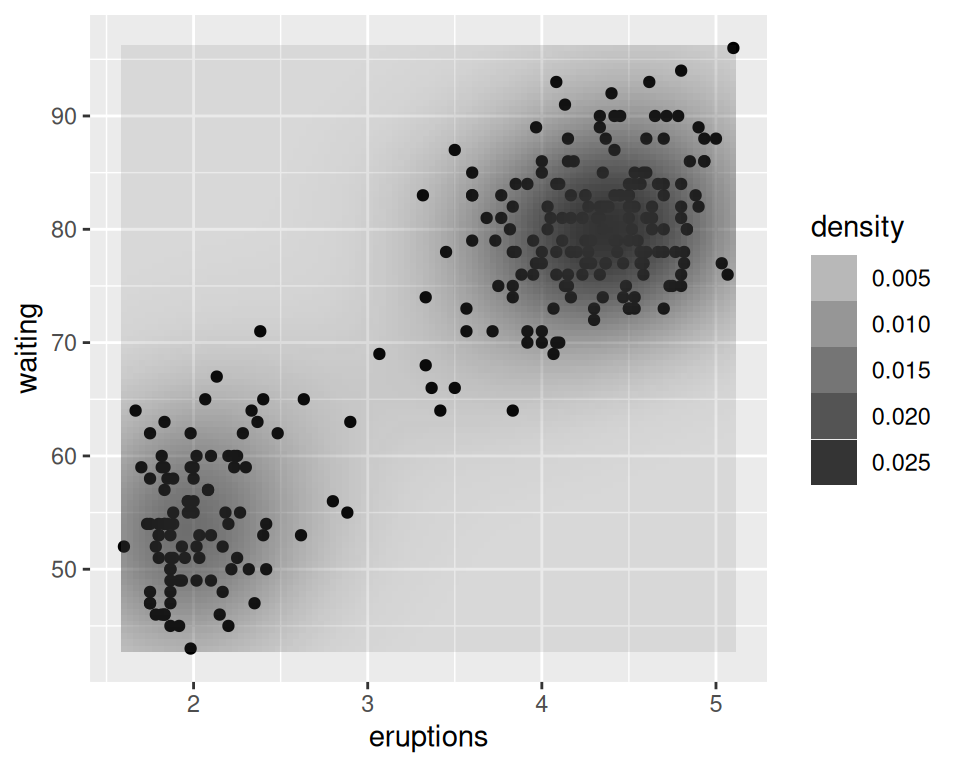
Figure 6.35: With ..density.. mapped to fill (left); With points, and ..density.. mapped to alpha (right)
Note
We used
geom = "raster"in the first of the preceding examples andgeom = "tile"in the second. The main difference is that the raster geom renders more efficiently than the tile geom. In theory they should appear the same, but in practice they often do not. If you are writing to a PDF file, the appearance depends on the PDF viewer. On some viewers, when tile is used there may be faint lines between the tiles, and when raster is used the edges of the tiles may appear blurry (although it doesn’t matter in this particular case).
As with the one-dimensional density estimate, you can control the bandwidth of the estimate. To do this, pass a vector for the x and y bandwidths to h. This argument gets passed on to the function that actually generates the density estimate, kde2d(). In this example (Figure 6.36), we’ll use a smaller bandwidth in the x and y directions, so that the density estimate is more closely fitted (perhaps overfitted) to the data:
faithful_p +
  stat_density2d(
    aes(fill = ..density..),
    geom = "raster",
    contour = FALSE,
    h = c(.5, 5)
  )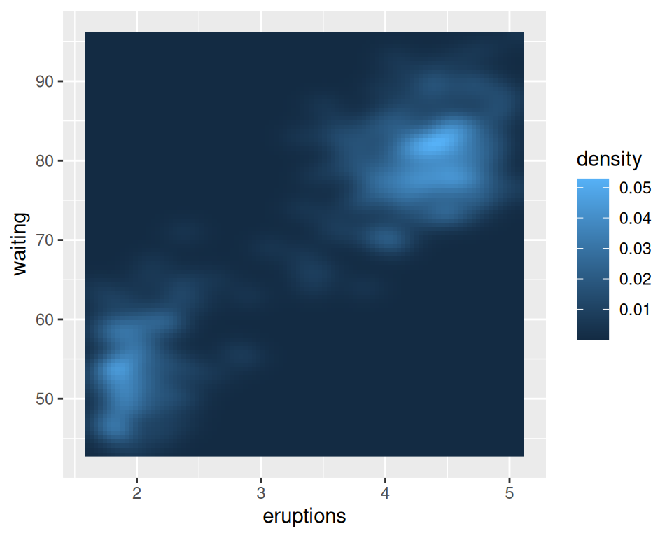
Figure 6.36: Density plot with a smaller bandwidth in the x and y directions
6.12.4 See Also
The relationship between stat_density2d() and stat_bin2d() is the same as the relationship between their one-dimensional counterparts, the density curve and the histogram. The density curve is an estimate of the distribution under certain assumptions, while the binned visualization represents the observed data directly. See Recipe 5.5 for more about binning data.
If you want to use a different color palette, see Recipe 12.6.
stat_density2d() passes options to kde2d(); see ?kde2d for information on the available options.