11.1 Splitting Data into Subplots with Facets
11.1.2 Solution
Use facet_grid() or facet_wrap(), and specify the variables on which to split.
With facet_grid(), you can specify a variable to split the data into vertical subpanels, and another variable to split it into horizontal subpanels (Figure 11.1):
# Create the base plot
mpg_plot <- ggplot(mpg, aes(x = displ, y = hwy)) +
  geom_point()

# Faceted by cyl, in horizontally arranged subpanels
mpg_plot +
  facet_grid(. ~ cyl)

# Faceted by drv, in vertically arranged subpanels
mpg_plot +
  facet_grid(drv ~ .)

# Split by drv (vertical) and cyl (horizontal)
mpg_plot +
  facet_grid(drv ~ cyl)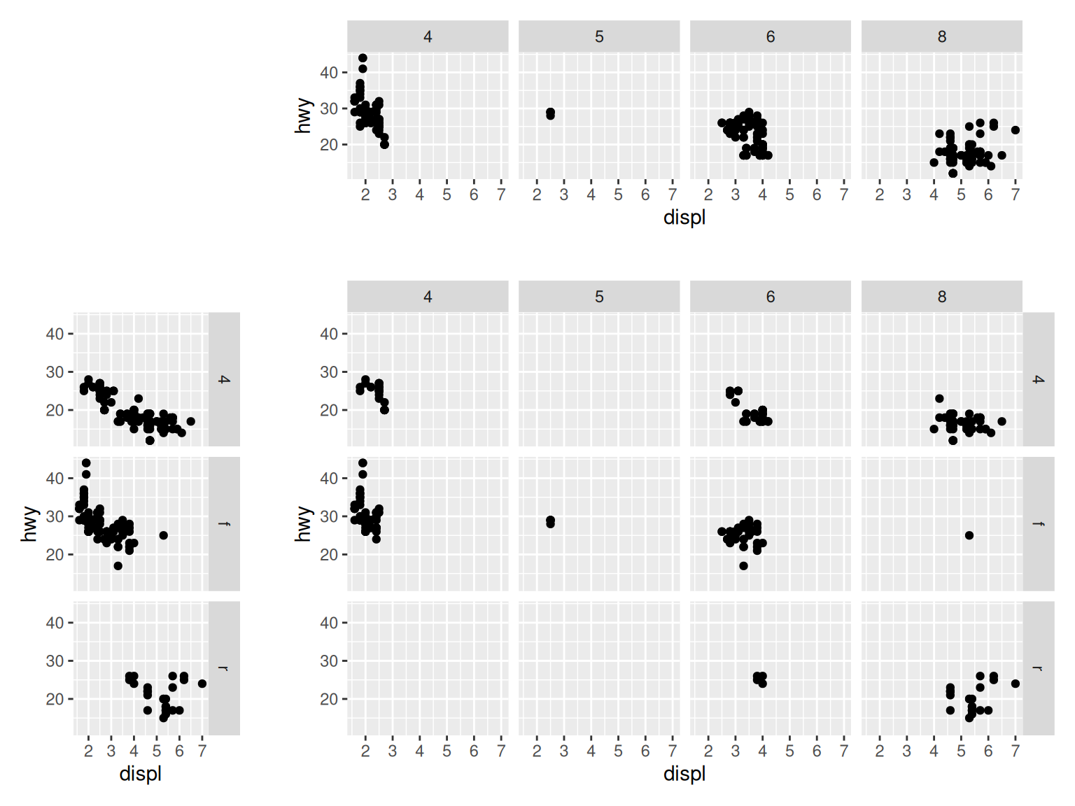
Figure 11.1: Faceting horizontally by cyl (top); faceting vertically by dev (left); faceting in both directions, with both variables (bottom right)
With facet_wrap(), the subplots are laid out horizontally and wrap around, like words on a page, as in Figure 11.2:
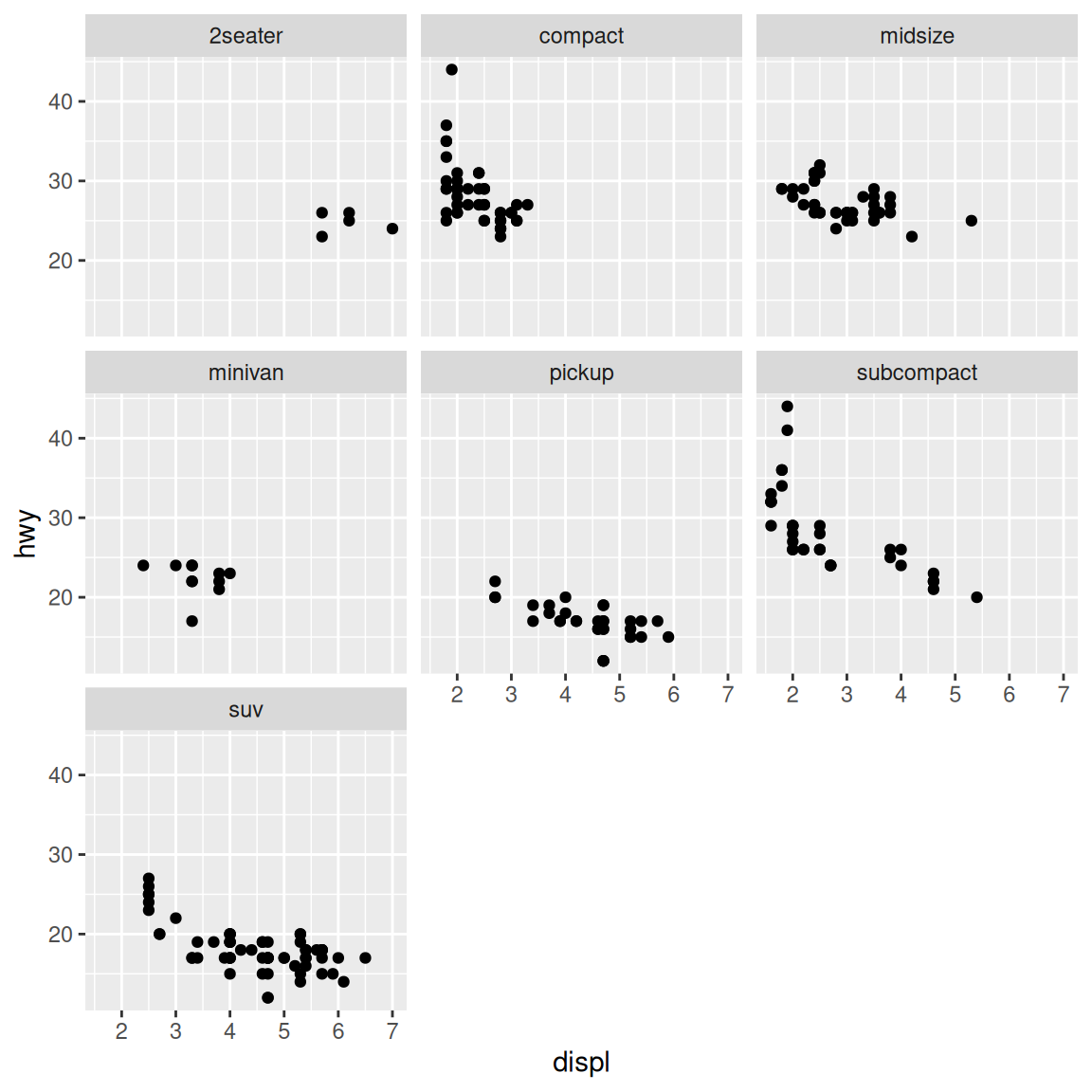
Figure 11.2: A scatter plot with facet_wrap() on class
11.1.3 Discussion
With facet_wrap(), the default is to use the same number of rows and columns. In Figure 11.2, there were seven facets, and they fit into a 3×3 square. To change this, you can pass a value for nrow or ncol:
# These will have the same result: 2 rows and 4 cols
mpg_plot +
  facet_wrap( ~ class, nrow = 2)

mpg_plot +
  facet_wrap( ~ class, ncol = 4)
The choice of faceting direction depends on the kind of comparison you would like to encourage. For example, if you want to compare heights of bars, it’s useful to make the facets go horizontally. If, on the other hand, you want to compare the horizontal distribution of histograms, it makes sense to make the facets go vertically.
Sometimes both kinds of comparisons are important – there may not be a clear answer as to which faceting direction is best. It may turn out that displaying the groups in a single plot by mapping the grouping variable to an aesthetic like color works better than using facets. In these situations, you’ll have to rely on your judgment.