5.11 Labeling Points in a Scatter Plot
5.11.2 Solution
For annotating just one or a few points, you can use annotate() or geom_text(). For this example, we’ll use the countries data set and visualize the relationship between health expenditures and infant mortality rate per 1,000 live births. To keep things manageable, we’ll filter the data to only look at data from 2009 for a subset of countries that spent more than $2,000 USD per capita:
library(gcookbook) # Load gcookbook for the countries data set
library(dplyr)

# Filter the data to only look at 2009 data for countries that spent > 2000 USD per capita
countries_sub <- countries %>%
  filter(Year == 2009 & healthexp > 2000)
We’ll save the basic scatter plot object in countries_sp (for countries scatter plot) and add then add our annotations to it. To manually add annotations, use annotate(), and specify the coordinates and label (Figure 5.30, left). It may require some trial-and-error tweaking to get the labels positioned just right:
countries_sp <- ggplot(countries_sub, aes(x = healthexp, y = infmortality)) +
    geom_point()

countries_sp +
  annotate("text", x = 4350, y = 5.4, label = "Canada") +
  annotate("text", x = 7400, y = 6.8, label = "USA")
To automatically add the labels from your data (Figure 5.30, right), use geom_text() and map a column that is a factor or character vector to the label aesthetic. In this case, we’ll use Name, and we’ll make the font slightly smaller to reduce crowding. The default value for size is 5, which doesn’t correspond directly to a point size:

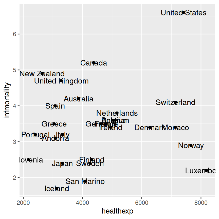
Figure 5.30: A scatter plot with manually labeled points (left); With automatically labeled points and a smaller font (right)
As you can see in the center of (Figure 5.30, right), you may find yourself with a plot where labels are overlapping. To automatically adjust point labels so that they don’t overlap, we can use geom_text_repel (Figure 5.31, left) or geom_label_repel (which adds a box around the label, Figure 5.31, right) from the ggrepel package, which functions similarly to geom_text.
# Make sure to have installed ggrepel with install.packages("ggrepel")
library(ggrepel)
countries_sp +
  geom_text_repel(aes(label = Name), size = 3)

countries_sp +
  geom_label_repel(aes(label = Name), size = 3)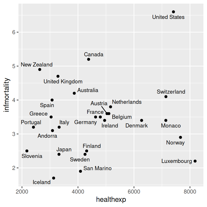
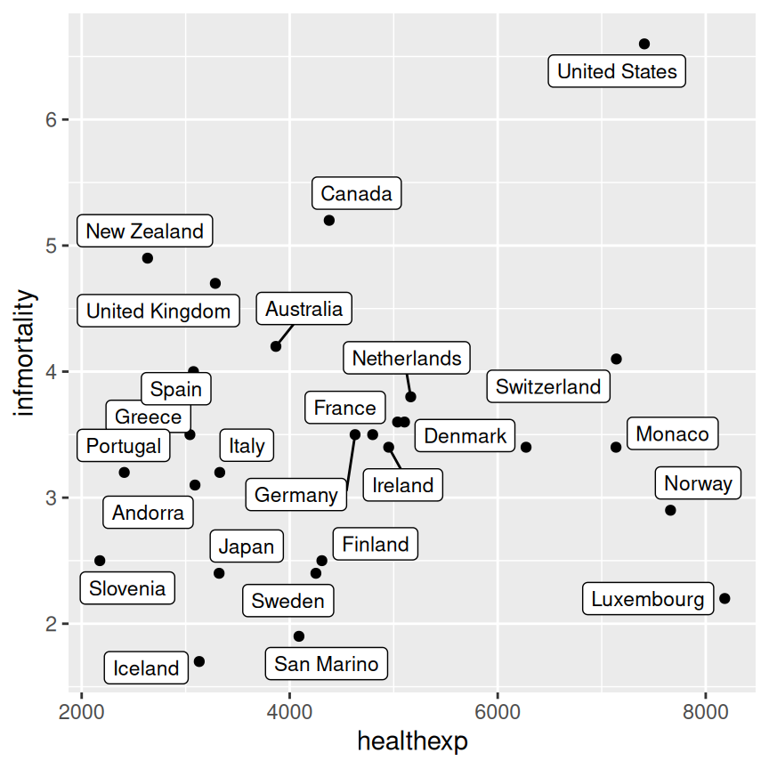
Figure 5.31: A scatter plot labeled with geom_text_repel (left); Labeled with geom_label_repel (right)
5.11.3 Discussion
Using geom_text_repel or geom_label_repel is the easiest way to have nicely-placed labels on a plot. It makes automatic (and random) decisions about label placement, so if exact control over where each label is placed, you should use annotate() or geom_text().
The automatic method for placing annotations using geom_text() centers each annotation on the x and y coordinates. You’ll probably want to shift the text vertically, horizontally, or both.
Setting vjust = 0 will make the baseline of the text on the same level as the point (Figure 5.32, left), and setting vjust = 1 will make the top of the text level with the point. This usually isn’t enough, though – you can increase or decrease vjust to shift the labels higher or lower, or you can add or subtract a bit to or from the y mapping to get the same effect (Figure 5.32, right):
countries_sp +
  geom_text(aes(label = Name), size = 3, vjust = 0)

# Add a little extra to y
countries_sp +
  geom_text(aes(y = infmortality + .1, label = Name), size = 3)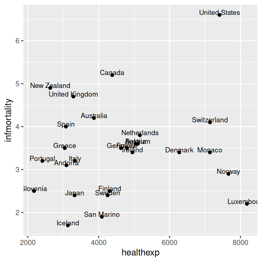
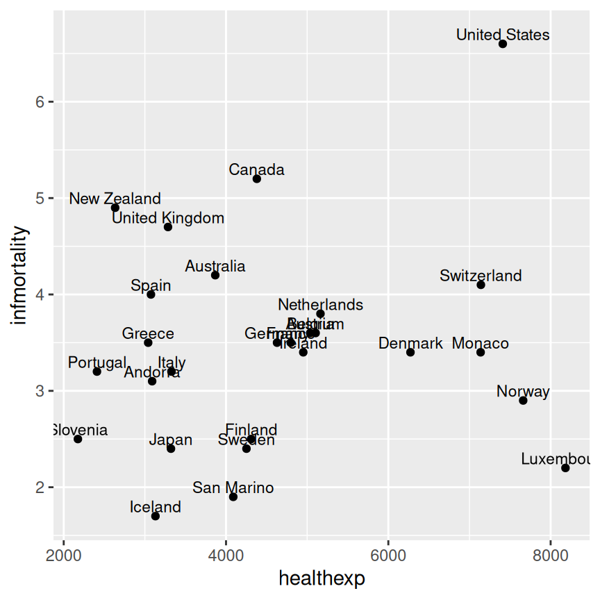
Figure 5.32: A scatter plot with vjust=0 (left); With a little extra added to y (right)
It often makes sense to right- or left-justify the labels relative to the points. To left-justify, set hjust = 0 (Figure 5.33, left), and to right-justify, set hjust = 1. As was the case with vjust, the labels will still slightly overlap with the points. This time, though, it’s not a good idea to try to fix it by increasing or decreasing hjust. Doing so will shift the labels a distance proportional to the length of the label, making longer labels move further than shorter ones. It’s better to just set hjust to 0 or 1, and then add or subtract a bit to or from x (Figure 5.33, right):
countries_sp +
  geom_text(
    aes(label = Name),
    size = 3,
    hjust = 0
  )

countries_sp +
  geom_text(
    aes(x = healthexp + 100, label = Name),
    size = 3,
    hjust = 0
  )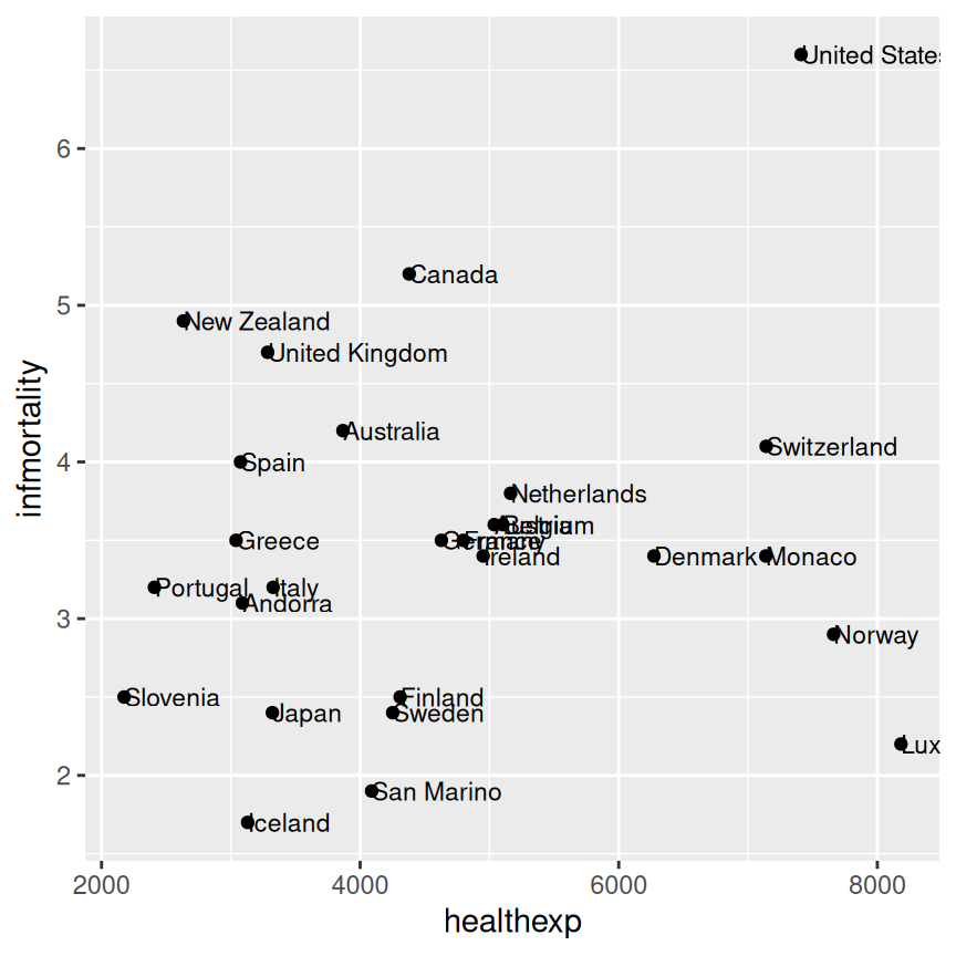

Figure 5.33: A scatter plot with hjust=0 (left); With a little extra added to x (right)
Note
If you are using a logarithmic axis, instead of adding to x or y, you’ll need to multiply the x or y value by a number to shift the labels a consistent amount.
Besides right- or left-justifying all of your labels, you can also adjust the position of all of the labels at once is to use position = position_nudge(). This allows you to specify the amount of vertical or horizontal distance you want to move the labels. As you can see from the figures below (Figure 5.34, this strategy works best when there are fewer labels, or fewer points that can cause overlap with labels. Note that the units you specify with x = ... and y = ... correspond to the units of the x and y axis.
countries_sp +
  geom_text(
    aes(x = healthexp + 100, label = Name),
    size = 3,
    hjust = 0
  )

countries_sp +
  geom_text(
    aes(x = healthexp + 100, label = Name),
    size = 3,
    hjust = 0,
    position = position_nudge(x = 100, y = -0.2)
  )
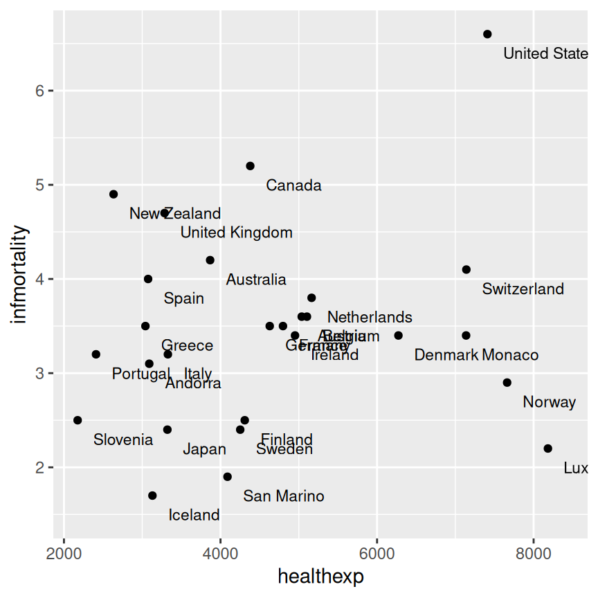
Figure 5.34: Original scatter plot (left); Scatter plot with labels nudged down and to the right (right)
If you want to label just some of the points but want the placement to be handled automatically, you can add a new column to your data frame containing just the labels you want. Here’s one way to do that: first we’ll make a copy of the data we’re using, then we’ll copy the Name column into plotname, converting from a factor to a character vector, for reasons we’ll see below.
cdat <- countries %>%
  filter(Year == 2009, healthexp > 2000) %>%
  mutate(plotname = as.character(Name))
Now that plotname is a character vector, we can use an ifelse() function and the %in% operator to identify if each row of plotname matches the list of names we want to show on our plot, which we have specified manually below. The %in% operator returns a logical vector that allows us to specify within the ifelse() function that we want to replace all values of plotname that do not match one of our specified names with a blank string.
countrylist <- c("Canada", "Ireland", "United Kingdom", "United States",
  "New Zealand", "Iceland", "Japan", "Luxembourg", "Netherlands", "Switzerland")

cdat <- cdat %>%
  mutate(plotname = ifelse(plotname %in% countrylist, plotname, ""))

# Take a look at the resulting `plotname` variable, as compared to the original `Name` variable
cdat %>%
  select(Name, plotname)
#>              Name       plotname
#> 1         Andorra
#> 2       Australia
#> 3         Austria
#>  ...<21 more rows>...
#> 25    Switzerland    Switzerland
#> 26 United Kingdom United Kingdom
#> 27  United States  United States
Now we can make the plot (Figure 5.35). This time, we’ll also expand the x range so that the text will fit:
ggplot(cdat, aes(x = healthexp, y = infmortality)) +
  geom_point() +
  geom_text(aes(x = healthexp + 100, label = plotname), size = 4, hjust = 0) +
  xlim(2000, 10000)
Figure 5.35: Scatter plot with selected labels and expanded x range
If any individual position adjustments are needed, you have a couple of options. One option is to copy the columns used for the x and y coordinates and modify the numbers for the individual items to move the text around. Make sure to use the original numbers for the coordinates of the points, of course!
Finally, another option is to save the output to a vector format such as PDF or SVG (see Recipes Recipe 14.1 and Recipe 14.2), then edit it in a program like Illustrator or Inkscape.