6.1 Making a Basic Histogram
6.1.2 Solution
Use geom_histogram() and map a continuous variable to x (Figure 6.1):
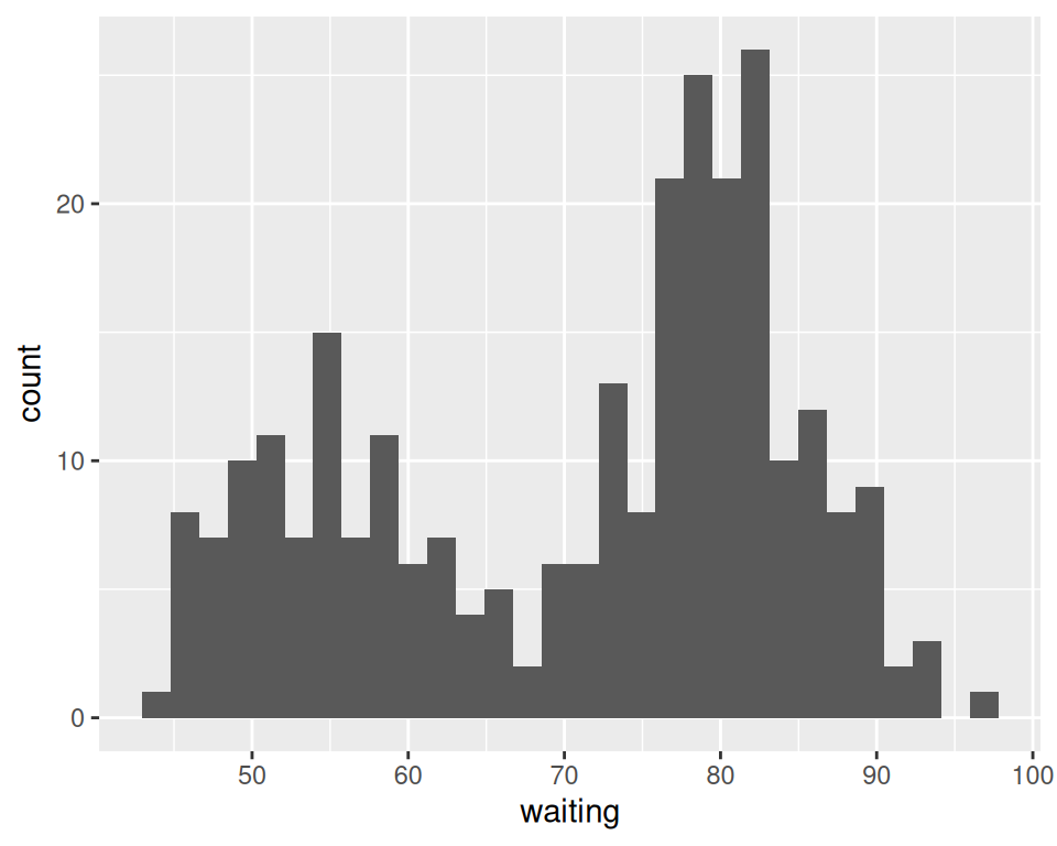
Figure 6.1: A basic histogram
6.1.3 Discussion
All geom_histogram() requires is one column from a data frame or a single vector of data. For this example we’ll use the faithful data set, which contains two columns with data about the Old Faithful geyser: eruptions, which is the length of each eruption, and waiting, which is the length of time to the next eruption. We’ll only use the waiting variable in this example:
faithful
#>     eruptions waiting
#> 1       3.600      79
#> 2       1.800      54
#> 3       3.333      74
#>  ...<266 more rows>...
#> 270     4.417      90
#> 271     1.817      46
#> 272     4.467      74
If you just want to get a quick look at some data that isn’t in a data frame, you can get the same result by passing in NULL for the data frame and giving ggplot() a vector of values. This would have the same result as the previous code:
# Store the values in a simple vector
w <- faithful$waiting

ggplot(NULL, aes(x = w)) +
  geom_histogram()
By default, the data is grouped into 30 bins. This number of bins is an arbitrary default value, and may be too fine or too coarse for your data. You can change the size of the bins by specifying the binwidth, or you can divide the range of the data into a specific number of bins.
In addition, the default colors – a dark fill without an outline – can make it difficult to see which bar corresponds to which value, so we’ll also change the colors, as shown in Figure 6.2.
# Set the width of each bin to 5 (each bin will span 5 x-axis units)
ggplot(faithful, aes(x = waiting)) +
  geom_histogram(binwidth = 5, fill = "white", colour = "black")

# Divide the x range into 15 bins
binsize <- diff(range(faithful$waiting))/15

ggplot(faithful, aes(x = waiting)) +
  geom_histogram(binwidth = binsize, fill = "white", colour = "black")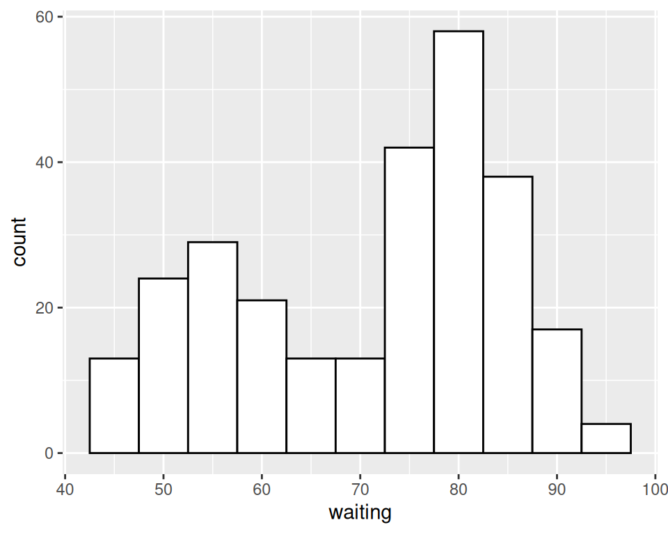
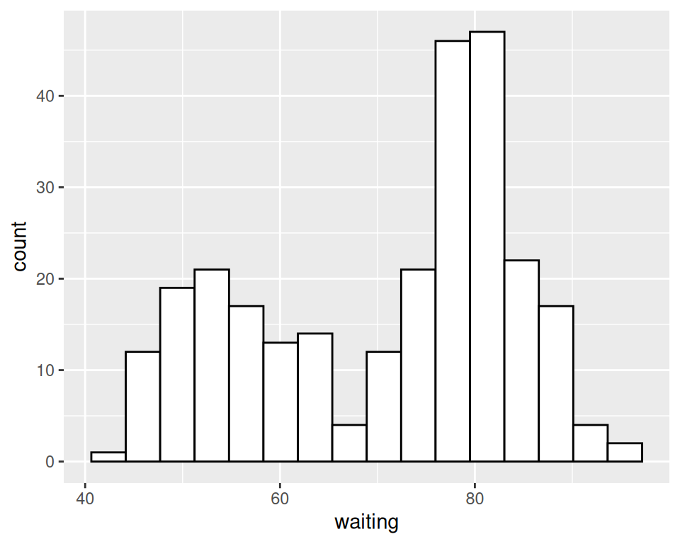
Figure 6.2: Histogram with binwidth = 5 and with different colors (left); With 15 bins (right)
Sometimes the appearance of the histogram will be very dependent on the width of the bins and where the boundary points between the bins are. In Figure 6.3, we’ll use a bin width of 8. In the version on the left, we’ll use the origin parameter to put boundaries at 31, 39, 47, etc., while in the version on the right, we’ll shift it over by 4, putting boundaries at 35, 43, 51, etc.:
# Save a base plot
faithful_p <- ggplot(faithful, aes(x = waiting))

faithful_p +
  geom_histogram(binwidth = 8, fill = "white", colour = "black", boundary = 31)

faithful_p +
  geom_histogram(binwidth = 8, fill = "white", colour = "black", boundary = 35)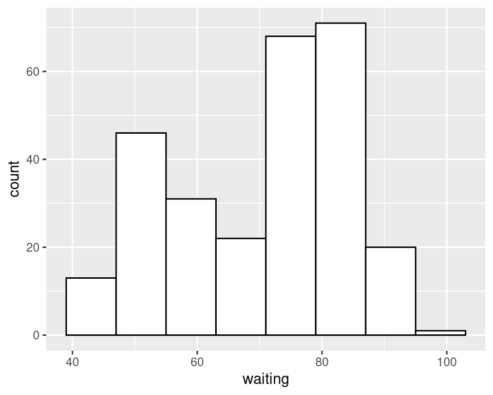
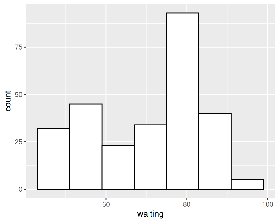
Figure 6.3: Different appearance of histograms with the origin at 31 and 35
The results look quite different, even though they have the same bin size. The faithful data set is not particularly small, with 272 observations; with smaller data sets, this can be even more of an issue. When visualizing your data, it’s a good idea to experiment with different bin sizes and boundary points.
If your data has discrete values, it may matter that the histogram bins are asymmetrical. They are closed on the lower bound and open on the upper bound. If you have bin boundaries at 1, 2, 3, etc., then the bins will be [1, 2), [2, 3), and so on. In other words, the first bin contains 1 but not 2, and the second bin contains 2 but not 3.
6.1.4 See Also
Frequency polygons provide a better way of visualizing multiple distributions without the bars interfering with each other. See Recipe 6.5.