2.3 Creating a Bar Graph
2.3.2 Solution
To make a bar graph of values (Figure 2.5, left), use barplot() and pass it a vector of values for the height of each bar and (optionally) a vector of labels for each bar. If the vector has names for the elements, the names will automatically be used as labels:
# First, take a look at the BOD data
BOD
#>   Time demand
#> 1    1    8.3
#> 2    2   10.3
#> 3    3   19.0
#> 4    4   16.0
#> 5    5   15.6
#> 6    7   19.8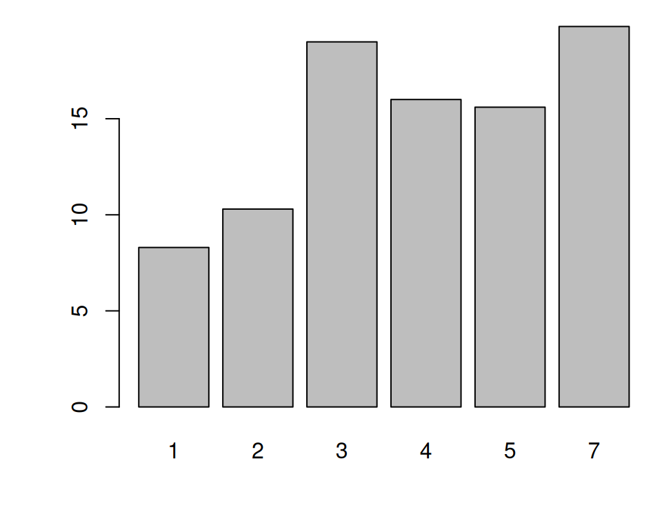
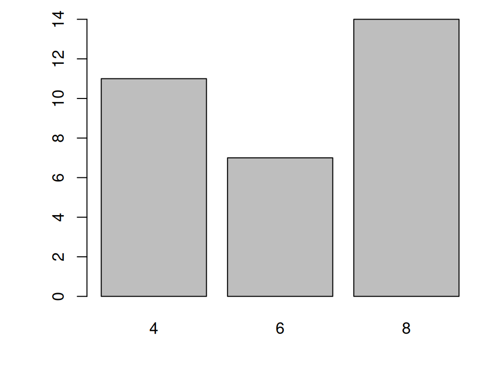
Figure 2.5: Bar graph of values with base graphics (left); Bar graph of counts (right)
Sometimes “bar graph” refers to a graph where the bars represent the count of cases in each category. This is similar to a histogram, but with a discrete instead of continuous x-axis. To generate the count of each unique value in a vector, use the table() function:
# There are 11 cases of the value 4, 7 cases of 6, and 14 cases of 8
table(mtcars$cyl)
#>
#>  4  6  8
#> 11  7 14
Then pass the table to barplot() to generate the graph of counts:
With ggplot2, you can get a similar result using geom_col() (Figure 2.6). To plot a bar graph of values, use geom_col(). Notice the difference in the output when the x variable is continuous and when it is discrete:
library(ggplot2)

# Bar graph of values. This uses the BOD data frame, with the
# "Time" column for x values and the "demand" column for y values.
ggplot(BOD, aes(x = Time, y = demand)) +
  geom_col()

# Convert the x variable to a factor, so that it is treated as discrete
ggplot(BOD, aes(x = factor(Time), y = demand)) +
  geom_col()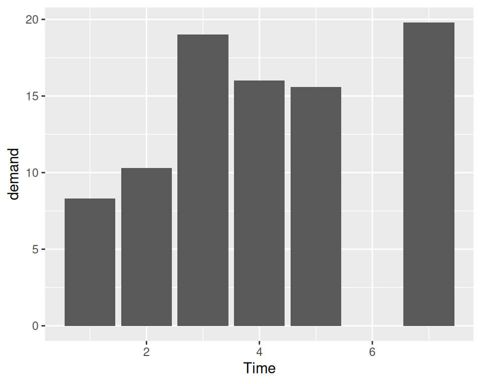
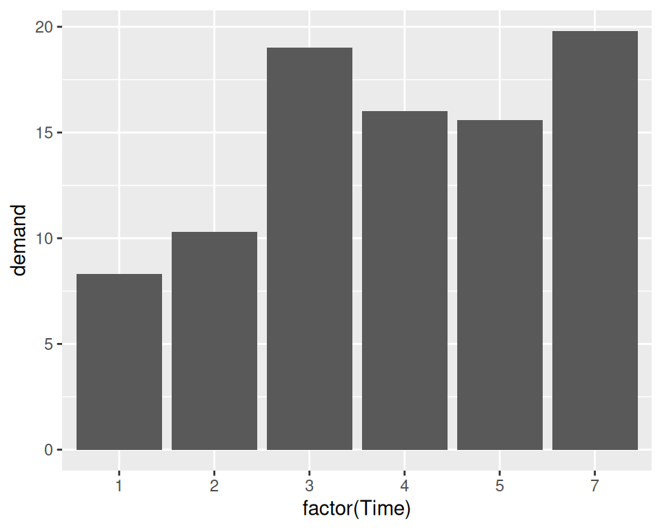
Figure 2.6: Bar graph of values using geom_col() with a continuous x variable (left); With x variable converted to a factor (notice that there is no entry for 6; right)
ggplot2 can also be used to plot the count of the number of data rows in each category (Figure 2.7, by using geom_bar() instead of geom_col(). Once again, notice the difference between a continuous x-axis and a discrete one. For some kinds of data, it may make more sense to convert the continuous x variable to a discrete one, with the factor() function.
# Bar graph of counts This uses the mtcars data frame, with the "cyl" column for
# x position. The y position is calculated by counting the number of rows for
# each value of cyl.
ggplot(mtcars, aes(x = cyl)) +
  geom_bar()

# Bar graph of counts
ggplot(mtcars, aes(x = factor(cyl))) +
  geom_bar()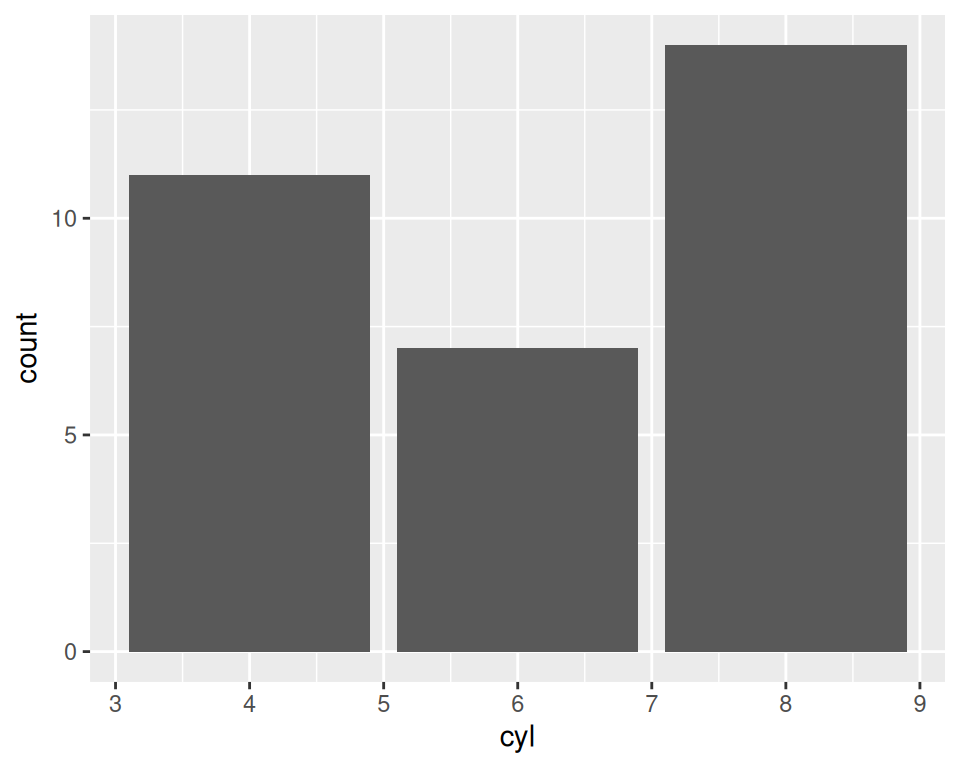

Figure 2.7: Bar graph of counts using geom_bar() with a continuous x variable (left); With x variable converted to a factor (right)
Note
In previous versions of ggplot2, the recommended way to create a bar graph of values was to use
geom_bar(stat = "identity"). As of ggplot2 2.2.0, there is ageom_col()function which does the same thing.
2.3.3 See Also
See Chapter 3 for more in-depth information about creating bar graphs.