5.13 Making a Scatter Plot Matrix
5.13.2 Solution
A scatter plot matrix is an excellent way of visualizing the pairwise relationships among several variables. To make one, use the pairs() function from R’s base graphics.
For this example, we’ll use a subset of the countries data. We’ll pull out the data for the year 2009, and keep only the columns that are relevant:
library(gcookbook) # Load gcookbook for the countries data set

c2009 <- countries %>%
  filter(Year == 2009) %>%
  select(Name, GDP, laborrate, healthexp, infmortality)

c2009
#>            Name       GDP laborrate healthexp infmortality
#> 1   Afghanistan        NA      59.8  50.88597        103.2
#> 2       Albania 3772.6047      59.5 264.60406         17.2
#> 3       Algeria 4022.1989      58.5 267.94653         32.0
#>  ...<210 more rows>...
#> 214 Yemen, Rep. 1130.1833      46.8  64.00204         58.7
#> 215      Zambia 1006.3882      69.2  47.05637         71.5
#> 216    Zimbabwe  467.8534      66.8        NA         52.2
To make the scatter plot matrix (Figure 5.38), we’ll use all of the variables except for Name, since making a scatter plot matrix using the names of the countries wouldn’t make sense and would produce strange-looking results:
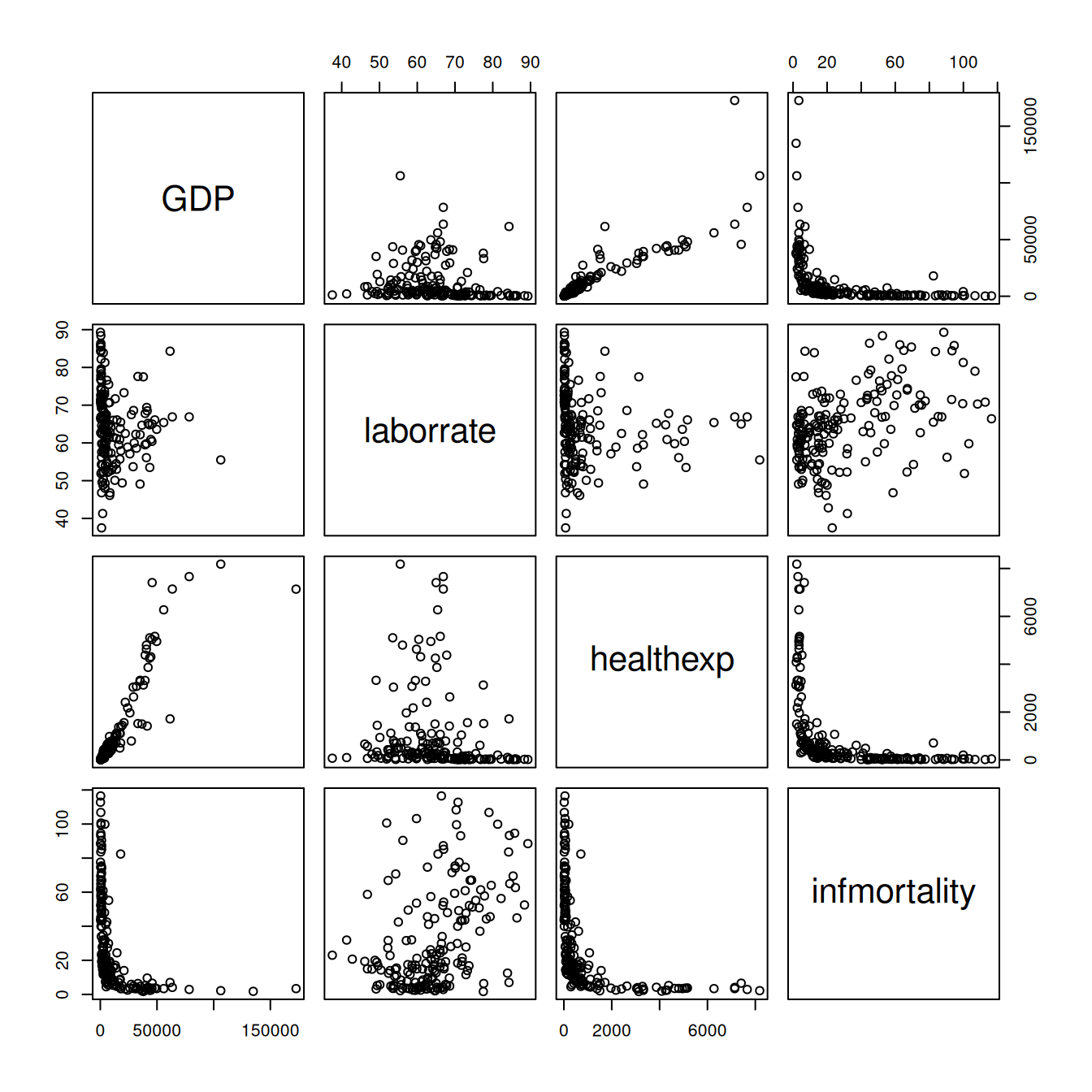
Figure 5.38: A scatter plot matrix
5.13.3 Discussion
You can also use customized functions for the panels. To show the correlation coefficient of each pair of variables instead of a scatter plot, we’ll define the function panel.cor. This will also show higher correlations in a larger font. Don’t worry about the details for now – just paste this code into your R session or script:
panel.cor <- function(x, y, digits = 2, prefix = "", cex.cor, ...) {
  usr <- par("usr")
  on.exit(par(usr))
  par(usr = c(0, 1, 0, 1))
  r <- abs(cor(x, y, use = "complete.obs"))
  txt <- format(c(r, 0.123456789), digits = digits)[1]
  txt <- paste(prefix, txt, sep = "")
  if (missing(cex.cor)) cex.cor <- 0.8/strwidth(txt)
  text(0.5, 0.5, txt, cex =  cex.cor * (1 + r) / 2)
}
To show histograms of each variable along the diagonal, we’ll define panel.hist:
panel.hist <- function(x, ...) {
  usr <- par("usr")
  on.exit(par(usr))
  par(usr = c(usr[1:2], 0, 1.5) )
  h <- hist(x, plot = FALSE)
  breaks <- h$breaks
  nB <- length(breaks)
  y <- h$counts
  y <- y/max(y)
  rect(breaks[-nB], 0, breaks[-1], y, col = "white", ...)
}
Both of these panel functions are taken from the pairs() help page, so if it’s more convenient, you can simply open that help page, then copy and paste. The last line of this version of the panel.cor function is slightly modified, however, so that the changes in font size aren’t as extreme as with the original.
Now that we’ve defined these functions we can use them for our scatter plot matrix, by telling pairs() to use panel.cor for the upper panels and panel.hist for the diagonal panels.
We’ll also throw in one more thing: panel.smooth for the lower panels, which makes a scatter plot and adds a LOWESS smoothed line, as shown in Figure 5.39. (LOWESS is slightly different from LOESS, which we saw in Recipe 5.6, but the differences aren’t important for this sort of rough exploratory visualization):
pairs(
  c2009_num,
  upper.panel = panel.cor,
  diag.panel  = panel.hist,
  lower.panel = panel.smooth
)
#> Warning in par(usr): argument 1 does not name a graphical parameter
#> Warning in par(usr): argument 1 does not name a graphical parameter
#> Warning in par(usr): argument 1 does not name a graphical parameter
#> Warning in par(usr): argument 1 does not name a graphical parameter
#> Warning in par(usr): argument 1 does not name a graphical parameter
#> Warning in par(usr): argument 1 does not name a graphical parameter
#> Warning in par(usr): argument 1 does not name a graphical parameter
#> Warning in par(usr): argument 1 does not name a graphical parameter
#> Warning in par(usr): argument 1 does not name a graphical parameter
#> Warning in par(usr): argument 1 does not name a graphical parameter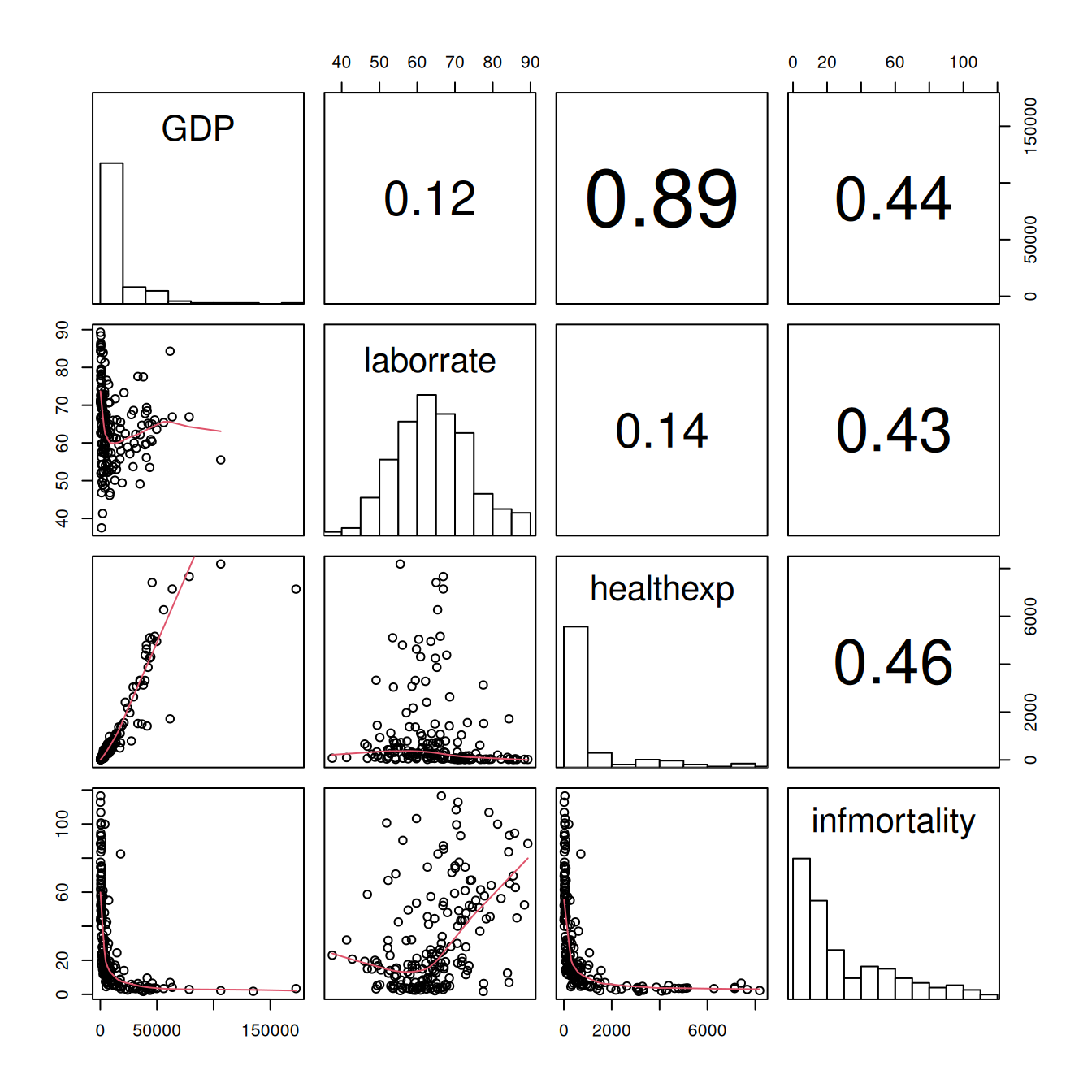
Figure 5.39: Scatter plot with correlations in the upper triangle, smoothing lines in the lower triangle, and histograms on the diagonal
It may be more desirable to use linear regression lines instead of LOWESS lines. The panel.lm() function will do the trick (unlike the previous panel functions, this one isn’t in the pairs help page):
panel.lm <- function (x, y, col = par("col"), bg = NA, pch = par("pch"),
                      cex = 1, col.smooth = "black", ...) {
  points(x, y, pch = pch, col = col, bg = bg, cex = cex)
  abline(stats::lm(y ~ x),  col = col.smooth, ...)
}
This time the default line color is black instead of red, though you can change it here (and with panel.smooth) by setting col.smooth when you call pairs().
We’ll also use small points in the visualization, so that we can distinguish them a bit better (Figure 5.40). This is done by setting pch = ".":
pairs(
  c2009_num,
  upper.panel = panel.cor,
  diag.panel  = panel.hist,
  lower.panel = panel.smooth,
  pch = "."
)
#> Warning in par(usr): argument 1 does not name a graphical parameter
#> Warning in par(usr): argument 1 does not name a graphical parameter
#> Warning in par(usr): argument 1 does not name a graphical parameter
#> Warning in par(usr): argument 1 does not name a graphical parameter
#> Warning in par(usr): argument 1 does not name a graphical parameter
#> Warning in par(usr): argument 1 does not name a graphical parameter
#> Warning in par(usr): argument 1 does not name a graphical parameter
#> Warning in par(usr): argument 1 does not name a graphical parameter
#> Warning in par(usr): argument 1 does not name a graphical parameter
#> Warning in par(usr): argument 1 does not name a graphical parameter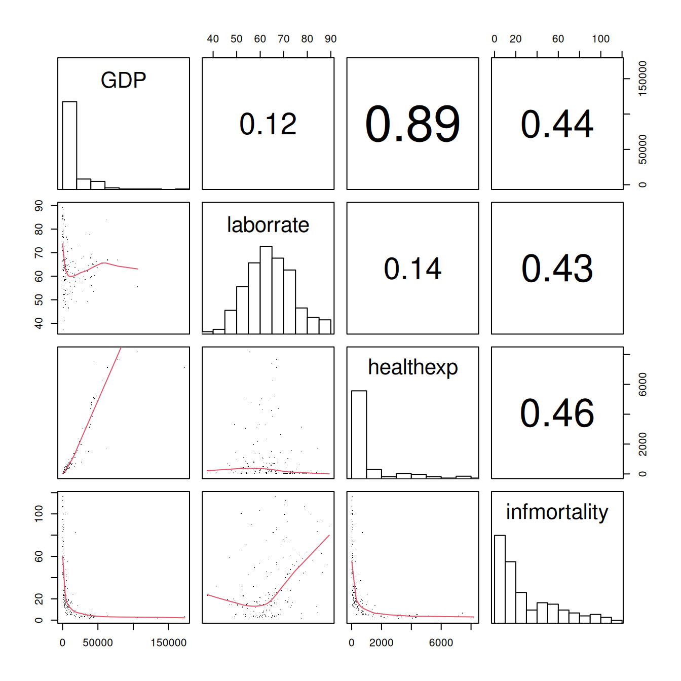
Figure 5.40: Scatter plot matrix with smaller points and linear fit lines
The size of the points can also be controlled using the cex parameter. The default value for cex is 1; make it smaller for smaller points and larger for larger points. Values below .5 might not render properly with PDF output.
5.13.4 See Also
To create a correlation matrix, see Recipe 13.1.
It is worth noting that we didn’t use ggplot here because it doesn’t make scatter plot matrices (at least, not well).
Other packages like GGally have been developed as extensions to ggplot to fill in this gap. The ggpairs() function from the GGally package makes scatter plot matrices, for example.