3.9 Adding Labels to a Bar Graph
3.9.2 Solution
Add geom_text() to your graph. It requires a mapping for x, y, and the text itself. By setting vjust (the vertical justification), it is possible to move the text above or below the tops of the bars, as shown in Figure 3.22:
library(gcookbook) # Load gcookbook for the cabbage_exp data set

# Below the top
ggplot(cabbage_exp, aes(x = interaction(Date, Cultivar), y = Weight)) +
  geom_col() +
  geom_text(aes(label = Weight), vjust = 1.5, colour = "white")

# Above the top
ggplot(cabbage_exp, aes(x = interaction(Date, Cultivar), y = Weight)) +
  geom_col() +
  geom_text(aes(label = Weight), vjust = -0.2)

Figure 3.22: Labels under the tops of bars (left); Labels above bars (right)
Notice that when the labels are placed atop the bars, they may be clipped. To remedy this, see Recipe 8.2.
Another common scenario is to add labels for a bar graph of counts instead of values. To do this, use geom_bar(), which adds bars whose height is proportional to the number of rows, and then use geom_text() with counts:
ggplot(mtcars, aes(x = factor(cyl))) +
  geom_bar() +
  geom_text(aes(label = ..count..), stat = "count", vjust = 1.5, colour = "white")
#> Warning: The dot-dot notation (`..count..`) was deprecated in ggplot2 3.4.0.
#> ℹ Please use `after_stat(count)` instead.
#> This warning is displayed once per session.
#> Call `lifecycle::last_lifecycle_warnings()` to see where this warning was
#> generated.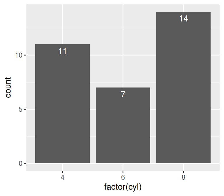
Figure 3.23: Bar graph of counts with labels under the tops of bars
We needed to tell geom_text() to use the "count" statistic to compute the number of rows for each x value, and then, to use those computed counts as the labels, we told it to use the aesthetic mapping aes(label = ..count..).
3.9.3 Discussion
In Figure 3.22, the y coordinates of the labels are centered at the top of each bar; by setting the vertical justification (vjust), they appear below or above the bar tops. One drawback of this is that when the label is above the top of the bar, it can go off the top of the plotting area. To fix this, you can manually set the y limits, or you can set the y positions of the text above the bars and not change the vertical justification. One drawback to changing the text’s y position is that if you want to place the text fully above or below the bar top, the value to add will depend on the y range of the data; in contrast, changing vjust to a different value will always move the text the same distance relative to the height of the bar:
# Adjust y limits to be a little higher
ggplot(cabbage_exp, aes(x = interaction(Date, Cultivar), y = Weight)) +
  geom_col() +
  geom_text(aes(label = Weight), vjust = -0.2) +
  ylim(0, max(cabbage_exp$Weight) * 1.05)

# Map y positions slightly above bar top - y range of plot will auto-adjust
ggplot(cabbage_exp, aes(x = interaction(Date, Cultivar), y = Weight)) +
  geom_col() +
  geom_text(aes(y = Weight + 0.1, label = Weight))
For grouped bar graphs, you also need to specify position=position_dodge() and give it a value for the dodging width. The default dodge width is 0.9. Because the bars are narrower, you might need to use size to specify a smaller font to make the labels fit. The default value of size is 5, so we’ll make it smaller by using 3 (Figure 3.24):
ggplot(cabbage_exp, aes(x = Date, y = Weight, fill = Cultivar)) +
  geom_col(position = "dodge") +
  geom_text(
    aes(label = Weight),
    colour = "white", size = 3,
    vjust = 1.5, position = position_dodge(.9)
  )
Figure 3.24: Labels on grouped bars
Putting labels on stacked bar graphs requires finding the cumulative sum for each stack. To do this, first make sure the data is sorted properly – if it isn’t, the cumulative sum might be calculated in the wrong order. We’ll use the arrange() function from the dplyr package. Note that we have to use the rev() function to reverse the order of Cultivar:
library(dplyr)

# Sort by the Date and Cultivar columns
ce <- cabbage_exp %>%
  arrange(Date, rev(Cultivar))
Once we make sure the data is sorted properly, we’ll use group_by() to chunk it into groups by Date, then calculate a cumulative sum of Weight within each chunk:
# Get the cumulative sum
ce <- ce %>%
  group_by(Date) %>%
  mutate(label_y = cumsum(Weight))

ce
#> # A tibble: 6 × 7
#> # Groups:   Date [3]
#>   Cultivar Date  Weight    sd     n     se label_y
#>   <fct>    <fct>  <dbl> <dbl> <int>  <dbl>   <dbl>
#> 1 c52      d16     2.26 0.445    10 0.141     2.26
#> 2 c39      d16     3.18 0.957    10 0.303     5.44
#> 3 c52      d20     3.11 0.791    10 0.250     3.11
#> 4 c39      d20     2.8  0.279    10 0.0882    5.91
#> 5 c52      d21     1.47 0.211    10 0.0667    1.47
#> 6 c39      d21     2.74 0.983    10 0.311     4.21

ggplot(ce, aes(x = Date, y = Weight, fill = Cultivar)) +
  geom_col() +
  geom_text(aes(y = label_y, label = Weight), vjust = 1.5, colour = "white")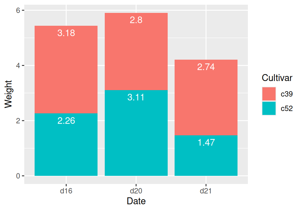
Figure 3.25: Labels on stacked bars
The result is shown in Figure 3.25.
When using labels, changes to the stacking order are best done by modifying the order of levels in the factor (see Recipe 15.8) before taking the cumulative sum. The other method of changing stacking order, by specifying breaks in a scale, won’t work properly, because the order of the cumulative sum won’t be the same as the stacking order.
To put the labels in the middle of each bar (Figure 3.26), there must be an adjustment to the cumulative sum, and the y offset in geom_bar() can be removed:
ce <- cabbage_exp %>%
  arrange(Date, rev(Cultivar))

# Calculate y position, placing it in the middle
ce <- ce %>%
  group_by(Date) %>%
  mutate(label_y = cumsum(Weight) - 0.5 * Weight)

ggplot(ce, aes(x = Date, y = Weight, fill = Cultivar)) +
  geom_col() +
  geom_text(aes(y = label_y, label = Weight), colour = "white")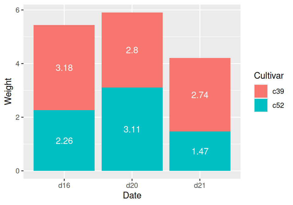
Figure 3.26: Labels in the middle of stacked bars
For a more polished graph (Figure 3.27), we’ll change the colors, add labels in the middle with a smaller font using size, add a “kg” suffix using paste, and make sure there are always two digits after the decimal point by using format():
ggplot(ce, aes(x = Date, y = Weight, fill = Cultivar)) +
  geom_col(colour = "black") +
  geom_text(aes(y = label_y, label = paste(format(Weight, nsmall = 2), "kg")), size = 4) +
  scale_fill_brewer(palette = "Pastel1")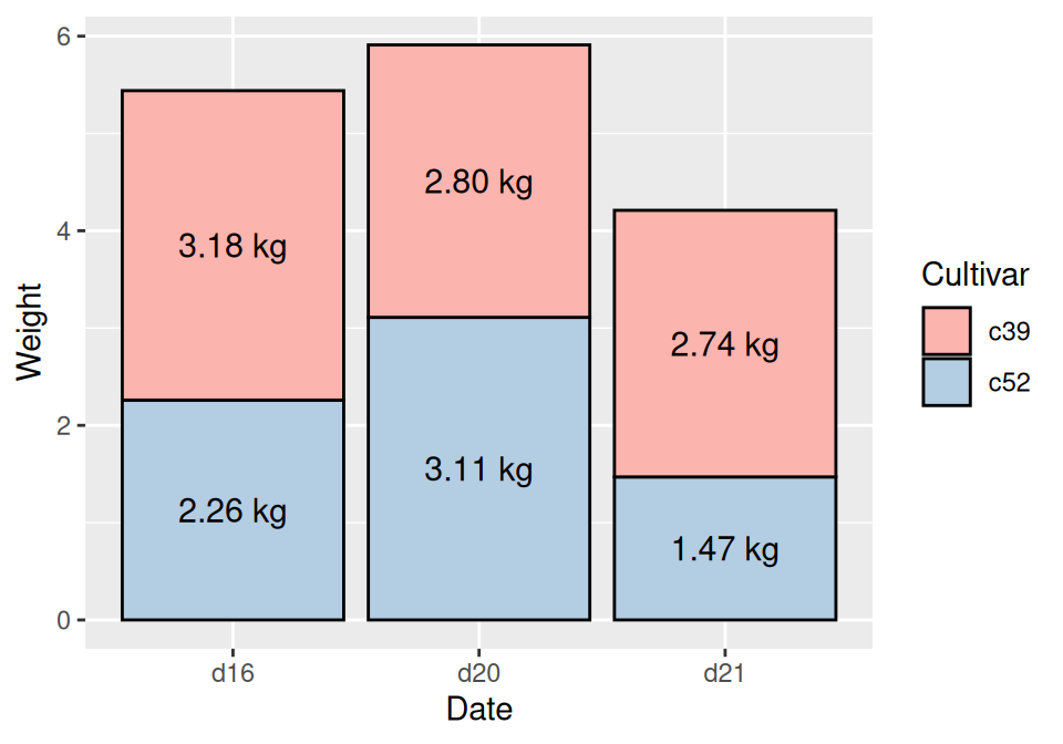
Figure 3.27: Customized stacked bar graph with labels