8.16 Making a Circular Plot
8.16.2 Solution
Use coord_polar(). For this example we’ll use the wind data set from gcookbook. It contains samples of wind speed and direction for every 5 minutes throughout a day. The direction of the wind is categorized into 15-degree bins, and the speed is categorized into 5 m/s increments:
library(gcookbook)  # Load gcookbook for the wind data set
wind
#>     TimeUTC Temp WindAvg WindMax WindDir SpeedCat DirCat
#> 3         0 3.54    9.52   10.39      89    10-15     90
#> 4         5 3.52    9.10    9.90      92     5-10     90
#> 5        10 3.53    8.73    9.51      92     5-10     90
#>  ...<280 more rows>...
#> 286    2335 6.74   18.98   23.81     250      >20    255
#> 287    2340 6.62   17.68   22.05     252      >20    255
#> 288    2345 6.22   18.54   23.91     259      >20    255
We’ll plot a count of the number of samples at each SpeedCat and DirCat using geom_histogram() (Figure 8.33). We’ll set binwidth to 15 and make the origin of the histogram start at –7.5, so that each bin is centered around 0, 15, 30, etc.:
ggplot(wind, aes(x = DirCat, fill = SpeedCat)) +
  geom_histogram(binwidth = 15, boundary = -7.5) +
  coord_polar() +
  scale_x_continuous(limits = c(0,360))
#> Warning: Removed 8 rows containing missing values or values outside the scale range
#> (`geom_bar()`).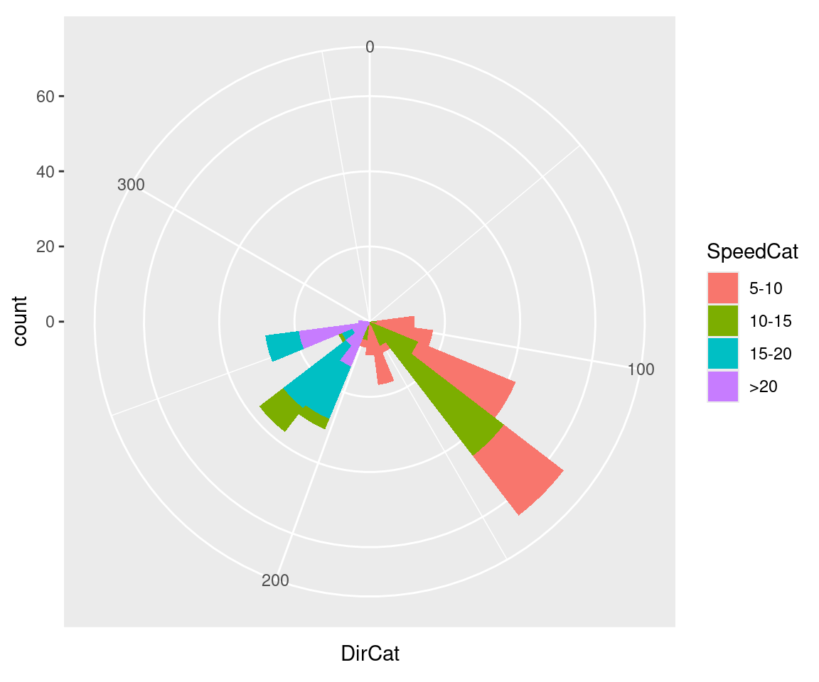
Figure 8.33: Polar plot
8.16.3 Discussion
Be cautious when using polar plots, since they can perceptually distort the data. In the example here, at 210 degrees there are 15 observations with a speed of 15–20 and 13 observations with a speed of >20, but a quick glance at the picture makes it appear that there are more observations at >20. There are also three observations with a speed of 10–15, but they’re barely visible.
In this example we can make the plot a little prettier by reversing the legend, using a different palette, adding an outline, and setting the breaks to some more familiar numbers (Figure 8.34):
ggplot(wind, aes(x = DirCat, fill = SpeedCat)) +
  geom_histogram(binwidth = 15, boundary = -7.5, colour = "black", size = .25) +
  guides(fill = guide_legend(reverse = TRUE)) +
  coord_polar() +
  scale_x_continuous(limits = c(0,360),
                     breaks = seq(0, 360, by = 45),
                     minor_breaks = seq(0, 360, by = 15)) +
  scale_fill_brewer()
#> Warning in geom_histogram(binwidth = 15, boundary = -7.5, colour = "black",
#> : Ignoring unknown parameters: `size`
#> Warning: Removed 8 rows containing missing values or values outside the scale range
#> (`geom_bar()`).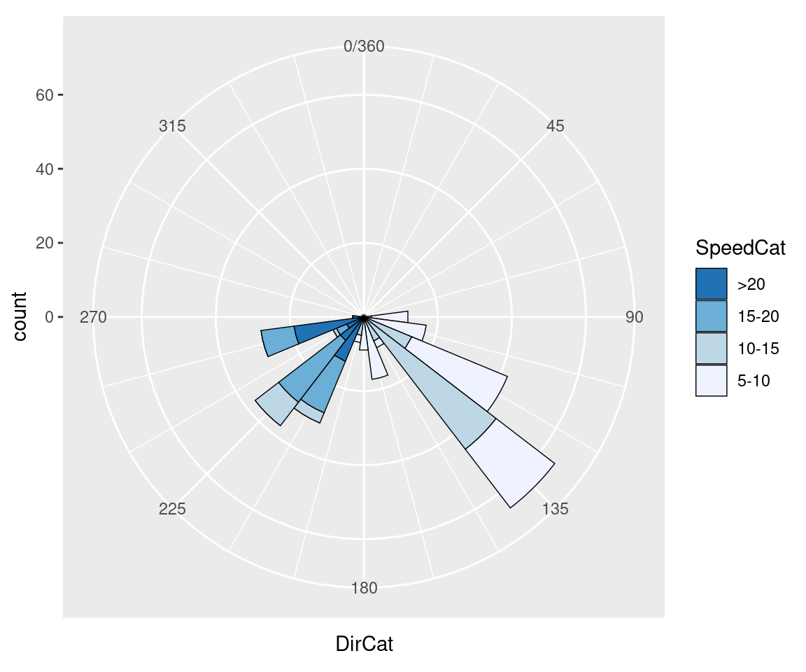
Figure 8.34: Polar plot with different colors and breaks
It may also be useful to set the starting angle with the start argument, especially when using a discrete variable for theta. The starting angle is specified in radians, so if you know the adjustment in degrees, you’ll have to convert it to radians:
Polar coordinates can be used with other geoms, including lines and points. There are a few important things to keep in mind when using these geoms. First, by default, for the variable that is mapped to y (or r), the smallest actual value gets mapped to the center; in other words, the smallest data value gets mapped to a visual radius value of 0. You may be expecting a data value of 0 to be mapped to a radius of 0, but to make sure this happens, you’ll need to set the limits.
Next, when using a continuous x (or theta), the smallest and largest data values are merged. Sometimes this is desirable, sometimes not. To change this behavior, you’ll need to set the limits.
Finally, the theta values of the polar coordinates do not wrap around-it is presently not possible to have a geom that crosses over the starting angle (usually vertical).
I’ll illustrate these issues with an example. The following code creates a data frame from the mdeaths time series data set and produces the graph shown on the left in Figure 8.35:
# Put mdeaths time series data into a data frame
mdeaths_mod <- data.frame(
  deaths = as.numeric(mdeaths),
  month = as.numeric(cycle(mdeaths))
)

# Calculate average number of deaths in each month
library(dplyr)
mdeaths_mod <- mdeaths_mod %>%
  group_by(month) %>%
  summarise(deaths = mean(deaths))

mdeaths_mod
#> # A tibble: 12 x 2
#>   month   deaths
#>   <dbl>  <dbl>
#> 1     1 2129.833
#> 2     2 2081.333
#> 3     3 1970.500
#> 4     4 1657.333
#> 5     5 1314.167
#> 6     6 1186.833
#> 7     7 1136.667
#> 8     8 1037.667
#> ... with 4 more rows

# Create the base plot
mdeaths_plot <- ggplot(mdeaths_mod, aes(x = month, y = deaths)) +
  geom_line() +
  scale_x_continuous(breaks = 1:12)

# With coord_polar
mdeaths_plot + coord_polar()
The first problem is that the data values (ranging from about 1000 to 2100) are mapped to the radius such that the smallest data value is at radius 0. We’ll fix this by setting the y (or r) limits from 0 to the maximum data value, as shown in the graph on the right in Figure 8.35:
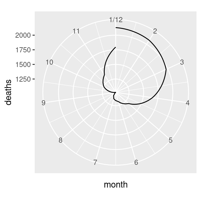
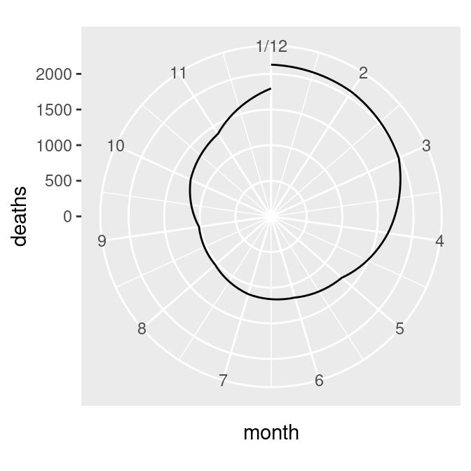
Figure 8.35: Polar plot with line (notice the data range of the radius) (left); With the radius representing a data range starting from zero (right)
The next problem is that the lowest and highest month values, 1 and 12, are shown at the same angle. We’ll fix this by setting the x limits from 0 to 12, creating the graph on the left in Figure 8.36 (notice that using xlim() overrides the scale_x_continuous() in p, so it no longer displays breaks for each month; see Recipe 8.2 for more information):
There’s one last issue, which is that the beginning and end aren’t connected. To fix that, we need to modify our data frame by adding one row with a month of 0 that has the same value as the row with month 12. This will make the starting and ending points the same, as in the graph on the right in Figure 8.36 (alternatively, we could add a row with month 13, instead of month 0):
# Connect the lines by adding a value for 0 that is the same as 12
mdeaths_x <- mdeaths_mod[mdeaths_mod$month==12, ]
mdeaths_x$month <- 0
mdeaths_new <- rbind(mdeaths_x, mdeaths_mod)

# Make the same plot as before, but with the new data, by using %+%
mdeaths_plot %+%
  mdeaths_new +
  coord_polar() +
  ylim(0, NA)
#> Warning: <ggplot> %+% x was deprecated in ggplot2 4.0.0.
#> ℹ Please use <ggplot> + x instead.
#> This warning is displayed once per session.
#> Call `lifecycle::last_lifecycle_warnings()` to see where this warning was
#> generated.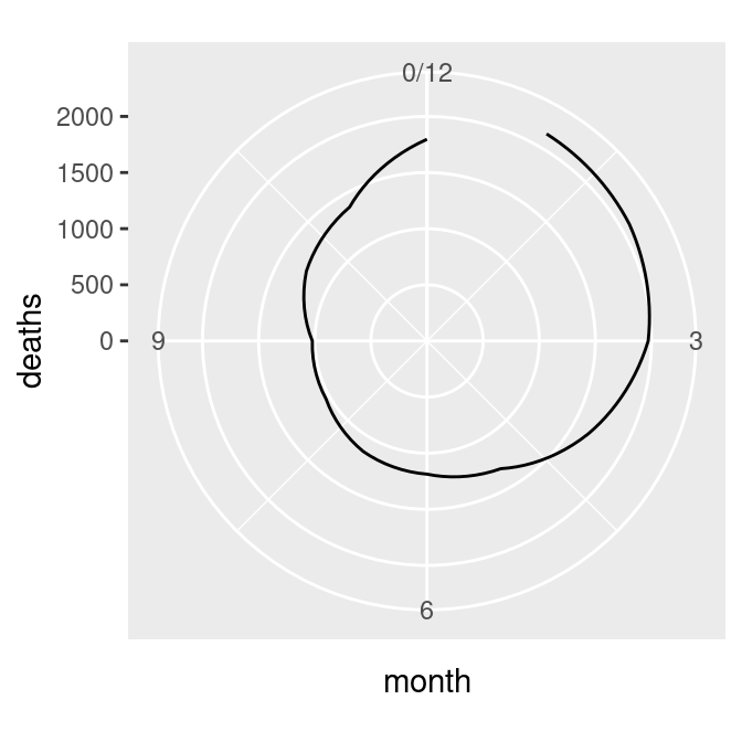
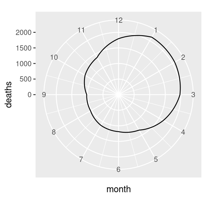
Figure 8.36: Polar plot with theta representing x values from 0 to 12 (left); The gap is filled in by adding a dummy data point for month 0 (right)
Note
Notice the use of the
%+%operator. When you add a data frame to a ggplot object with%+%, it replaces the default data frame in the ggplot object. In this case, it changed the default data frame forpfrommdtomdnew.