8.2 Setting the Range of a Continuous Axis
8.2.2 Solution
You can use xlim() or ylim() to set the minimum and maximum values of a continuous axis. Figure 8.3 shows one graph with the default y limits, and one with manually set y limits:
pg_plot <- ggplot(PlantGrowth, aes(x = group, y = weight)) +
  geom_boxplot()

# Display the basic graph
pg_plot

pg_plot +
  ylim(0, max(PlantGrowth$weight))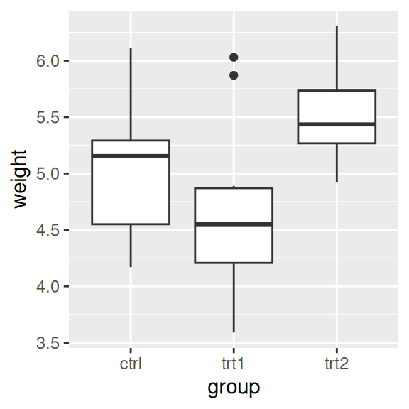

Figure 8.3: Box plot with default range (left); With manually set range (right)
The latter example sets the y range from 0 to the maximum value of the weight column, though a constant value (like 10) could instead be used as the maximum.
8.2.3 Discussion
ylim() is shorthand for setting the limits with scale_y_continuous(). (The same is true for xlim() and scale_x_continuous().) The following are equivalent:
Sometimes you will need to set other properties of scale_y_continuous(), and in these cases using xlim() and scale_y_continuous() together may result in some unexpected behavior, because only the first of the directives will have an effect. In these two examples, ylim(0, 10) should set the y range from 0 to 10, and scale_y_continuous(breaks=c(0, 5, 10)) should put tick marks at 0, 5, and 10. However, in both cases, only the second directive has any effect:
pg_plot +
  ylim(0, 10) +
  scale_y_continuous(breaks = NULL)

pg_plot +
  scale_y_continuous(breaks = NULL) +
  ylim(0, 10)
To make both changes work, get rid of ylim() and set both limits and breaks in scale_y_continuous():
In ggplot, there are two ways of setting the range of the axes. The first way is to modify the scale, and the second is to apply a coordinate transform. When you modify the limits of the x or y scale, any data outside of the limits is removed – that is, the out-of-range data is not only not displayed, it is removed from consideration entirely. (It will also print a warning when this happens.)
With the box plots in these examples, if you restrict the y range so that some of the original data is clipped, the box plot statistics will be computed based on clipped data, and the shape of the box plots will change.
With a coordinate transform, the data is not clipped; in essence, it zooms in or out to the specified range. Figure 8.4 shows the difference between the two methods:
pg_plot +
  scale_y_continuous(limits = c(5, 6.5))  # Same as using ylim()
#> Warning: Removed 13 rows containing non-finite outside the scale range
#> (`stat_boxplot()`).

pg_plot +
coord_cartesian(ylim = c(5, 6.5))Figure 8.4: Smaller y range using a scale (data has been dropped, so the box plots have changed shape; left); “Zooming in” using a coordinate transform (right)
Finally, it’s also possible to expand the range in one direction, using expand_limits() (Figure 8.5). You can’t use this to shrink the range, however:
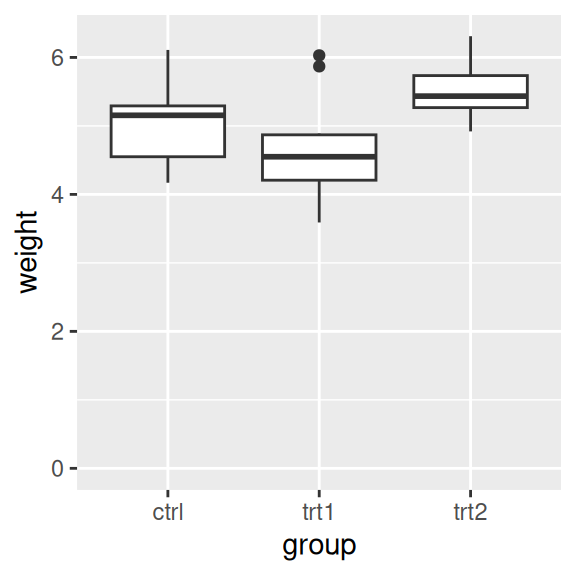
Figure 8.5: Box plot on which y range has been expanded to include 0