5.6 Adding Fitted Regression Model Lines
5.6.2 Solution
To add a linear regression line to a scatter plot, add stat_smooth() and tell it to use method = lm. This instructs ggplot to fit the data with the lm() (linear model) function. First we’ll save the base plot object in sp, then we’ll add different components to it:
library(gcookbook) # Load gcookbook for the heightweight data set

# We'll use the heightweight data set and create a base plot called `hw_sp` (for heighweight scatter plot)
hw_sp <- ggplot(heightweight, aes(x = ageYear, y = heightIn))

hw_sp +
  geom_point() +
  stat_smooth(method = lm)
By default, stat_smooth() also adds a 95% confidence region for the regression fit. The confidence interval can be changed by modifying the value for level, or it can be disabled with se = FALSE (Figure 5.18):
# 99% confidence region
hw_sp +
  geom_point() +
  stat_smooth(method = lm, level = 0.99)

# No confidence region
hw_sp +
  geom_point() +
  stat_smooth(method = lm, se = FALSE)
The default color of the fit line is blue. This can be change by setting colour. As with any other line, the attributes linetype and size can also be set. To emphasize the line, you can make the dots less prominent by changing the colour of the points (Figure 5.18, bottom right):
#> `geom_smooth()` using formula = 'y ~ x'
#> `geom_smooth()` using formula = 'y ~ x'
#> `geom_smooth()` using formula = 'y ~ x'
#> `geom_smooth()` using formula = 'y ~ x'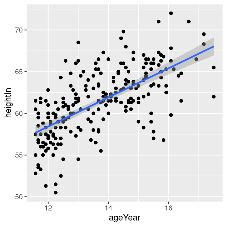
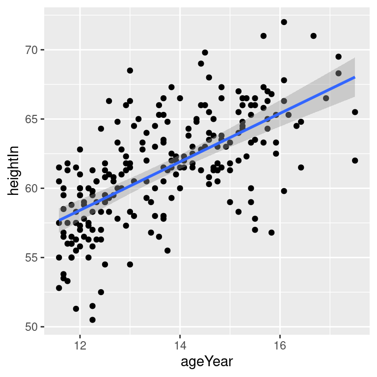
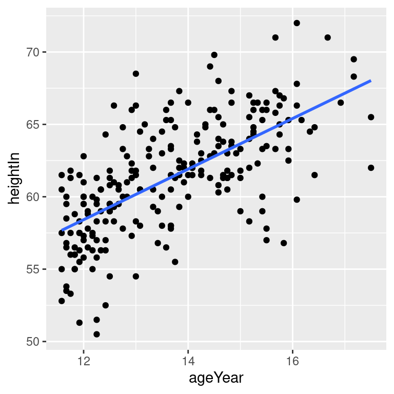
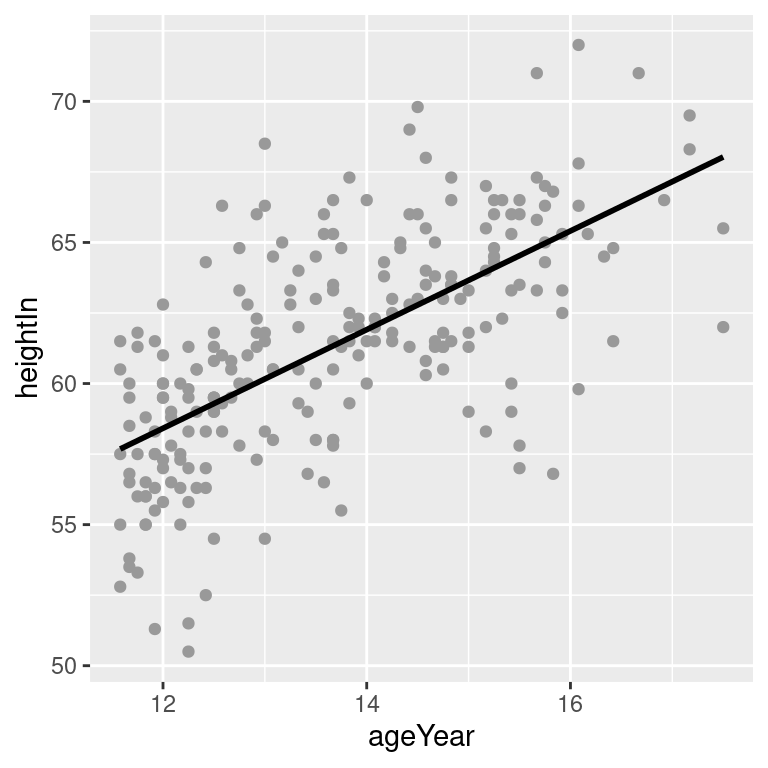
Figure 5.18: An lm fit with the default 95% confidence region (top left); A 99% confidence region (top right); No confidence region (bottom left); In black with grey points (bottom right)
5.6.3 Discussion
The linear regression line is not the only way of fitting a model to the data – in fact, it’s not even the default. If you add stat_smooth() without specifying the method, it will use a LOESS (locally weighted polynomial) curve by default, as shown in Figure 5.19:
hw_sp +
  geom_point(colour = "grey60") +
  stat_smooth()

# Equivalent to:
hw_sp +
  geom_point(colour = "grey60") +
  stat_smooth(method = loess)
#> `geom_smooth()` using formula = 'y ~ x'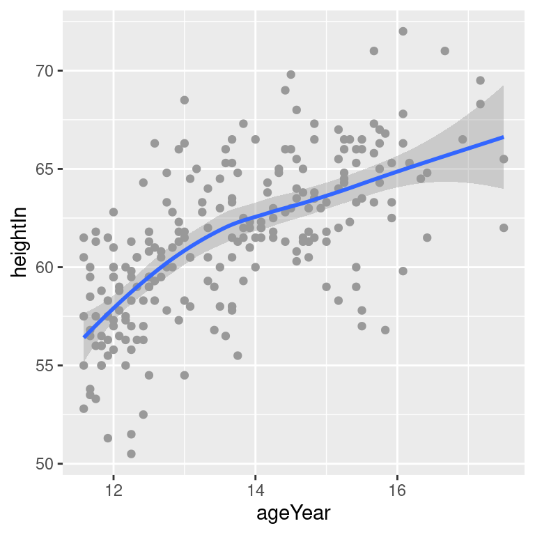
Figure 5.19: A LOESS fit
It may be useful to specify additional parameters for the modeling function, which in this case is loess(). If, for example, you wanted to use loess(degree = 1), you would call stat_smooth(method = loess, method.args = list(degree = 1)). The same could be done for other modeling functions like lm() or glm().
Another common type of model fit is a logistic regression. Logistic regression isn’t appropriate for heightweight, but it’s perfect for the biopsy data set in the MASS package. In the biopsy data, there are nine different measured attributes of breast cancer biopsies, as well as the class of the tumor, which is either benign or malignant. To prepare the data for logistic regression, we must convert the factor class, with the levels benign and malignant, to a vector with numeric values of 0 and 1. We’ll make a copy of the biopsy data frame called biopsy_mod, then store the numeric coded class in a column called classn:
library(MASS) # Load MASS for the biopsy data set

biopsy_mod <- biopsy %>%
  mutate(classn = recode(class, benign = 0, malignant = 1))

biopsy_mod
#>          ID V1 V2 V3 V4 V5 V6 V7 V8 V9     class classn
#> 1   1000025  5  1  1  1  2  1  3  1  1    benign      0
#> 2   1002945  5  4  4  5  7 10  3  2  1    benign      0
#> 3   1015425  3  1  1  1  2  2  3  1  1    benign      0
#>  ...<693 more rows>...
#> 697  888820  5 10 10  3  7  3  8 10  2 malignant      1
#> 698  897471  4  8  6  4  3  4 10  6  1 malignant      1
#> 699  897471  4  8  8  5  4  5 10  4  1 malignant      1
Although there are many attributes we could examine, for this example we’ll just look at the relationship of V1 (clump thickness) and the class of the tumor. Because there is a large degree of overplotting, we’ll jitter the points and make them semitransparent (alpha = 0.4), hollow (shape = 21), and slightly smaller (size = 1.5). Then we’ll add a fitted logistic regression line (Figure 5.20) by telling stat_smooth() to use the glm() function with family = binomial:
ggplot(biopsy_mod, aes(x = V1, y = classn)) +
  geom_point(
    position = position_jitter(width = 0.3, height = 0.06),
    alpha = 0.4,
    shape = 21,
    size = 1.5
  ) +
  stat_smooth(method = glm, method.args = list(family = binomial))
#> `geom_smooth()` using formula = 'y ~ x'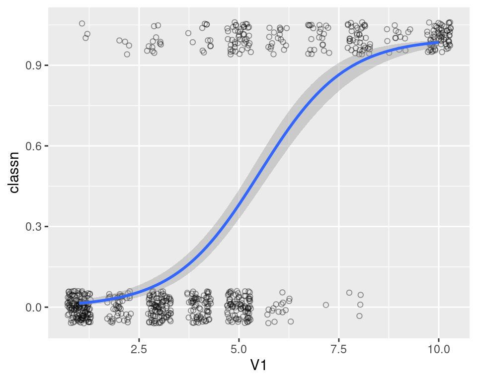
Figure 5.20: A logistic model
If your scatter plot has points grouped by a factor, and that factor is mapped to an aesthetic such as colour or shape, one fit line will be drawn for each factor level. First we’ll make the base plot object hw_sp, then we’ll add the LOESS lines to it. We’ll also make the points less prominent by making them semitransparent, using alpha = .4 (Figure 5.21):
hw_sp <- ggplot(heightweight, aes(x = ageYear, y = heightIn, colour = sex)) +
    geom_point() +
    scale_colour_brewer(palette = "Set1")

hw_sp +
  geom_smooth()
Notice that the blue line, for males, doesn’t run all the way to the right side of the plot. There are two reasons for this. The first is that by default, stat_smooth() limits the prediction to within the range of the predictor data on the x-axis. The second is that even if it extrapolates, the loess() function only offers prediction within the x range of the data.
If you want the lines to extrapolate from the data, as shown in the right-hand image of Figure 5.21, you must use a model method that allows extrapolation, like lm(), and pass stat_smooth() the option fullrange = TRUE:
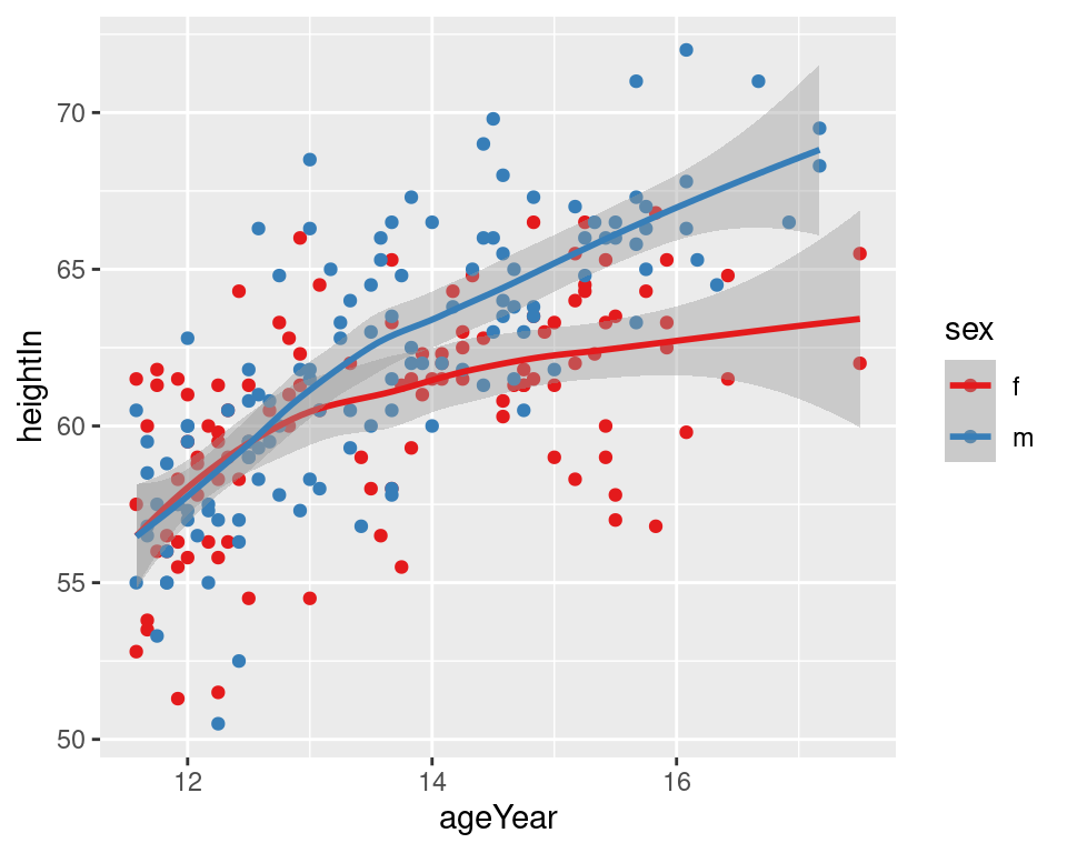
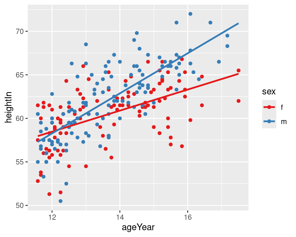
Figure 5.21: LOESS fit lines for each group (left); Extrapolated linear fit lines (right)
In this example with the heightweight data set, the default settings for stat_smooth() (with loess and no extrapolation) may make more sense than the extrapolated linear predictions, because humans don’t grow linearly and we don’t grow forever.