13.6 Creating a Heat Map
13.6.2 Solution
Use geom_tile() or geom_raster() and map a continuous variable to fill. We’ll use the presidents data set, which is a time series object rather than a data frame:
presidents
#>      Qtr1 Qtr2 Qtr3 Qtr4
#> 1945   NA   87   82   75
#> 1946   63   50   43   32
#> 1947   35   60   54   55
#>  ...
#> 1972   49   61   NA   NA
#> 1973   68   44   40   27
#> 1974   28   25   24   24
str(presidents)
#>  Time-Series [1:120] from 1945 to 1975: NA 87 82 75 63 50 43 32 35 60 ...
We’ll first convert it to a format that is usable by ggplot: a data frame with columns that are numeric:
pres_rating <- data.frame(
  rating = as.numeric(presidents),
  year = as.numeric(floor(time(presidents))),
  quarter = as.numeric(cycle(presidents))
)
pres_rating
#>     rating year quarter
#> 1       NA 1945       1
#> 2       87 1945       2
#> 3       82 1945       3
#>  ...<114 more rows>...
#> 118     25 1974       2
#> 119     24 1974       3
#> 120     24 1974       4
Now we can make the plot using geom_tile() or geom_raster() (Figure 13.12). Simply map one variable to x, one to y, and one to fill:
# Base plot
p <- ggplot(pres_rating, aes(x = year, y = quarter, fill = rating))

# Using geom_tile()
p + geom_tile()

# Using geom_raster() - looks the same, but a little more efficient
p + geom_raster()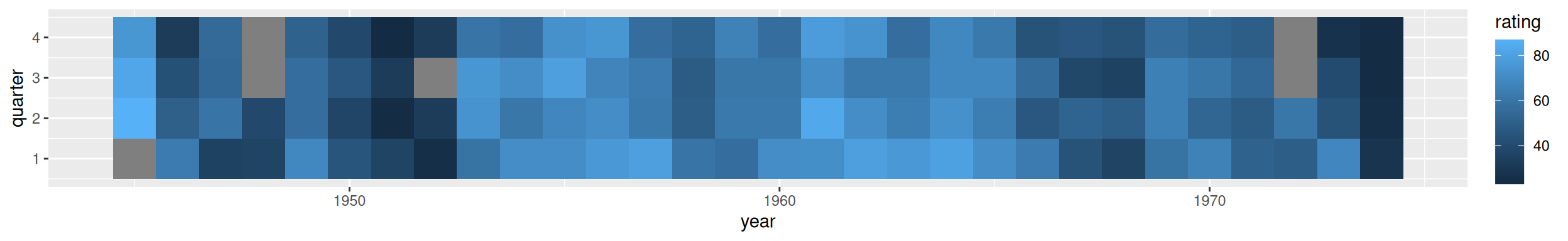
Figure 13.12: A heat map-the grey squares represent NAs in the data
Note
The results with
geom_tile()andgeom_raster()should look the same, but in practice they might appear different. See Recipe 6.12 for more information about this issue.
13.6.3 Discussion
To better convey useful information, you may want to customize the appearance of the heat map. With this example, we’ll reverse the y-axis so that it progresses from top to bottom, and we’ll add tick marks every four years along the x-axis, to correspond with each presidential term. For the x and y scales, we remove the padding by using expand=c(0, 0). We’ll also change the color scale using scale_fill_gradient2(), which lets you specify a midpoint color and the two colors at the low and high ends (Figure 13.13):
p +
  geom_tile() +
  scale_x_continuous(breaks = seq(1940, 1976, by = 4), expand = c(0, 0)) +
  scale_y_reverse(expand = c(0, 0)) +
  scale_fill_gradient2(midpoint = 50, mid = "grey70", limits = c(0, 100))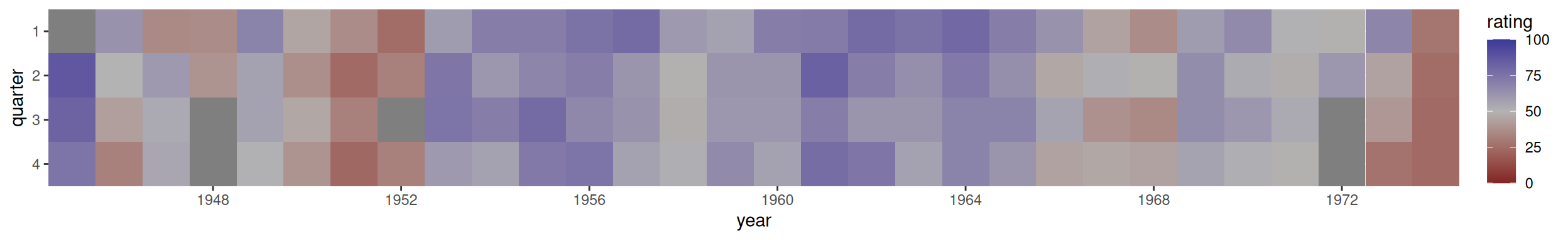
Figure 13.13: A heat map with customized appearance
13.6.4 See Also
If you want to use a different color palette, see Recipe 12.6.