2.5 Creating a Box Plot
2.5.2 Solution
To make a box plot (Figure 2.10), use plot() and pass it a factor of x values and a vector of y values. When x is a factor (as opposed to a numeric vector), it will automatically create a box plot:
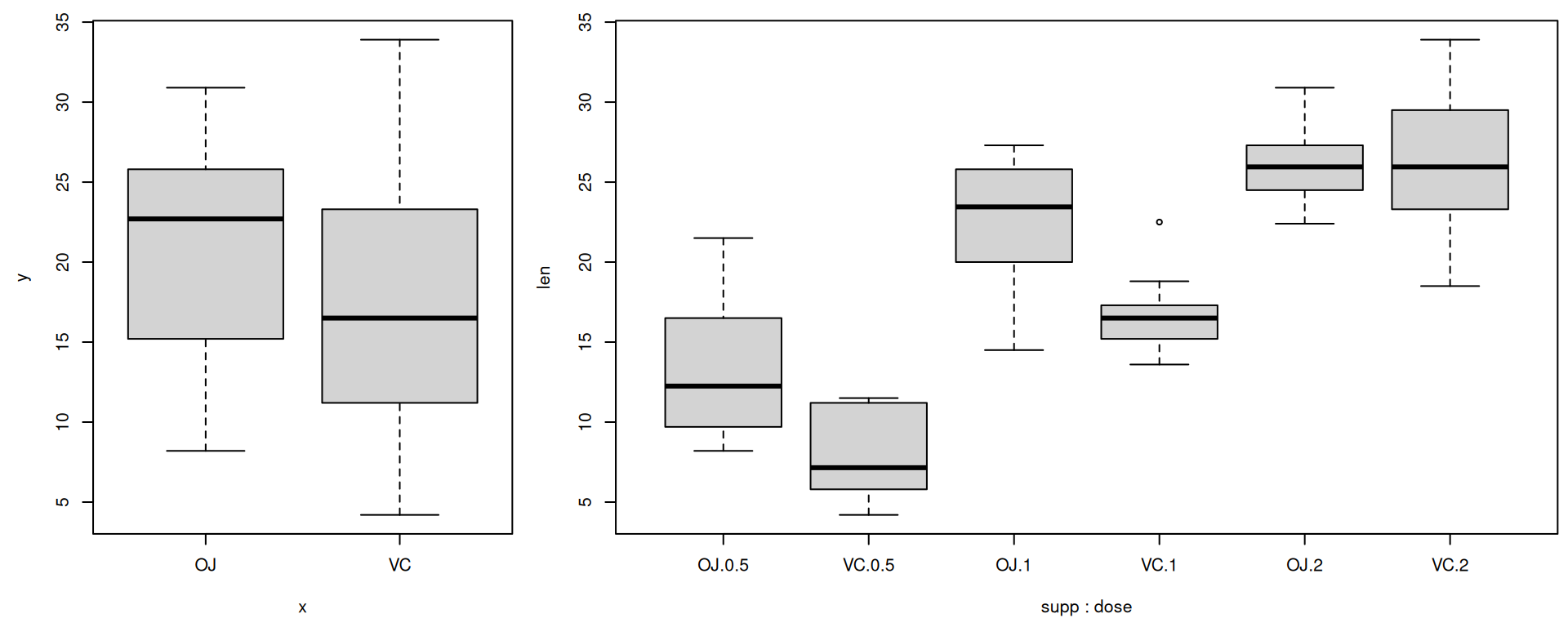
Figure 2.10: Box plot with base graphics (left); With multiple grouping variables (right)
If the two vectors are in the same data frame, you can also use the boxplot() function with formula syntax. With this syntax, you can combine two variables on the x-axis, as in Figure 2.10:
# Formula syntax
boxplot(len ~ supp, data = ToothGrowth)

# Put interaction of two variables on x-axis
boxplot(len ~ supp + dose, data = ToothGrowth)
With the ggplot2 package, you can get a similar result (Figure 2.11), with geom_boxplot():
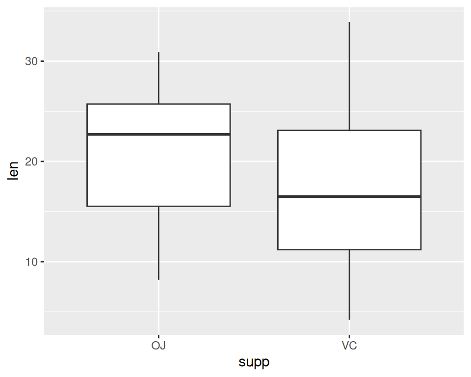
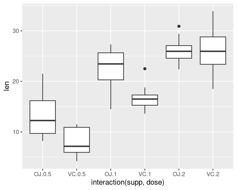
Figure 2.11: Box plot with ggplot() (left); With multiple grouping variables (right)
It’s also possible to make box plots for multiple variables, by combining the variables with interaction(), as in Figure 2.11:
Note
You may have noticed that the box plots from base graphics are ever-so-slightly different from those from ggplot2. This is because they use slightly different methods for calculating quantiles. See
?geom_boxplotand?boxplot.statsfor more information on how they differ.
2.5.3 See Also
For more on making basic box plots, see Recipe 6.6.