6.11 Making Multiple Dot Plots for Grouped Data
6.11.2 Solution
To compare multiple groups, it’s possible to stack the dots along the y-axis, and group them along the x-axis, by setting binaxis = "y". For this example, we’ll use the heightweight data set (Figure 6.31):
library(gcookbook) # Load gcookbook for the heightweight data set

ggplot(heightweight, aes(x = sex, y = heightIn)) +
  geom_dotplot(binaxis = "y", binwidth = .5, stackdir = "center")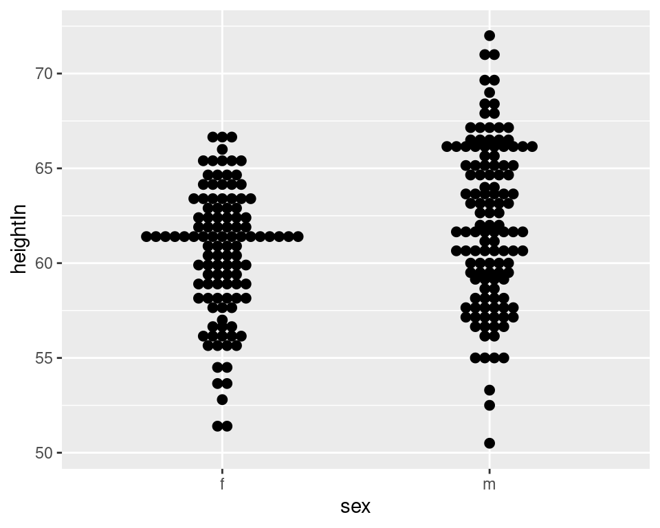
Figure 6.31: Dot plot of multiple groups, binning along the y-axis
6.11.3 Discussion
Dot plots are sometimes overlaid on box plots. In these cases, it may be helpful to make the dots hollow and have the box plots not show outliers, since the outlier points will appear to be part of the dot plot (Figure 6.32):
ggplot(heightweight, aes(x = sex, y = heightIn)) +
  geom_boxplot(outlier.colour = NA, width = .4) +
  geom_dotplot(binaxis = "y", binwidth = .5, stackdir = "center", fill = NA)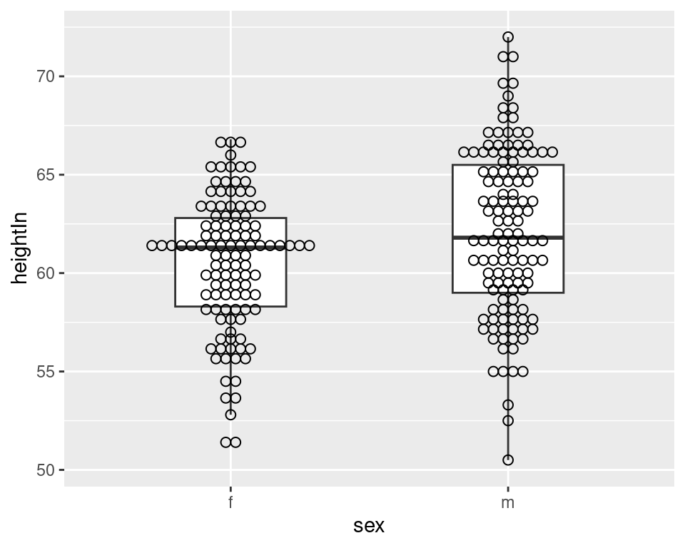
Figure 6.32: Dot plot overlaid on box plot
It’s also possible to show the dot plots next to the box plots, as shown in Figure 6.33. This requires using a bit of a hack, by treating the x variable as a numeric variable and then subtracting or adding a small quantity to shift the box plots and dot plots left and right. When the x variable is treated as numeric you must also specify the group, or else the data will be treated as a single group, with just one box plot and dot plot. Finally, since the x-axis is treated as numeric, it will by default show numbers for the x-axis tick labels; they must be modified with scale_x_continuous() to show x tick labels as text corresponding to the factor levels:
ggplot(heightweight, aes(x = sex, y = heightIn)) +
  geom_boxplot(aes(x = as.numeric(sex) + .2, group = sex), width = .25) +
  geom_dotplot(
    aes(x = as.numeric(sex) - .2, group = sex),
    binaxis = "y",
    binwidth = .5,
    stackdir = "center"
  ) +
  scale_x_continuous(
    breaks = 1:nlevels(heightweight$sex),
    labels = levels(heightweight$sex)
  )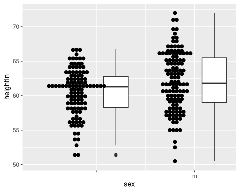
Figure 6.33: Dot plot next to box plot