6.2 Making Multiple Histograms from Grouped Data
6.2.2 Solution
Use geom_histogram() and use facets for each group, as shown in Figure 6.4:
library(MASS) # Load MASS for the birthwt data set

# Use smoke as the faceting variable
ggplot(birthwt, aes(x = bwt)) +
  geom_histogram(fill = "white", colour = "black") +
  facet_grid(smoke ~ .)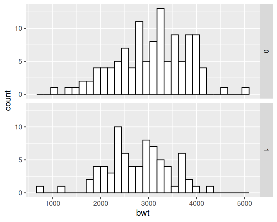
Figure 6.4: Two histograms with facets (left); With different facet labels (right)
6.2.3 Discussion
To make multiple histograms from grouped data, the data must all be in one data frame, with one column containing a categorical variable used for grouping.
For this example, we used the birthwt data set. It contains data about birth weights and a number of risk factors for low birth weight:
birthwt
#>    low age lwt race smoke ptl ht ui ftv  bwt
#> 85   0  19 182    2     0   0  0  1   0 2523
#> 86   0  33 155    3     0   0  0  0   3 2551
#> 87   0  20 105    1     1   0  0  0   1 2557
#>  ...<183 more rows>...
#> 82   1  23  94    3     1   0  0  0   0 2495
#> 83   1  17 142    2     0   0  1  0   0 2495
#> 84   1  21 130    1     1   0  1  0   3 2495
One problem with the faceted graph is that the facet labels are just 0 and 1, and there’s no label indicating that those values are for whether or not smoking is a risk factor that is present. To change the labels, we change the names of the factor levels. First we’ll take a look at the factor levels, then we’ll assign new factor level names in the same order, and save this new data set as birthwt_mod:
birthwt_mod <- birthwt
# Convert smoke to a factor and reassign new names
birthwt_mod$smoke <- recode_factor(birthwt_mod$smoke, '0' = 'No Smoke', '1' = 'Smoke')
Now when we plot our modified data frame, our desired labels appear (Figure 6.5).
ggplot(birthwt_mod, aes(x = bwt)) +
  geom_histogram(fill = "white", colour = "black") +
  facet_grid(smoke ~ .)
Figure 6.5: Histograms with new facet labels
With facets, the axes have the same y scaling in each facet. If your groups have different sizes, it might be hard to compare the shapes of the distributions of each one. For example, see what happens when we facet the birth weights by race (Figure 6.6, left):
ggplot(birthwt, aes(x = bwt)) +
  geom_histogram(fill = "white", colour = "black") +
  facet_grid(race ~ .)
To allow the y scales to be resized independently (Figure 6.6, right), use scales = "free". Note that this will only allow the y scales to be free – the x scales will still be fixed because the histograms are aligned with respect to that axis:
ggplot(birthwt, aes(x = bwt)) +
  geom_histogram(fill = "white", colour = "black") +
facet_grid(race ~ ., scales = "free")Figure 6.6: Histograms with the default fixed scales (left); With scales = “free” (right)
Another approach is to map the grouping variable to fill, as shown in Figure 6.7. The grouping variable must be a factor or a character vector. In the birthwt data set, the desired grouping variable, smoke, is stored as a number, so we’ll use the birthwt_mod data set we created above, in which smoke is a factor:
# Map smoke to fill, make the bars NOT stacked, and make them semitransparent
ggplot(birthwt_mod, aes(x = bwt, fill = smoke)) +
  geom_histogram(position = "identity", alpha = 0.4)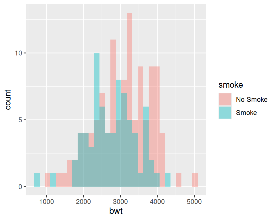
Figure 6.7: Multiple histograms with different fill colors
Specifying position = "identity" is important. Without it, ggplot will stack the histogram bars on top of each other vertically, making it much more difficult to see the distribution of each group.