3.2 Grouping Bars Together
3.2.2 Solution
Map a variable to fill, and use geom_col(position = "dodge").
In this example we’ll use the cabbage_exp data set, which has two categorical variables, Cultivar and Date, and one continuous variable, Weight:
library(gcookbook)  # Load gcookbook for the cabbage_exp data set
cabbage_exp
#>   Cultivar Date Weight        sd  n         se
#> 1      c39  d16   3.18 0.9566144 10 0.30250803
#> 2      c39  d20   2.80 0.2788867 10 0.08819171
#> 3      c39  d21   2.74 0.9834181 10 0.31098410
#> 4      c52  d16   2.26 0.4452215 10 0.14079141
#> 5      c52  d20   3.11 0.7908505 10 0.25008887
#> 6      c52  d21   1.47 0.2110819 10 0.06674995
We’ll map Date to the x position and map Cultivar to the fill color (Figure 3.4):
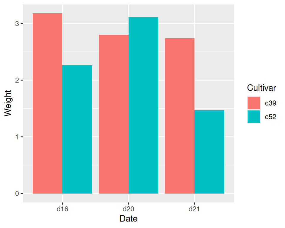
Figure 3.4: Graph with grouped bars
3.2.3 Discussion
The most basic bar graphs have one categorical variable on the x-axis and one continuous variable on the y-axis. Sometimes you’ll want to use another categorical variable to divide up the data, in addition to the variable on the x-axis. You can produce a grouped bar plot by mapping that variable to fill, which represents the fill color of the bars. You must also use position = "dodge", which tells the bars to “dodge” each other horizontally; if you don’t, you’ll end up with a stacked bar plot (Recipe 3.7).
As with variables mapped to the x-axis of a bar graph, variables that are mapped to the fill color of bars must be categorical rather than continuous variables.
To add a black outline, use colour = "black" inside geom_col(). To set the colors, you can use scale_fill_brewer() or scale_fill_manual(). In Figure 3.5 we’ll use the Pastel1 palette from RColorBrewer:
ggplot(cabbage_exp, aes(x = Date, y = Weight, fill = Cultivar)) +
  geom_col(position = "dodge", colour = "black") +
  scale_fill_brewer(palette = "Pastel1")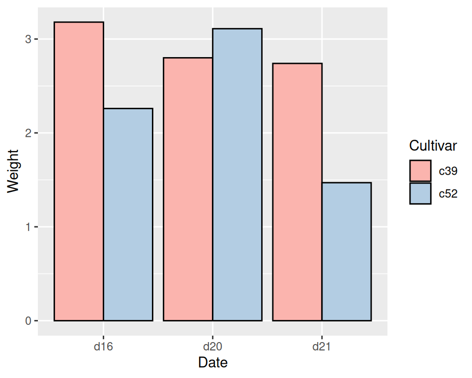
Figure 3.5: Grouped bars with black outline and a different color palette
Other aesthetics, such as colour (the color of the outlines of the bars) or linestyle, can also be used for grouping variables, but fill is probably what you’ll want to use.
Note that if there are any missing combinations of the categorical variables, that bar will be missing, and the neighboring bars will expand to fill that space. If we remove the last row from our example data frame, we get Figure 3.6:
ce <- cabbage_exp[1:5, ]
ce
#>   Cultivar Date Weight        sd  n         se
#> 1      c39  d16   3.18 0.9566144 10 0.30250803
#> 2      c39  d20   2.80 0.2788867 10 0.08819171
#> 3      c39  d21   2.74 0.9834181 10 0.31098410
#> 4      c52  d16   2.26 0.4452215 10 0.14079141
#> 5      c52  d20   3.11 0.7908505 10 0.25008887

ggplot(ce, aes(x = Date, y = Weight, fill = Cultivar)) +
  geom_col(position = "dodge", colour = "black") +
  scale_fill_brewer(palette = "Pastel1")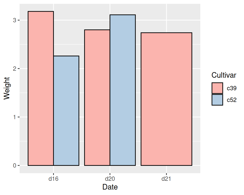
Figure 3.6: Graph with a missing bar-the other bar fills the space
If your data has this issue, you can manually make an entry for the missing factor level combination with an NA for the y variable.