A.1 Background
In a data graphic, there is a mapping (or correspondence) from properties of the data to visual properties in the graphic. The data properties are typically numerical or categorical values, while the visual properties include the x and y positions of points, colors of lines, heights of bars, and so on. A data visualization that didn’t map the data to visual properties wouldn’t be a data visualization. On the surface, representing a number with an x coordinate may seem very different from representing a number with a color of a point, but at an abstract level, they are the same. Everyone who has made data graphics has at least an implicit understanding of this. For most of us, that’s where our understanding remains.
In the grammar of graphics, this deep similarity is not just recognized, but made central. In R’s base graphics functions, each mapping of data properties to visual properties is its own special case, and changing the mappings may require restructuring your data, issuing completely different plotting commands, or both.
To illustrate, I’ll show a graph made from the simpledat data set from the gcookbook package:
# Install gcookbook if you don't already have it installed.
# install.packages("gcookbook")

library(gcookbook)  # Load gcookbook for the simpledat data set
simpledat
#>    A1 A2 A3
#> B1 10  7 12
#> B2  9 11  6
The following will make a simple grouped bar plot, with the As going along the x-axis and the bars grouped by the Bs (Figure A.1):
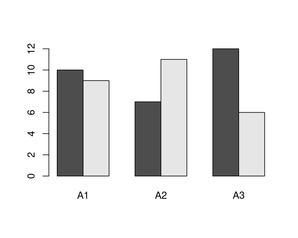
Figure A.1: A bar plot made with barplot()
One thing we might want to do is switch things up so the Bs go along the x-axis and the As are used for grouping. To do this, we need to restructure the data by transposing the matrix:
With the restructured data, we can create the plot the same way as before (Figure A.2):
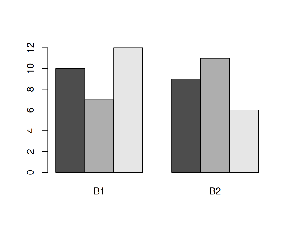
Figure A.2: A bar plot with transposed data
Another thing we might want to do is to represent the data with lines instead of bars, as shown in Figure A.3. To do this with base graphics, we need to use a completely different set of commands. First we call plot(), which tells R to create a new plot and draw a line for one row of data. Then we tell it to draw a second row with lines():
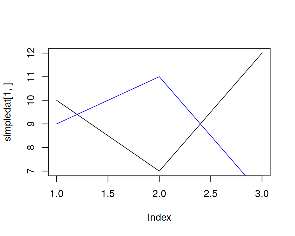
Figure A.3: A line graph made with plot() and lines()
The resulting plot has a few quirks. The second (blue) line runs below the visible range, because the y range was set only for the first line, when the plot() function was called. Additionally, the x-axis is numbered instead of categorical.
Now let’s take a look at the corresponding code and plots with ggplot2. With ggplot2, the structure of the data is always the same: it requires a data frame in “long” format, as opposed to the “wide” format used previously. When the data is in long format, each row represents one item. Instead of having their groups determined by their positions in the matrix, the items have their groups specified in a separate column. Here is simpledat, converted to long format:
simpledat_long
#>   Aval Bval value
#> 1   A1   B1    10
#> 2   A1   B2     9
#> 3   A2   B1     7
#> 4   A2   B2    11
#> 5   A3   B1    12
#> 6   A3   B2     6
This represents the same information, but with a different structure. Another term for it is tidy data, where each row represents one observation. There are advantages and disadvantages to this format, but on the whole, it makes things simpler when dealing with complicated data sets. See Recipes Recipe 15.19 and Recipe 15.20 for information about converting between wide and long data formats.
To make the first grouped bar plot (Figure A.4), we first have to load the ggplot2 package. Then we tell it to map Aval to the x position, with x = Aval, and Bval to the fill color, with fill = Bval. This will make the As run along the x-axis and the Bs determine the grouping. We also tell it to map value to the y position, or height, of the bars, with y = value. Finally, we tell it to draw bars with geom_col() (don’t worry about the other details yet; we’ll get to those later):
library(ggplot2)
ggplot(simpledat_long, aes(x = Aval, y = value, fill = Bval)) +
    geom_col(position = "dodge")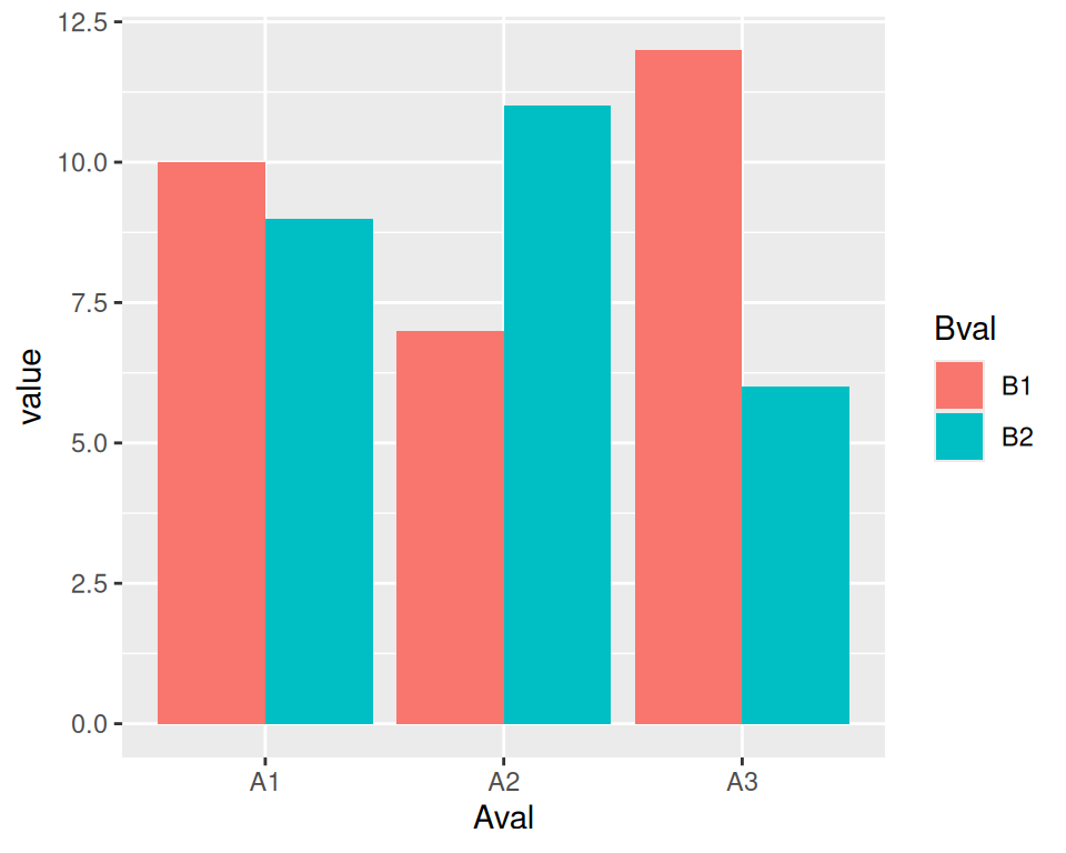
Figure A.4: A bar graph made with ggplot() and geom_col()
To switch things so that the Bs go along the x-axis and the As determine the grouping (Figure A.5), we simply swap the mapping specification, with x = Bval and fill = Aval. Unlike with base graphics, we don’t have to change the data; we just change the commands for making the plot:
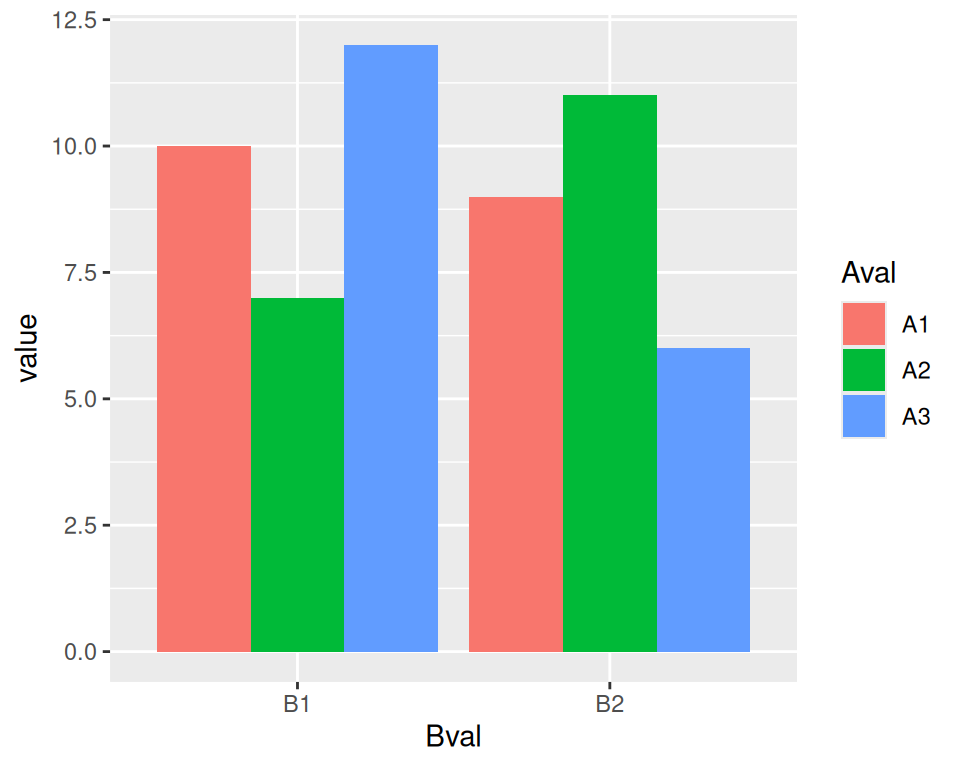
Figure A.5: Bar plot of the same data, but with x and fill mappings switched
Note
You may have noticed that with ggplot2, components of the plot are combined with the
+operator. You can gradually build up a ggplot object by adding components to it. Then, when you’re all done, you can tell it to print.
To change it to a line plot (Figure A.6), we’ll change geom_col() to geom_line(). We’ll also map Bval to the line color, with colour, instead of the fill colour (note the British spelling – the author of ggplot2 is a Kiwi). Again, don’t worry about the other details yet:
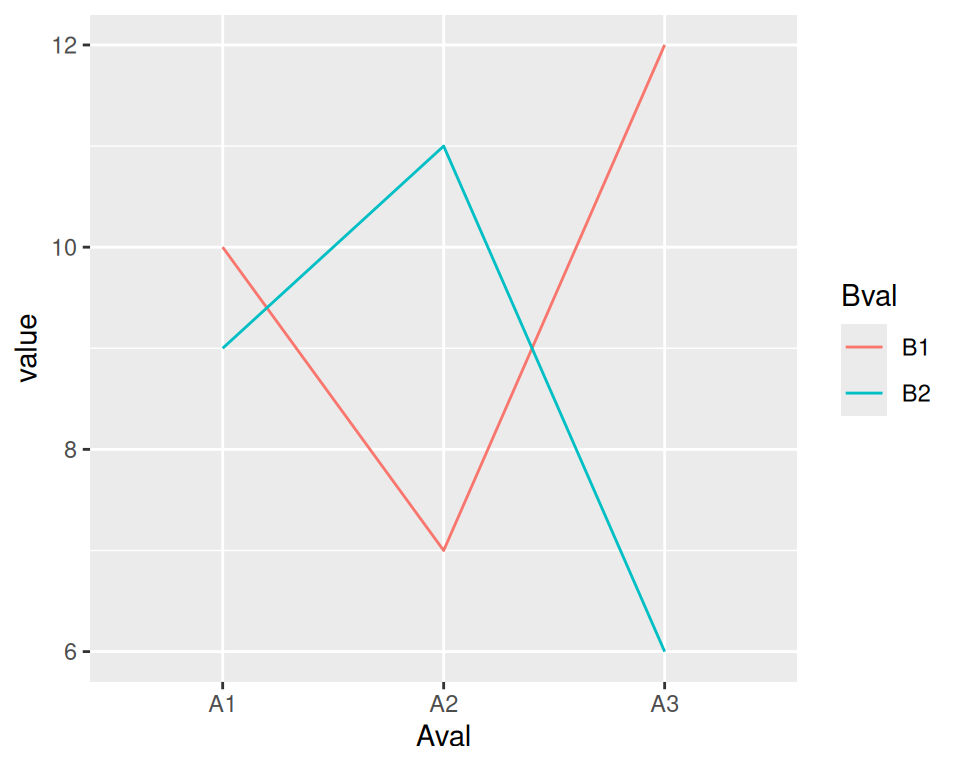
Figure A.6: A line graph made with ggplot() and geom_line()
With base graphics, we had to use completely different commands to make a line plot instead of a bar plot With ggplot2, we just changed the geom from bars to lines. The resulting plot also has important differences from the base graphics version: the y range is automatically adjusted to fit all the data because all the lines are drawn together instead of one at a time, and the x-axis remains categorical instead of being converted to a numeric axis. The ggplot2 plots also have automatically-generated legends.