13.7 Creating a Three-Dimensional Scatter Plot
13.7.2 Solution
We’ll use the rgl package, which provides an interface to the OpenGL graphics library for 3D graphics. To create a 3D scatter plot, as in Figure 13.14, use plot3d() and pass in a data frame where the first three columns represent x, y, and z coordinates, or pass in three vectors representing the x, y, and z coordinates.
# You may need to install first, with install.packages("rgl")
library(rgl)
plot3d(mtcars$wt, mtcars$disp, mtcars$mpg, type = "s", size = 0.75, lit = FALSE)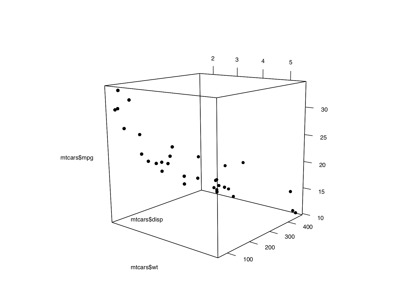
Figure 13.14: A 3D scatter plot
Note
If you are using a Mac, you will need to install XQuartz before you can use rgl. You can download it from https://www.xquartz.org/.
Viewers can rotate the image by clicking and dragging with the mouse, and zoom in and out with the scroll wheel.
Note
By default,
plot3d()uses square points, which do not appear properly when saving to a PDF. For improved appearance, the example above usestype="s"for spherical points, made them smaller withsize=0.75, and turned off the 3D lighting withlit=FALSE(otherwise they look like shiny spheres).
13.7.3 Discussion
Three-dimensional scatter plots can be difficult to interpret, so it’s often better to use a two-dimensional representation of the data. That said, there are things that can help make a 3D scatter plot easier to understand.
In Figure 13.15, we’ll add vertical segments to help give a sense of the spatial positions of the points:
# Function to interleave the elements of two vectors
interleave <- function(v1, v2)  as.vector(rbind(v1,v2))

# Plot the points
plot3d(mtcars$wt, mtcars$disp, mtcars$mpg,
       xlab = "Weight", ylab = "Displacement", zlab = "MPG",
       size = .75, type = "s", lit = FALSE)

# Add the segments
segments3d(interleave(mtcars$wt,   mtcars$wt),
           interleave(mtcars$disp, mtcars$disp),
           interleave(mtcars$mpg,  min(mtcars$mpg)),
           alpha = 0.4, col = "blue")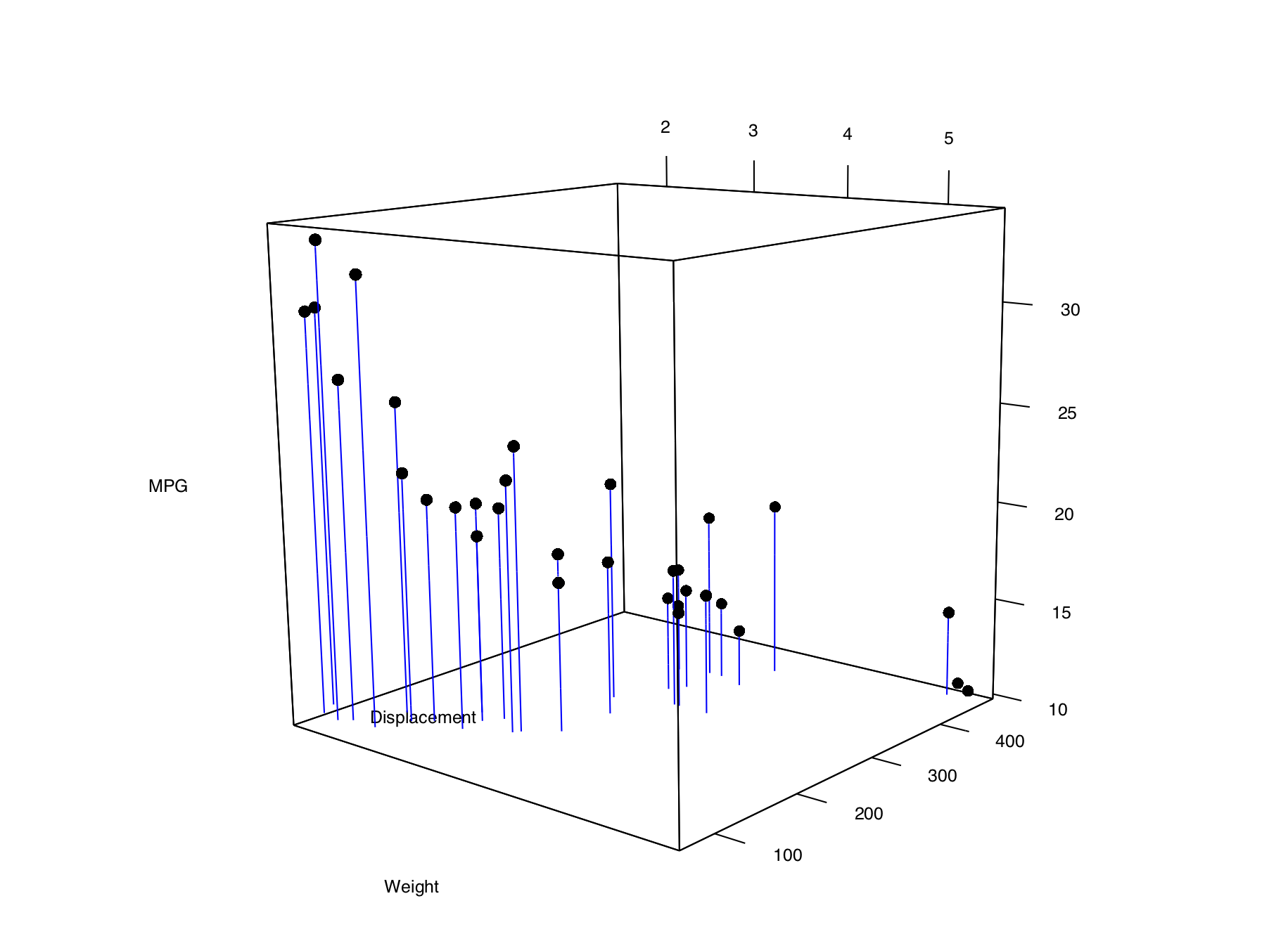
Figure 13.15: A 3D scatter plot with vertical lines for each point
It’s possible to tweak the appearance of the background and the axes. In Figure 13.16, we change the number of tick marks and add tick marks and axis labels to the specified sides:
# Make plot without axis ticks or labels
plot3d(mtcars$wt, mtcars$disp, mtcars$mpg,
       xlab = "", ylab = "", zlab = "",
       axes = FALSE,
       size = .75, type = "s", lit = FALSE)

segments3d(interleave(mtcars$wt,   mtcars$wt),
           interleave(mtcars$disp, mtcars$disp),
           interleave(mtcars$mpg,  min(mtcars$mpg)),
           alpha = 0.4, col = "blue")

# Draw the box.
rgl.bbox(color = "grey50",          # grey60 surface and black text
         emission = "grey50",       # emission color is grey50
         xlen = 0, ylen = 0, zlen = 0)  # Don't add tick marks

# Set default color of future objects to black
rgl.material(color = "black")

# Add axes to specific sides. Possible values are "x--", "x-+", "x+-", and "x++".
axes3d(edges = c("x--", "y+-", "z--"),
       ntick = 6,                       # Attempt 6 tick marks on each side
       cex = .75)                       # Smaller font

# Add axis labels. 'line' specifies how far to set the label from the axis.
mtext3d("Weight",       edge = "x--", line = 2)
mtext3d("Displacement", edge = "y+-", line = 3)
mtext3d("MPG",          edge = "z--", line = 3)
Figure 13.16: 3D scatter plot with axis ticks and labels repositioned