12.3 Using a Colorblind-Friendly Palette
12.3.1 Problem
You want to select a color palette that can also be distinguished by colorblind viewers.
12.3.2 Solution
Use the color scales in the viridis package.
The viridis package contains a set of beautiful color scales that are each designed to span as wide a palette as possible, making it easier to see differences in your data. These scales are also designed to be perceptually uniform, printable in grey scale, and easier to read by those with colorblindness.
Here is an example from the introduction page to viridis (https://cran.r-project.org/web/packages/viridis/vignettes/intro-to-viridis.html; Figure 12.4):
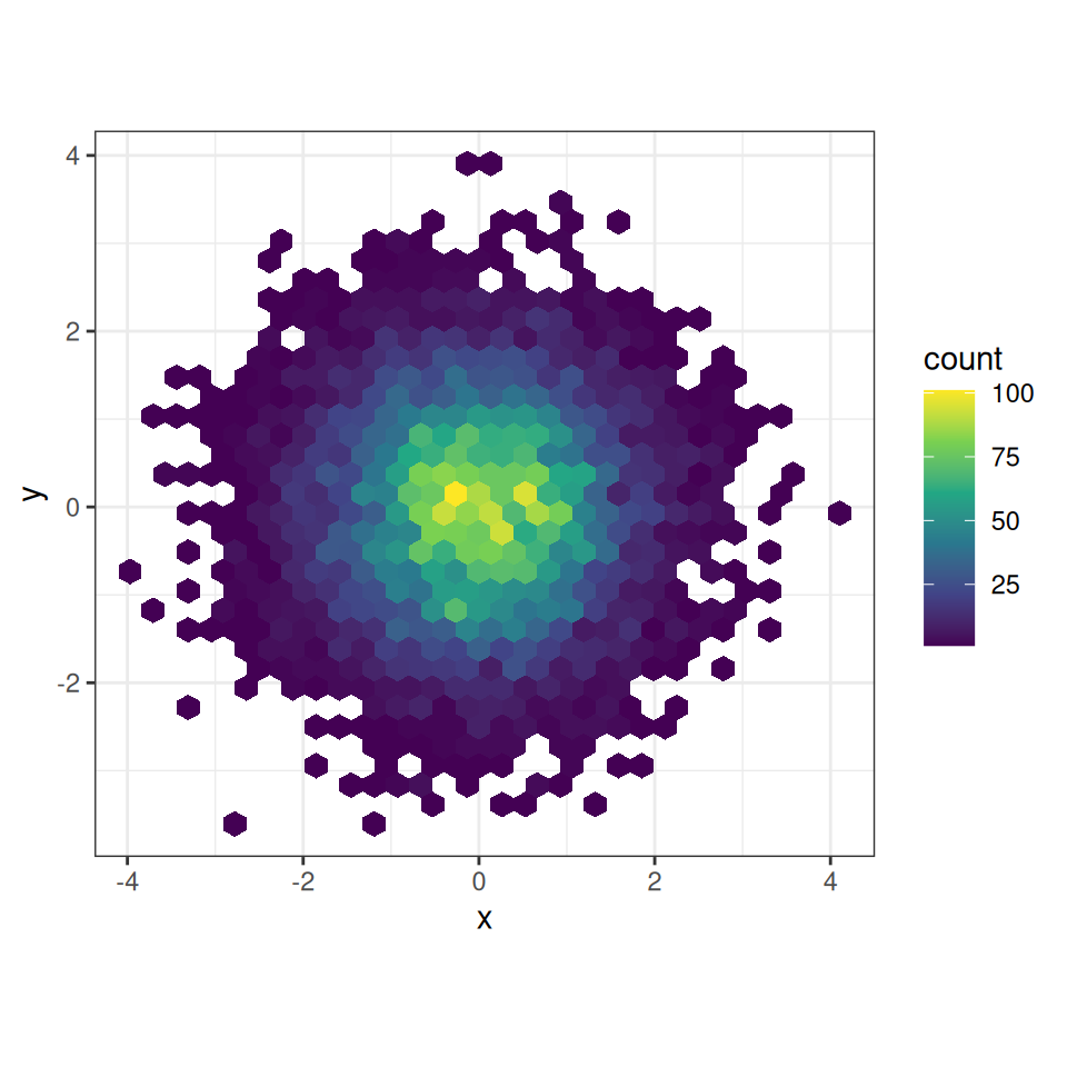
Figure 12.4: Example of viridis color palette
The viridis color scales can be implemented for data that is both continuous and discrete in nature. You will need to add scale_fill_viridis_c() to your plot if your data is continuous. If your data is discrete you will need to use scale_fill_viridis_d() instead, as in Figure 12.5 below:
library(gcookbook)  # Load gcookbook for the uspopage data set

# Create the base plot
uspopage_plot <- ggplot(uspopage, aes(x = Year, y = Thousands, fill = AgeGroup)) +
  geom_area()

# Add the viridis color scale
uspopage_plot +
  scale_fill_viridis_d()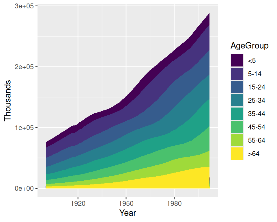
Figure 12.5: A plot with the colorblind-friendly viridis palette
12.3.3 Discussion
About 8 percent of males and 0.5 percent of females have some form of color-vision deficiency, so there’s a good chance that someone in your audience will be among them. There are many different forms of color blindness - the palettes that are mentioned in this book are designed to enable people with any of the most common forms of color-vision deficiency to distinguish the colors. (Monochromacy, or total colorblindness, is rare. Those who have it can only see differences in brightness.)
The viridis color scales come with the current version of ggplot2 (3.0.0). There are also other color palettes that are friendly to users with color blindness, such as those in cetcolor package (see below).
12.3.4 See Also
To see more on the different viridis palettes, see ?scales::viridis_pal.
The cetcolor scales: https://github.com/coatless/cetcolor.
The Color Oracle program (http://colororacle.org) can simulate how things on your screen appear to someone with color vision deficiency, but keep in mind that the simulation isn’t perfect. In my informal testing, I viewed an image with simulated red-green deficiency, and I could distinguish the colors just fine – but others with actual red-green deficiency viewed the same image and couldn’t tell the colors apart!