13.2 Plotting a Function
13.2.2 Solution
Use stat_function(). It’s also necessary to give ggplot a dummy data frame so that it will get the proper x range. In this example we’ll use dnorm(), which gives the density of the normal distribution (Figure 13.4, left):
13.2.3 Discussion
Some functions take additional arguments. For example, dt(), the function for the density of the t-distribution, takes a parameter for degrees of freedom (Figure 13.4, right). These additional arguments can be passed to the function by putting them in a list and giving the list to args:
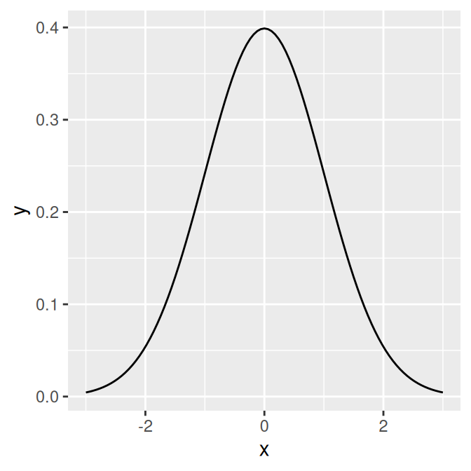
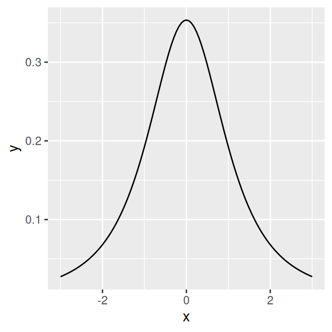
Figure 13.4: The normal distribution (left); The t-distribution with df=2 (right)
It’s also possible to define your own functions. It should take an x value for its first argument, and it should return a y value. In this example, we’ll define a sigmoid function (Figure 13.5):
myfun <- function(xvar) {
    1 / (1 + exp(-xvar + 10))
}

ggplot(data.frame(x = c(0, 20)), aes(x = x)) +
  stat_function(fun = myfun)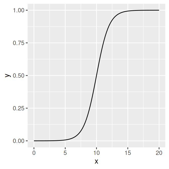
Figure 13.5: A user-defined function
By default, the function is calculated at 101 points along the x range. If you have a rapidly fluctuating function, you may be able to see the individual segments. To smooth out the curve, pass a larger value of n to stat_function(), as in stat_function(fun=myfun, n=200).
13.2.4 See Also
For plotting predicted values from model objects (such as lm and glm), see Recipe 5.7.