13.13 Creating a QQ Plot
13.13.1 Problem
You want to make a quantile-quantile (QQ) plot to compare an empirical distribution to a theoretical distribution.
13.13.2 Solution
Use geom_qq() and geom_qq_line() to compare to a normal distribution (Figure 13.25):
library(gcookbook) # For the data set

ggplot(heightweight, aes(sample = heightIn)) +
  geom_qq() +
  geom_qq_line()

ggplot(heightweight, aes(sample = ageYear)) +
  geom_qq() +
  geom_qq_line()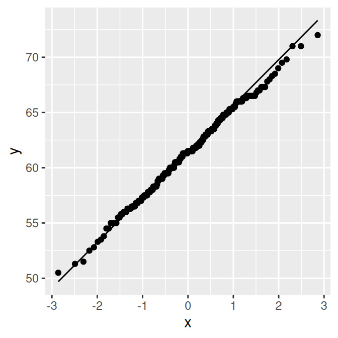
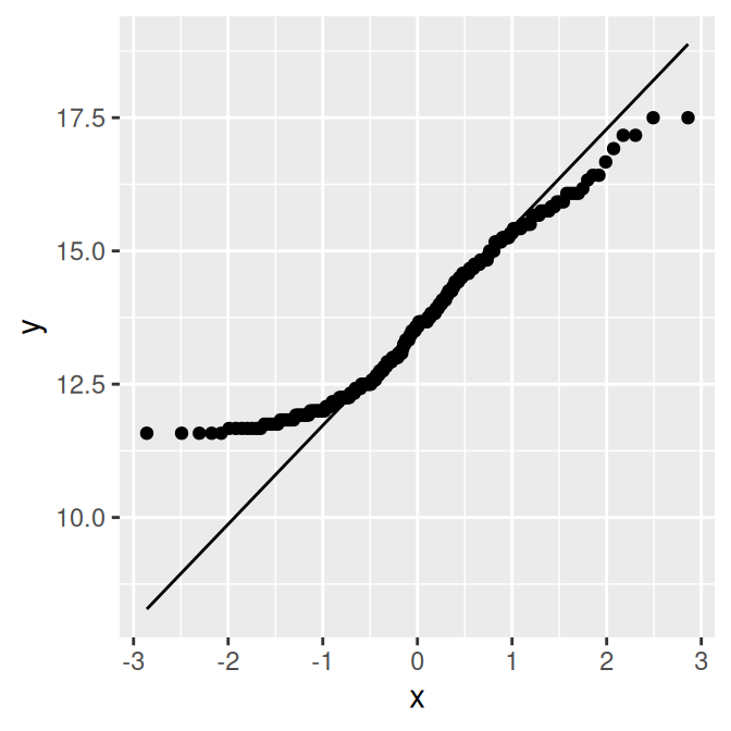
Figure 13.25: QQ plot of height, which is close to normally distributed (left); QQ plot of age, which is not normally distributed (right)
13.13.3 Discussion
The points for heightIn are close to the line, which means that the distribution is close to normal. In contrast, the points for ageYear veer far away from the line, especially on the left, indicating that the distribution is skewed. A histogram may also be useful for exploring how the data is distributed.