2.1 Creating a Scatter Plot
2.1.2 Solution
To make a scatter plot (Figure 2.1), use plot() and pass it a vector of x values followed by a vector of y values:
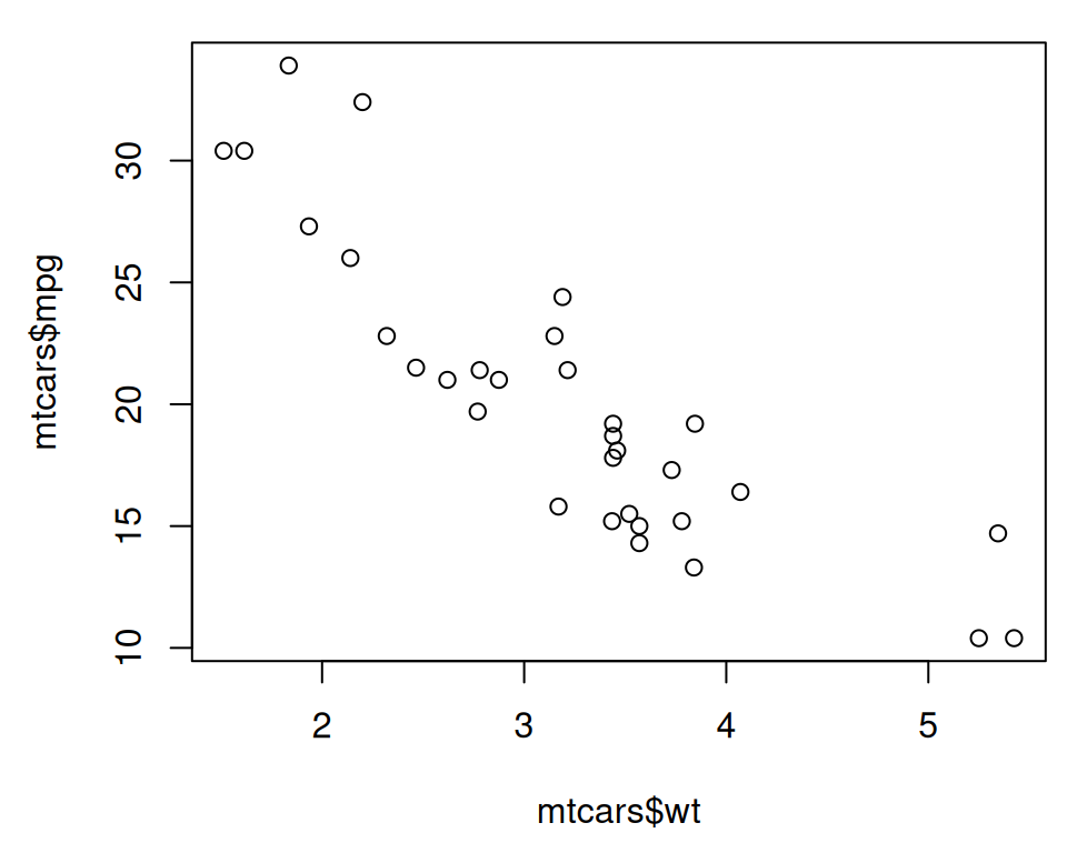
Figure 2.1: Scatter plot with base graphics
The mtcars$wt returns the column named wt from the mtcars data frame, and mtcars$mpg is the mpg column.
With ggplot2, you can get a similar result using the ggplot() function (Figure Figure 2.2):
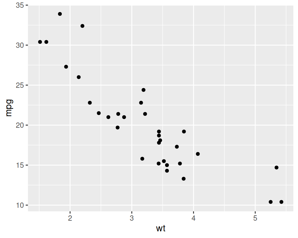
Figure 2.2: Scatter plot with ggplot2
The first part, ggplot(), tell it to create a plot object, and the second part, geom_point(), tells it to add a layer of points to the plot.
The usual way to use ggplot() is to pass it a data frame (mtcars) and then tell it which columns to use for the x and y values. If you want to pass it two vectors for x and y values, you can use data = NULL, and then pass it the vectors. Keep in mind that ggplot2 is designed to work with data frames as the data source, not individual vectors, and that using it this way will only allow you to use a limited part of its capabilities.
It is common to see ggplot() commands spread across multiple lines, so you may see the above code also written like this:
2.1.3 See Also
See Chapter 5 for more in-depth information about creating scatter plots.