13.16 Creating a Pie Chart
13.16.2 Solution
Use the pie() function. In this example (Figure 13.31), we’ll use the survey data set from the MASS library:
library(MASS) # For the data set
# Get a table of how many cases are in each level of fold
fold <- table(survey$Fold)
fold
#>
#>  L on R Neither  R on L
#>      99      18     120

# Reduce margins so there's less blank space around the plot
par(mar = c(1, 1, 1, 1))
# Make the pie chart
pie(fold)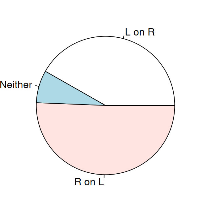
Figure 13.31: A pie chart
We passed pie() an object of class table. We could have instead given it a named vector, or a vector of values and a vector of labels like this, with the same result:
13.16.3 Discussion
The lowly pie chart is the subject of frequent abuse from data visualization experts. If you’re thinking of using a pie chart, consider whether a bar graph (or stacked bar graph) would convey the information more effectively. Despite their faults, pie charts do have one important virtue: everyone knows how to read them.