12.7 Coloring a Shaded Region Based on Value
12.7.2 Solution
Add a column that categorizes the y values, then map that column to fill. In this example, we’ll first categorize the values as positive or negative:
library(gcookbook)  # Load gcookbook for the climate data set
library(dplyr)

climate_mod <- climate %>%
  filter(Source == "Berkeley") %>%
  mutate(valence = if_else(Anomaly10y >= 0, "pos", "neg"))

climate_mod
#>       Source Year Anomaly1y Anomaly5y Anomaly10y Unc10y valence
#> 1   Berkeley 1800        NA        NA     -0.435  0.505     neg
#> 2   Berkeley 1801        NA        NA     -0.453  0.493     neg
#> 3   Berkeley 1802        NA        NA     -0.460  0.486     neg
#>  ...<199 more rows>...
#> 203 Berkeley 2002        NA        NA      0.856  0.028     pos
#> 204 Berkeley 2003        NA        NA      0.869  0.028     pos
#> 205 Berkeley 2004        NA        NA      0.884  0.029     pos
Once we’ve categorized the values as positive or negative, we can make the plot, mapping valence to the fill color, as shown in Figure 12.13:
ggplot(climate_mod, aes(x = Year, y = Anomaly10y)) +
  geom_area(aes(fill = valence)) +
  geom_line() +
  geom_hline(yintercept = 0)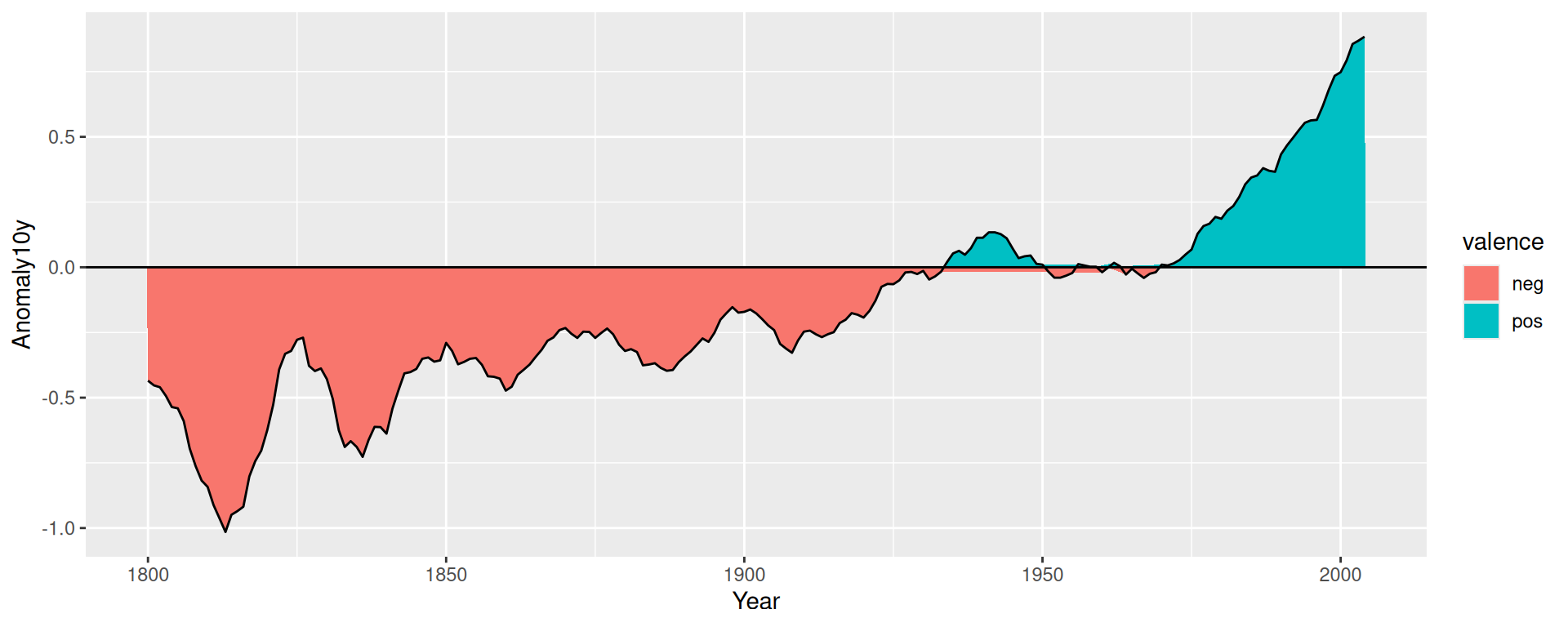
Figure 12.13: Mapping valence to fill color-notice the red area under the zero line around 1950
12.7.3 Discussion
If you look closely at the figure, you’ll notice that there are some stray shaded areas near the zero line. This is because each of the two colored areas is a single polygon bounded by the data points, and the data points are not actually at zero. To solve this problem, we can interpolate the data to 1,000 points by using approx():
# approx() returns a list with x and y vectors
interp <- approx(climate_mod$Year, climate_mod$Anomaly10y, n = 1000)

# Put in a data frame and recalculate valence
cbi <- data.frame(Year = interp$x, Anomaly10y = interp$y) %>%
  mutate(valence = if_else(Anomaly10y >= 0, "pos", "neg"))
It would be more precise (and more complicated) to interpolate exactly where the line crosses zero, but approx() works fine for the purposes here.
Now we can plot the interpolated data (Figure 12.14). This time we’ll make a few adjustments – we’ll make the shaded regions partially transparent, change the colors, remove the legend, and remove the padding on the left and right sides:
ggplot(cbi, aes(x = Year, y = Anomaly10y)) +
  geom_area(aes(fill = valence), alpha = .4) +
  geom_line() +
  geom_hline(yintercept = 0) +
  scale_fill_manual(values = c("#CCEEFF", "#FFDDDD"), guide = FALSE) +
  scale_x_continuous(expand = c(0, 0))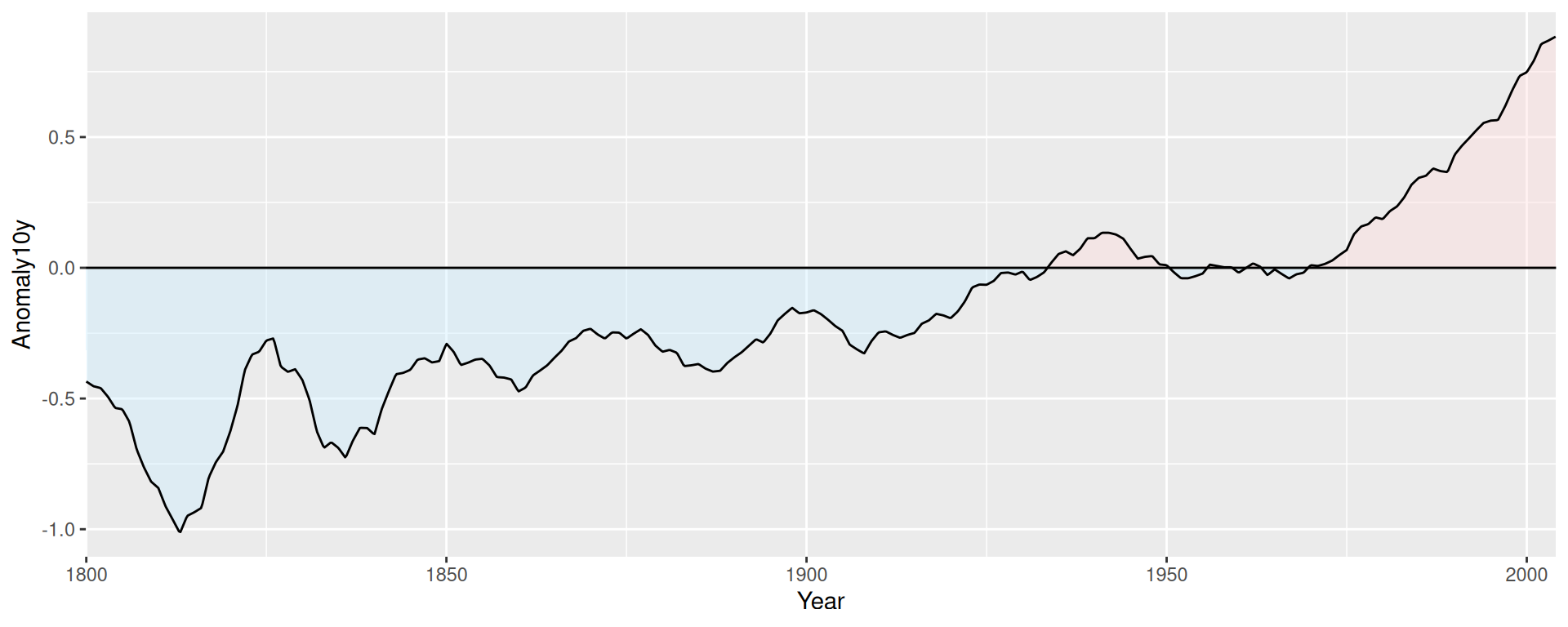
Figure 12.14: Shaded regions with interpolated data