6.4 Making Multiple Density Curves from Grouped Data
6.4.2 Solution
Use geom_density(), and map the grouping variable to an aesthetic like colour or fill, as shown in Figure 6.12. The grouping variable must be a factor or a character vector. In the birthwt data set, the desired grouping variable, smoke, is stored as a number, so we have to convert it to a factor first.
library(MASS) # Load MASS for the birthwt data set

birthwt_mod <- birthwt %>%
  mutate(smoke = as.factor(smoke)) # Convert smoke to a factor

# Map smoke to colour
ggplot(birthwt_mod, aes(x = bwt, colour = smoke)) +
  geom_density()

# Map smoke to fill and make the fill semitransparent by setting alpha
ggplot(birthwt_mod, aes(x = bwt, fill = smoke)) +
  geom_density(alpha = .3)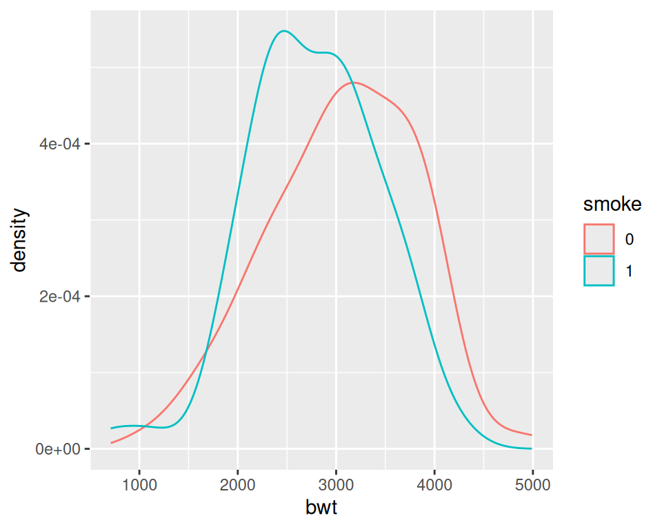
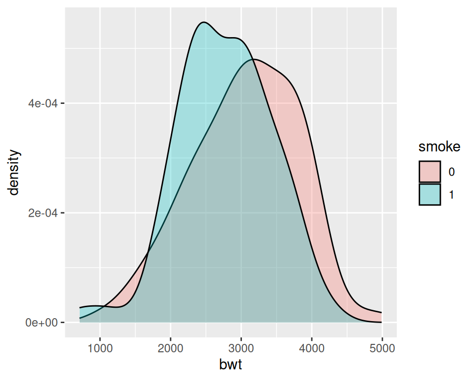
Figure 6.12: Different line colors for each group (left); Different semitransparent fill colors for each group (right)
6.4.3 Discussion
To make these plots, the data must all be in one data frame, with one column containing a categorical variable used for grouping.
For this example, we used the birthwt data set. It contains data about birth weights and a number of risk factors for low birth weight:
birthwt
#>    low age lwt race smoke ptl ht ui ftv  bwt
#> 85   0  19 182    2     0   0  0  1   0 2523
#> 86   0  33 155    3     0   0  0  0   3 2551
#> 87   0  20 105    1     1   0  0  0   1 2557
#>  ...<183 more rows>...
#> 82   1  23  94    3     1   0  0  0   0 2495
#> 83   1  17 142    2     0   0  1  0   0 2495
#> 84   1  21 130    1     1   0  1  0   3 2495
We looked at the relationship between smoke (smoking) and bwt (birth weight in grams). The value of smoke is either 0 or 1, but since it’s stored as a numeric vector, ggplot doesn’t know that it should be treated as a categorical variable. To make it so ggplot knows to treat smoke as categorical, we can either convert that column of the data frame to a factor, or tell ggplot to treat it as a factor by using factor(smoke) inside of the aes() statement. For these examples, we converted smoke to a factor.
Another method for visualizing the distributions is to use facets, as shown in Figure 6.13. We can align the facets vertically or horizontally. Here we’ll align them vertically so that it’s easy to compare the two distributions:
One problem with the faceted graph is that the facet labels are just 0 and 1, and there’s no label indicating that those values are for smoke. To change the labels, we need to change the names of the factor levels. First we’ll take a look at the factor levels, then we’ll assign new factor level names:
levels(birthwt_mod$smoke)
#> [1] "0" "1"

birthwt_mod$smoke <- recode(birthwt_mod$smoke, '0' = 'No Smoke', '1' = 'Smoke')
Now when we plot our modified data frame, our desired labels appear (Figure 6.13, right):
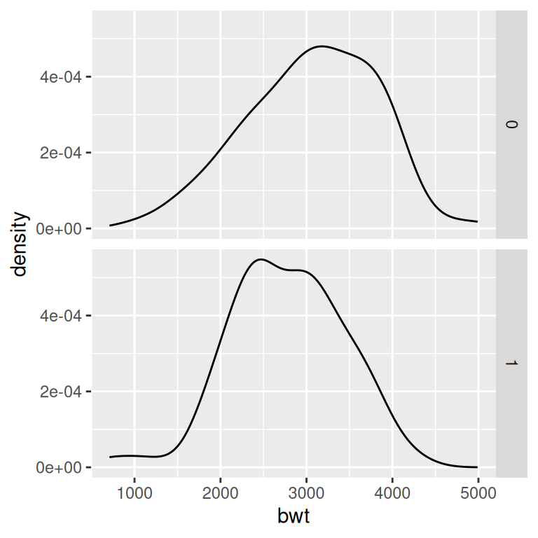
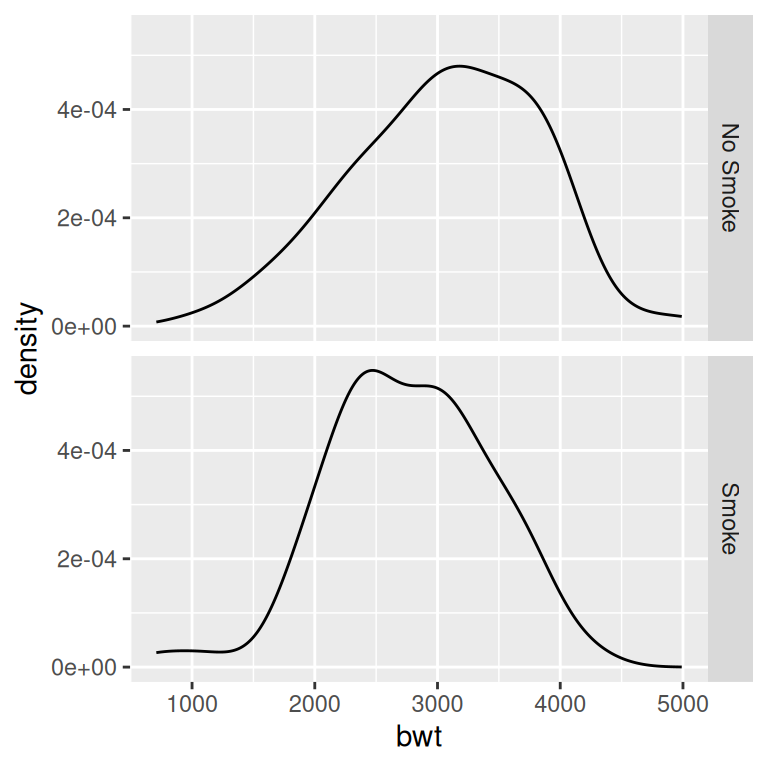
Figure 6.13: Density curves with facets (left); With different facet labels (right)
If you want to see the histograms along with the density curves, the best option is to use facets, since other methods of visualizing both histograms in a single graph can be difficult to interpret. To do this, map y = ..density.., so that the histogram is scaled down to the height of the density curves. In this example, we’ll also make the histogram bars a little less prominent by changing the colors (Figure 6.14):
ggplot(birthwt_mod, aes(x = bwt, y = ..density..)) +
  geom_histogram(binwidth = 200, fill = "cornsilk", colour = "grey60", size = .2) +
  geom_density() +
  facet_grid(smoke ~ .)
#> Warning in geom_histogram(binwidth = 200, fill = "cornsilk", colour =
#> "grey60", : Ignoring unknown parameters: `size`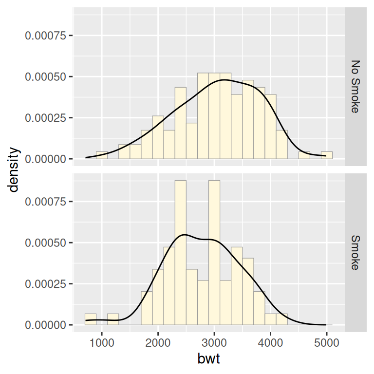
Figure 6.14: Density curves overlaid on histograms