3.8 Making a Proportional Stacked Bar Graph
3.8.1 Problem
You want to make a stacked bar graph that shows proportions (also called a 100% stacked bar graph).
3.8.2 Solution
Use geom_col(position = "fill") (Figure 3.20):
library(gcookbook) # Load gcookbook for the cabbage_exp data set

ggplot(cabbage_exp, aes(x = Date, y = Weight, fill = Cultivar)) +
  geom_col(position = "fill")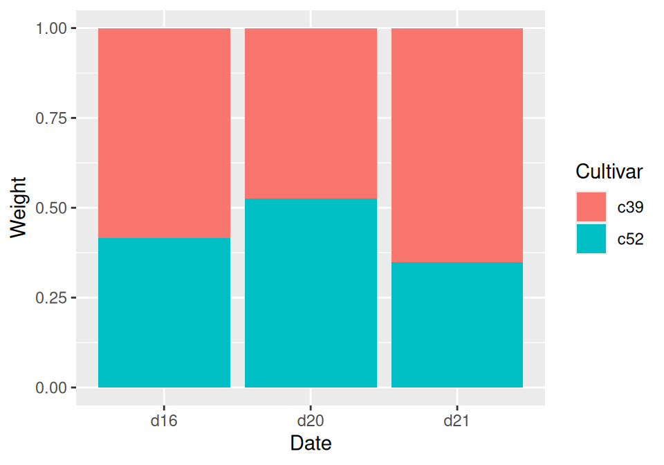
Figure 3.20: Proportional stacked bar graph
3.8.3 Discussion
With position = "fill", the y values will be scaled to go from 0 to 1. To print the labels as percentages, use scale_y_continuous(labels = scales::percent).
ggplot(cabbage_exp, aes(x = Date, y = Weight, fill = Cultivar)) +
  geom_col(position = "fill") +
  scale_y_continuous(labels = scales::percent)
Note
Using
scales::percentis a way of using thepercentfunction from the scales package. You could instead dolibrary(scales)and then just usescale_y_continuous(labels = percent). This would also make all of the functions from scales available in the current R session.
To make the output look a little nicer, you can change the color palette and add an outline. This is shown in (Figure 3.21):
ggplot(cabbage_exp, aes(x = Date, y = Weight, fill = Cultivar)) +
  geom_col(colour = "black", position = "fill") +
  scale_y_continuous(labels = scales::percent) +
  scale_fill_brewer(palette = "Pastel1")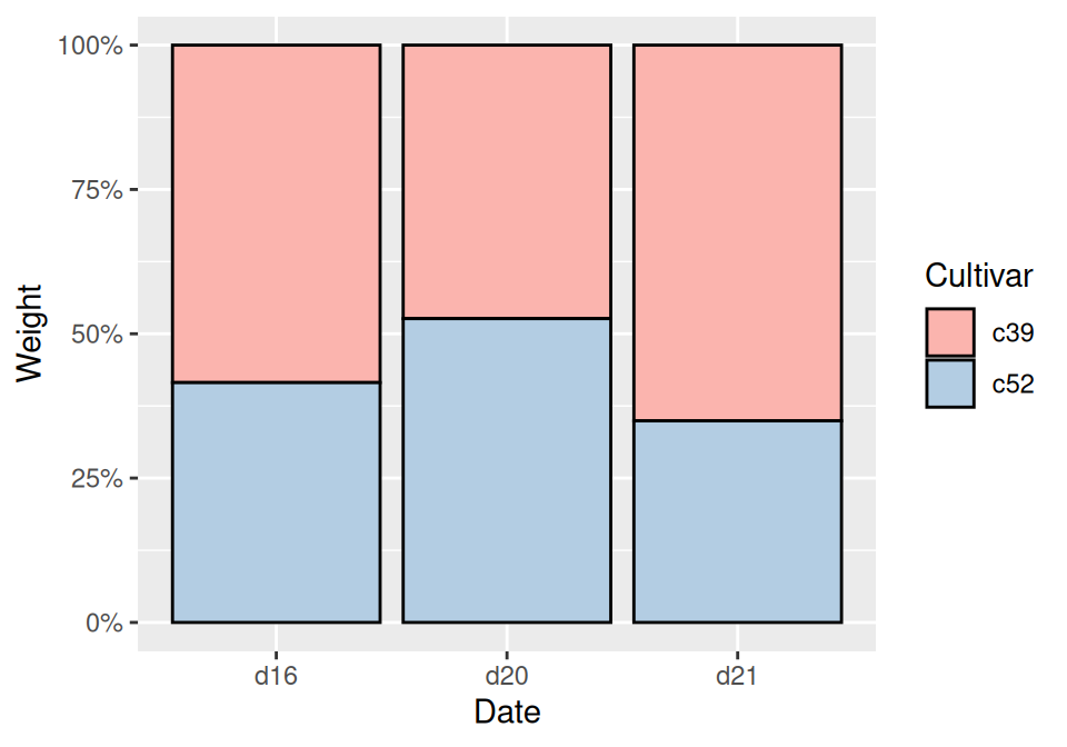
Figure 3.21: Proportional stacked bar graph with reversed legend, new palette, and black outline
Instead of having ggplot2 compute the proportions automatically, you may want to compute the proportional values yourself. This can be useful if you want to use those values in other computations.
To do this, first scale the data to 100% within each stack. This can be done by using group_by() together with mutate() from the dplyr package.
library(gcookbook)
library(dplyr)

cabbage_exp
#>   Cultivar Date Weight        sd  n         se
#> 1      c39  d16   3.18 0.9566144 10 0.30250803
#> 2      c39  d20   2.80 0.2788867 10 0.08819171
#> 3      c39  d21   2.74 0.9834181 10 0.31098410
#> 4      c52  d16   2.26 0.4452215 10 0.14079141
#> 5      c52  d20   3.11 0.7908505 10 0.25008887
#> 6      c52  d21   1.47 0.2110819 10 0.06674995

# Do a group-wise transform(), splitting on "Date"
ce <- cabbage_exp %>%
  group_by(Date) %>%
  mutate(percent_weight = Weight / sum(Weight) * 100)

ce
#> # A tibble: 6 × 7
#> # Groups:   Date [3]
#>   Cultivar Date  Weight    sd     n     se percent_weight
#>   <fct>    <fct>  <dbl> <dbl> <int>  <dbl>          <dbl>
#> 1 c39      d16     3.18 0.957    10 0.303            58.5
#> 2 c39      d20     2.8  0.279    10 0.0882           47.4
#> 3 c39      d21     2.74 0.983    10 0.311            65.1
#> 4 c52      d16     2.26 0.445    10 0.141            41.5
#> 5 c52      d20     3.11 0.791    10 0.250            52.6
#> 6 c52      d21     1.47 0.211    10 0.0667           34.9
To calculate the percentages within each Weight group, we used dplyr’s group_by() and mutate() functions. In the example here, the group_by() function tells dplyr that future operations should operate on the data frame as though it were split up into groups, on the Date column. The mutate() function tells it to calculate a new column, dividing each row’s Weight value by the sum of the Weight column within each group.
Note
You may have noticed that
cabbage_expandceprint out differently. This is becausecabbage_expis a regular data frame, whileceis a tibble, which is a data frame with some extra properties. The dplyr package creates tibbles. For more information, see Chapter 15.
After computing the new column, making the graph is the same as with a regular stacked bar graph.
3.8.4 See Also
For more on transforming data by groups, see Recipe 15.16.