5.7 Adding Fitted Lines from an Existing Model
5.7.1 Problem
You have already created a fitted regression model object for a data set, and you want to plot the lines for that model.
5.7.2 Solution
Usually the easiest way to overlay a fitted model is to simply ask stat_smooth() to do it for you, as described in Recipe 5.6. Sometimes, however, you may want to create the model yourself and then add it to your graph. This allows you to be sure that the model you’re using for other calculations is the same one that you see.
In this example, we’ll build a quadratic model using lm() with ageYear as a predictor of heightIn. Then we’ll use the predict() function and find the predicted values of heightIn across the range of values for the predictor, ageYear:
library(gcookbook) # Load gcookbook for the heightweight data set

model <- lm(heightIn ~ ageYear + I(ageYear^2), heightweight)
model
#>
#> Call:
#> lm(formula = heightIn ~ ageYear + I(ageYear^2), data = heightweight)
#>
#> Coefficients:
#>  (Intercept)       ageYear  I(ageYear^2)
#>     -10.3136        8.6673       -0.2478

# Create a data frame with ageYear column, interpolating across range
xmin <- min(heightweight$ageYear)
xmax <- max(heightweight$ageYear)
predicted <- data.frame(ageYear = seq(xmin, xmax, length.out = 100))

# Calculate predicted values of heightIn
predicted$heightIn <- predict(model, predicted)
predicted
#>     ageYear heightIn
#> 1   11.5800 56.82624
#> 2   11.6398 57.00047
#> 3   11.6996 57.17294
#>  ...<94 more rows>...
#> 98  17.3804 65.47641
#> 99  17.4402 65.47875
#> 100 17.5000 65.47933
We can now plot the data points along with the values predicted from the model (as you’ll see in Figure 5.22):
5.7.3 Discussion
Any model object (e.g. lm) can be used, so long as it has a corresponding predict() method. For example, lm has predict.lm(), loess has predict.loess(), and so on. Adding lines from a model can be simplified by using the function predictvals(), defined below. If you simply pass a model to predictvals(), the function will do the work of finding the variable names and the range of the predictor, and will return a data frame with predictor and predicted values. That data frame can then be passed to geom_line() to draw the fitted line, as we did earlier:
# Given a model, predict values of yvar from xvar
# This function supports one predictor and one predicted variable
# xrange: If NULL, determine the x range from the model object. If a vector with
#   two numbers, use those as the min and max of the prediction range.
# samples: Number of samples across the x range.
# ...: Further arguments to be passed to predict()
predictvals <- function(model, xvar, yvar, xrange = NULL, samples = 100, ...) {

  # If xrange isn't passed in, determine xrange from the models.
  # Different ways of extracting the x range, depending on model type
  if (is.null(xrange)) {
    if (any(class(model) %in% c("lm", "glm")))
      xrange <- range(model$model[[xvar]])
    else if (any(class(model) %in% "loess"))
      xrange <- range(model$x)
  }

  newdata <- data.frame(x = seq(xrange[1], xrange[2], length.out = samples))
  names(newdata) <- xvar
  newdata[[yvar]] <- predict(model, newdata = newdata, ...)
  newdata
}
With the heightweight data set, we’ll make a linear model with lm() and a LOESS model with loess() (Figure 5.22):
modlinear <- lm(heightIn ~ ageYear, heightweight)
modloess  <- loess(heightIn ~ ageYear, heightweight)
Then we can call predictvals() on each model, and pass the resulting data frames to geom_line():
lm_predicted    <- predictvals(modlinear, "ageYear", "heightIn")
loess_predicted <- predictvals(modloess, "ageYear", "heightIn")

hw_sp +
  geom_line(data = lm_predicted, colour = "red", size = .8) +
  geom_line(data = loess_predicted, colour = "blue", size = .8)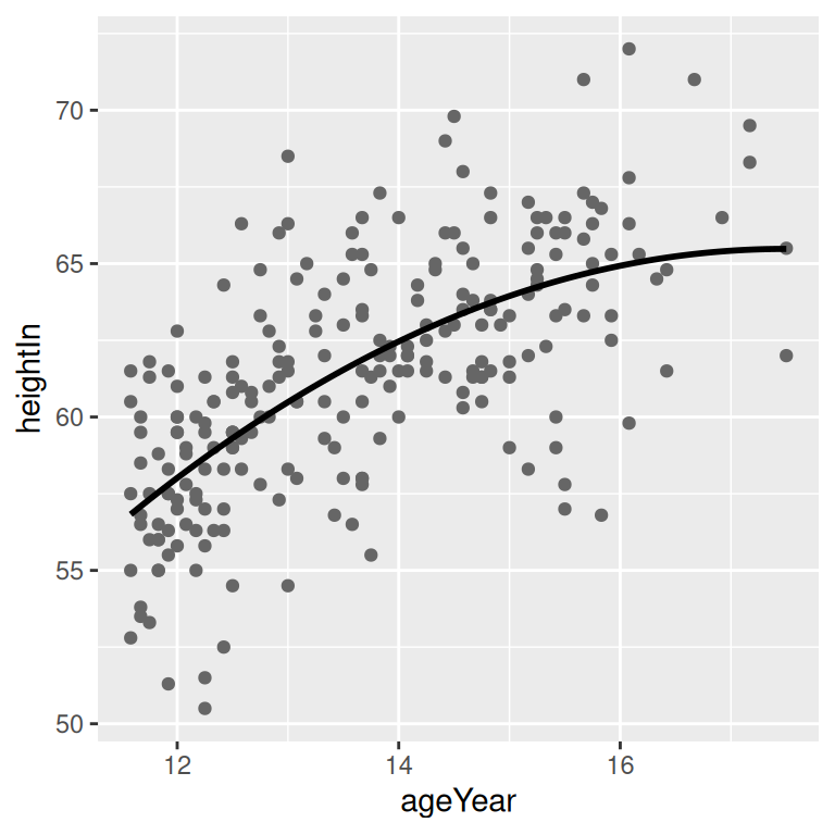
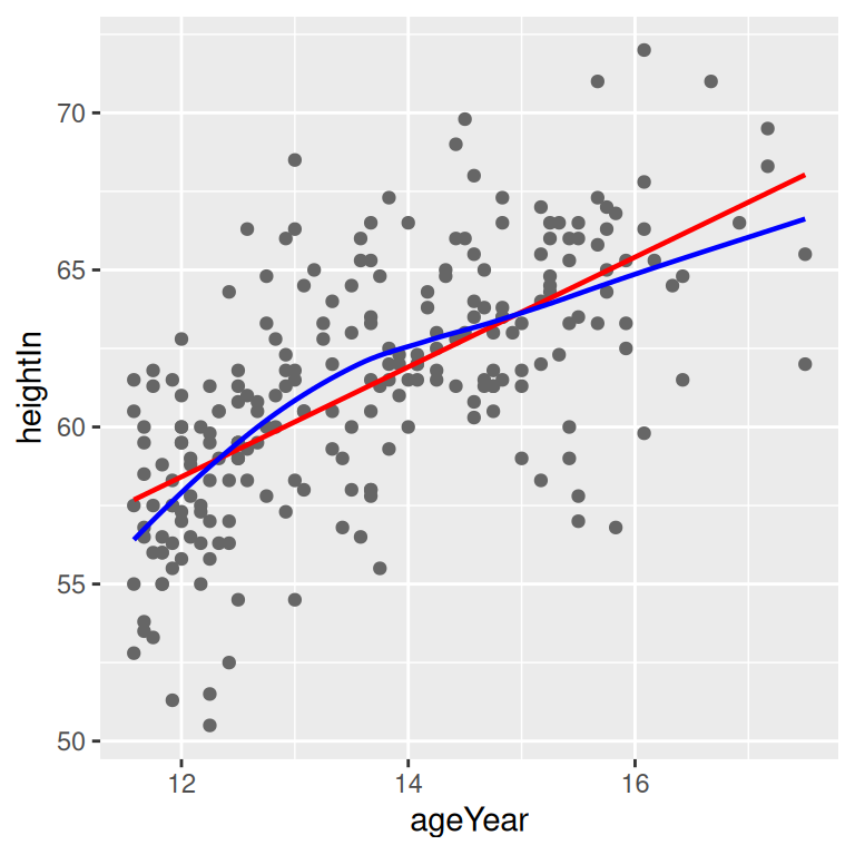
Figure 5.22: A quadratic prediction line from an lm object (left); Prediction lines from linear (in red) and LOESS (in blue) models (right)
For glm models use a nonlinear link function, you need to specify type = "response" to the predictvals() function. This is because the default behavior of glm is to return predicted values in the scale of the linear predictors, instead of in the scale of the response (y) variable.
To illustrate this, we’ll use the biopsy data set from the MASS package. As we did in Recipe 5.6, we’ll use V1 to predict class. Since logistic regressions require numeric values from 0 to 1, we need to convert the factor class to 0s and 1s:
library(MASS) # Load MASS for the biopsy data set

# Using the biopsy data set, create a new column that stores the factor `class` as a numeric variable named `classn`. If `class` == "benign", set `classn` to 0. If `class` == "malignant", set `classn` to 1. Save this new dataset as `biopsy_mod`.

biopsy_mod <- biopsy %>%
  mutate(classn = recode(class, benign = 0, malignant = 1))

biopsy_mod
#>          ID V1 V2 V3 V4 V5 V6 V7 V8 V9     class classn
#> 1   1000025  5  1  1  1  2  1  3  1  1    benign      0
#> 2   1002945  5  4  4  5  7 10  3  2  1    benign      0
#> 3   1015425  3  1  1  1  2  2  3  1  1    benign      0
#>  ...<693 more rows>...
#> 697  888820  5 10 10  3  7  3  8 10  2 malignant      1
#> 698  897471  4  8  6  4  3  4 10  6  1 malignant      1
#> 699  897471  4  8  8  5  4  5 10  4  1 malignant      1
Next, we’ll perform the logistic regression:
Finally, we’ll make the graph with jittered points and the fitlogistic line. We’ll make the line in a shade of blue by specifying a color in RGB values, and slightly thicker, with size = 1 (Figure 5.23):
# Get predicted values
glm_predicted <- predictvals(fitlogistic, "V1", "classn", type = "response")

ggplot(biopsy_mod, aes(x = V1, y = classn)) +
  geom_point(
    position = position_jitter(width = .3, height = .08),
    alpha = 0.4,
    shape = 21,
    size = 1.5
  ) +
  geom_line(data = glm_predicted, colour = "#1177FF", size = 1)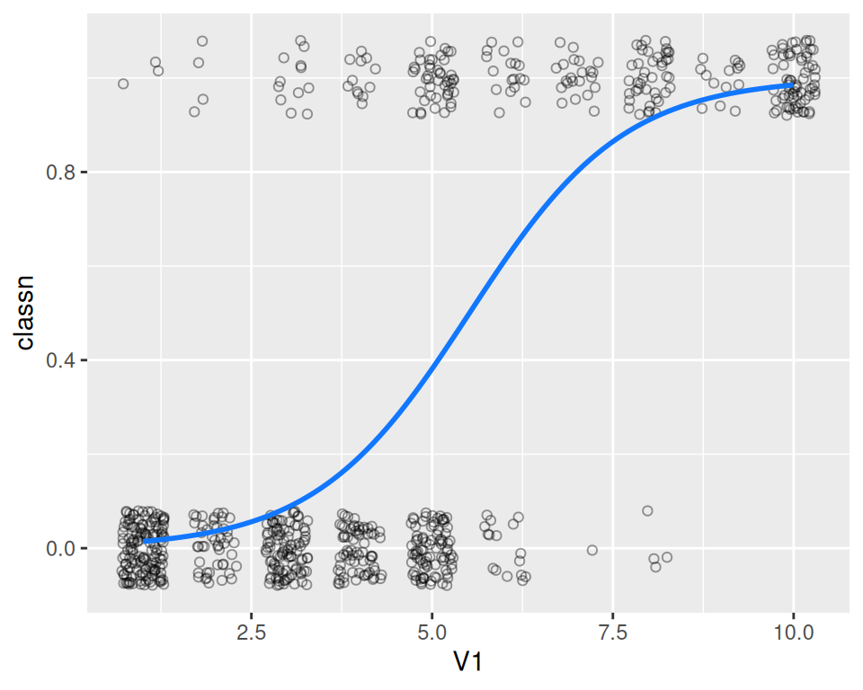
Figure 5.23: A fitted logistic model