7.3 Adding Lines
7.3.2 Solution
For horizontal and vertical lines, use geom_hline() and geom_vline(), and for angled lines, use geom_abline() (Figure 7.7). For this example, we’ll use the heightweight data set:
library(gcookbook)  # Load gcookbook for the heightweight data set

hw_plot <- ggplot(heightweight, aes(x = ageYear, y = heightIn, colour = sex)) +
  geom_point()

# Add horizontal and vertical lines
hw_plot +
  geom_hline(yintercept = 60) +
  geom_vline(xintercept = 14)

# Add angled line
hw_plot +
  geom_abline(intercept = 37.4, slope = 1.75)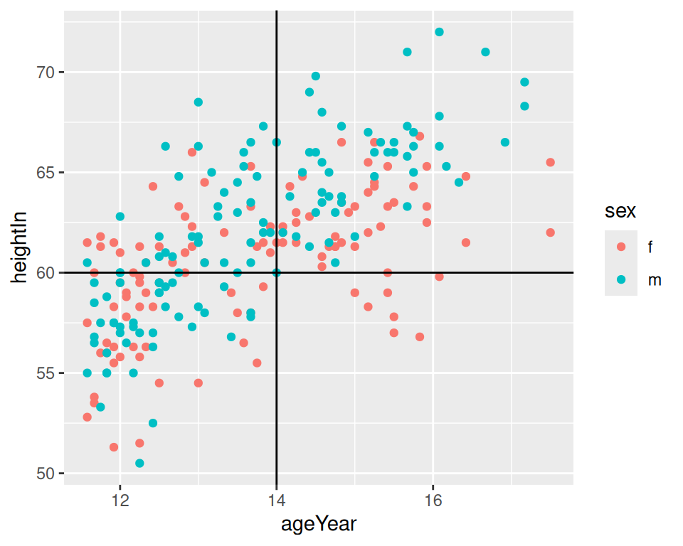
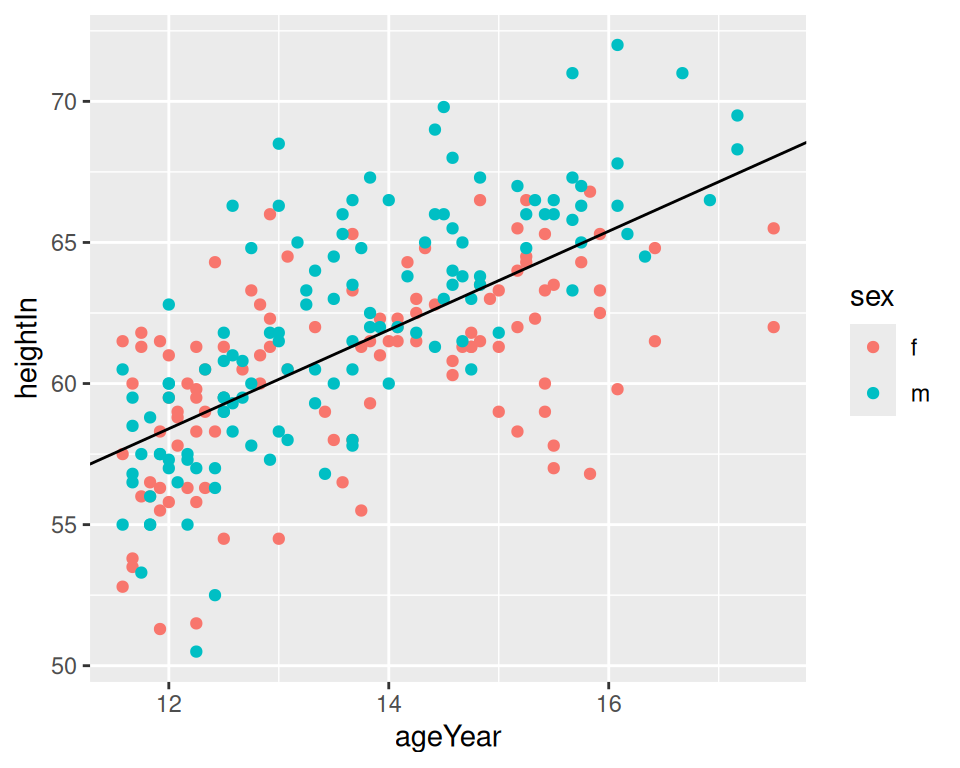
Figure 7.7: horizontal and vertical lines (left); angled line (right)
7.3.3 Discussion
The previous examples demonstrate setting the positions of the lines manually, resulting in one line drawn for each geom added. It is also possible to map values from the data to xintercept, yintercept, and so on, and even draw them from another data frame.
Here we’ll take the average height for males and females and store it in a data frame, hw_means. Then we’ll draw a horizontal line for each, and set the linetype and size (Figure 7.8):
library(dplyr)

hw_means <- heightweight %>%
  group_by(sex) %>%
  summarise(heightIn = mean(heightIn))

hw_means
#> # A tibble: 2 × 2
#>   sex   heightIn
#>   <fct>    <dbl>
#> 1 f         60.5
#> 2 m         62.1

hw_plot +
  geom_hline(
    data = hw_means,
    aes(yintercept = heightIn, colour = sex),
    linetype = "dashed",
    size = 1
  )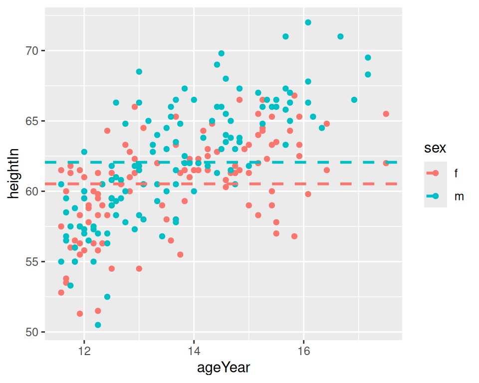
Figure 7.8: Multiple lines, drawn at the mean of each group
If one of the axes is discrete rather than continuous, you can’t specify the intercepts as just a character string – they must still be specified as numbers. If the axis represents a factor, the first level has a numeric value of 1, the second level has a value of 2, and so on. You can specify the numerical intercept manually, or calculate the numerical value using which(levels(...)) (Figure 7.9):
pg_plot <- ggplot(PlantGrowth, aes(x = group, y = weight)) +
  geom_point()

pg_plot +
  geom_vline(xintercept = 2)

pg_plot +
  geom_vline(xintercept = which(levels(PlantGrowth$group) == "ctrl"))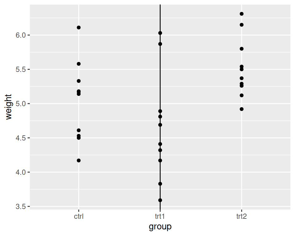
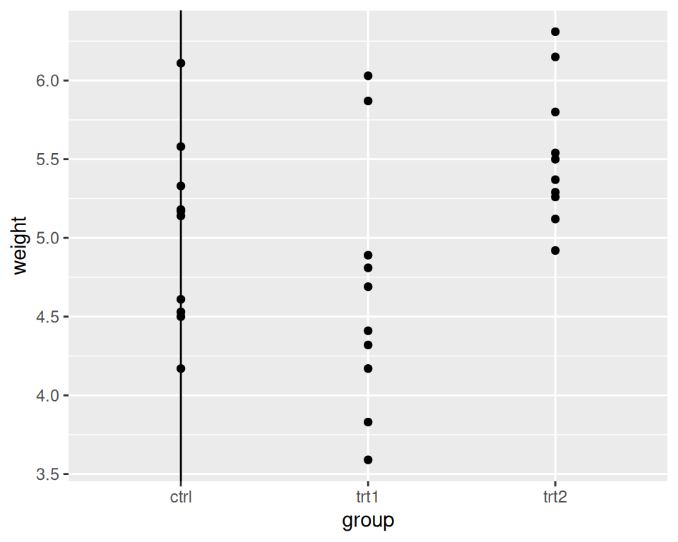
Figure 7.9: Lines with a discrete axis
Note
You may have noticed that adding lines differs from adding other annotations. Instead of using the
annotate()function, we’ve usedgeom_hline()and friends. This is because old versions of ggplot2 didn’t have theannotate()function. The line geoms had code to handle the special cases where they were used to add a single line, and changing it would break backward compatibility.