6.6 Making a Basic Box Plot
6.6.2 Solution
Use geom_boxplot(), mapping a continuous variable to y and a discrete variable to x (Figure 6.16):
library(MASS) # Load MASS for the birthwt data set

# Use factor() to convert a numeric variable into a discrete variable
ggplot(birthwt, aes(x = factor(race), y = bwt)) +
  geom_boxplot()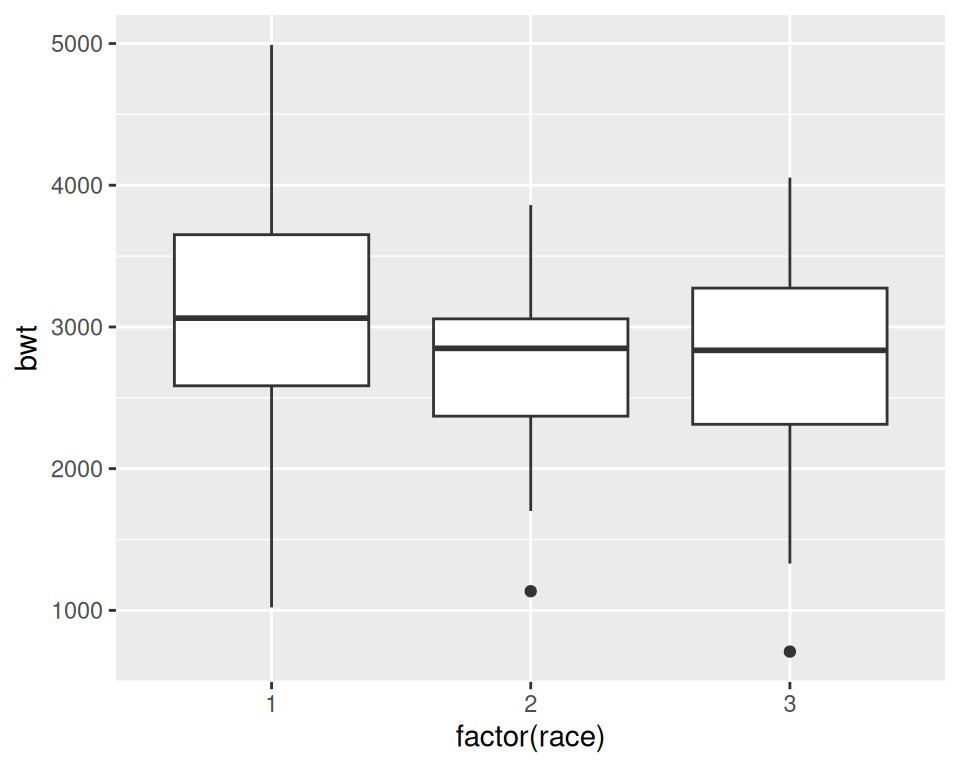
Figure 6.16: A box plot
6.6.3 Discussion
For this example, we used the birthwt data set from the MASS package. This data set contains data about birth weights (bwt) and a number of risk factors for low birth weight:
birthwt
#>    low age lwt race smoke ptl ht ui ftv  bwt
#> 85   0  19 182    2     0   0  0  1   0 2523
#> 86   0  33 155    3     0   0  0  0   3 2551
#> 87   0  20 105    1     1   0  0  0   1 2557
#>  ...<183 more rows>...
#> 82   1  23  94    3     1   0  0  0   0 2495
#> 83   1  17 142    2     0   0  1  0   0 2495
#> 84   1  21 130    1     1   0  1  0   3 2495
In Figure 6.16 we have visualized the distributions of bwt by each race group. Because race is stored as a numeric vector with the values of 1, 2, or 3, ggplot doesn’t know how to use this numeric version of race as a grouping variable. To make this work, we can modify the data frame by converting race to a factor, or by telling ggplot to treat race as a factor by using factor(race) inside of the aes() statement. In the preceding example, we used factor(race).
A box plot consists of a box and “whiskers.” The box goes from the 25th percentile to the 75th percentile of the data, also known as the inter-quartile range (IQR). There’s a line indicating the median, or the 50th percentile of the data. The whiskers start from the edge of the box and extend to the furthest data point that is within 1.5 times the IQR. Any data points that are past the ends of the whiskers are considered outliers and displayed with dots. Figure 6.17 shows the relationship between a histogram, a density curve, and a box plot, using a skewed data set.
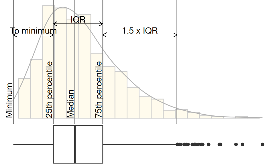
Figure 6.17: Box plot compared to histogram and density curve
To change the width of the boxes, you can set width (Figure 6.18, left):
If there are many outliers and there is overplotting, you can change the size and shape of the outlier points with outlier.size and outlier.shape. The default size is 2 and the default shape is 16. This will use smaller points, and hollow circles (Figure 6.18, right):
ggplot(birthwt, aes(x = factor(race), y = bwt)) +
  geom_boxplot(outlier.size = 1.5, outlier.shape = 21)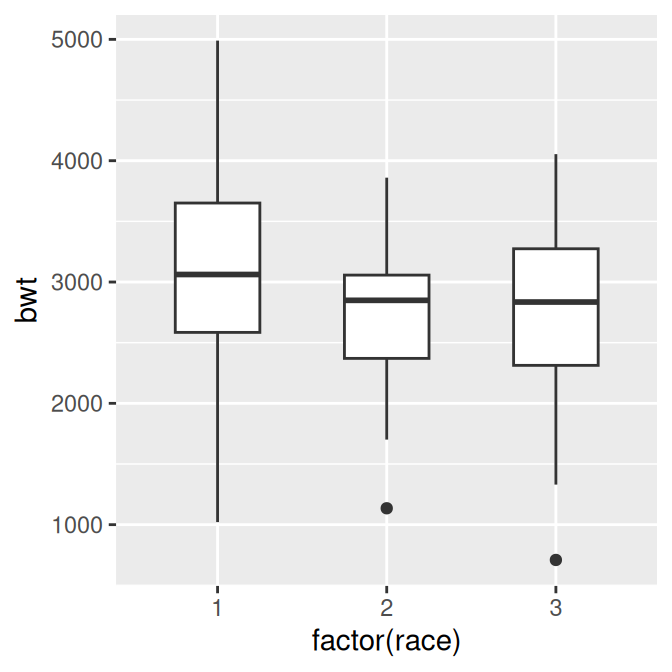
Figure 6.18: Box plot with narrower boxes (left); With smaller, hollow outlier points (right)
To make a box plot of just a single group, we have to provide some arbitrary value for x; otherwise, ggplot won’t know what x coordinate to use for the box plot. In this case, we’ll set it to 1 and remove the x-axis tick markers and label (Figure 6.19):
ggplot(birthwt, aes(x = 1, y = bwt)) +
  geom_boxplot() +
  scale_x_continuous(breaks = NULL) +
  theme(axis.title.x = element_blank())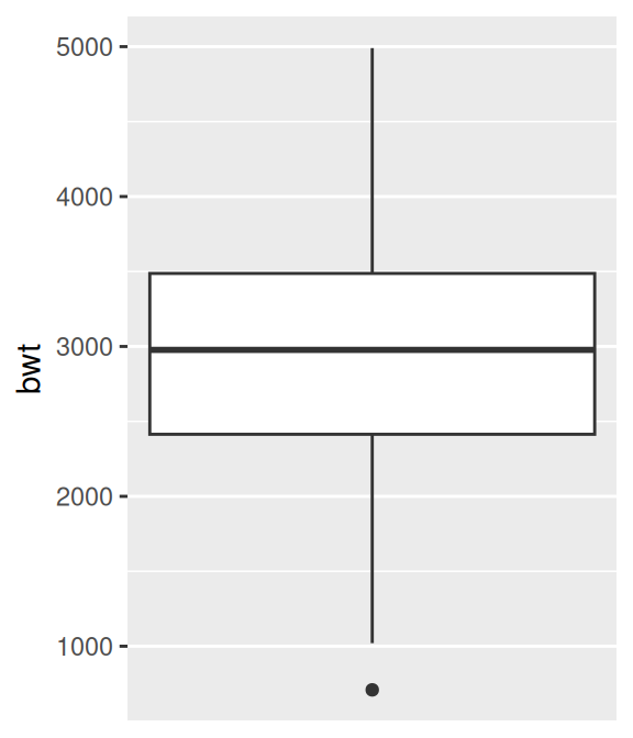
Figure 6.19: Box plot of a single group
Note
The calculation of quantiles works slightly differently from the
boxplot()function in base R. This can sometimes be noticeable for small sample sizes. See?geom_boxplotfor detailed information about how the calculations differ.