5.12 Creating a Balloon Plot
5.12.1 Problem
You want to make a balloon plot, where the area of the dots is proportional to their numerical value.
5.12.2 Solution
Use geom_point() with scale_size_area(). For this example, we’ll filter the data set countries to only include data from the year 2009, for certain countries we have specified in countrylist:
library(gcookbook) # Load gcookbook for the countries data set

countrylist <- c("Canada", "Ireland", "United Kingdom", "United States",
  "New Zealand", "Iceland", "Japan", "Luxembourg", "Netherlands", "Switzerland")

cdat <- countries %>%
  filter(Year == 2009, Name %in% countrylist)

cdat
#>              Name Code Year      GDP laborrate healthexp infmortality
#> 1          Canada  CAN 2009 39599.04      67.8  4379.761          5.2
#> 2         Iceland  ISL 2009 37972.24      77.5  3130.391          1.7
#> 3         Ireland  IRL 2009 49737.93      63.6  4951.845          3.4
#>  ...<4 more rows>...
#> 8     Switzerland  CHE 2009 63524.65      66.9  7140.729          4.1
#> 9  United Kingdom  GBR 2009 35163.41      62.2  3285.050          4.7
#> 10  United States  USA 2009 45744.56      65.0  7410.163          6.6
If we just map GDP to size, the value of GDP gets mapped to the radius of the dots (Figure 5.36, left), which is not what we want; a doubling of value results in a quadrupling of area, and this will distort the interpretation of the data. We instead want to map the value of GDP to the area of the dots, which we can do this using scale_size_area() (Figure 5.36, right):
# Create a base plot using the cdat data frame. We will call this base plot `cdat_sp` (for cdat scatter plot)
cdat_sp <- ggplot(cdat, aes(x = healthexp, y = infmortality, size = GDP)) +
    geom_point(shape = 21, colour = "black", fill = "cornsilk")

# GDP mapped to radius (default with scale_size_continuous)
cdat_sp

# GDP mapped to area instead, and larger circles
cdat_sp +
  scale_size_area(max_size = 15)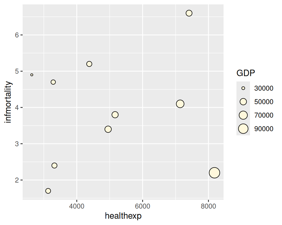
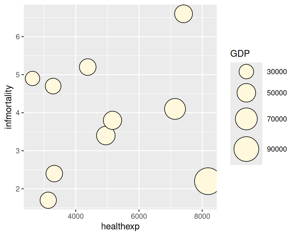
Figure 5.36: Balloon plot with value mapped to radius (left); With value mapped to area (right)
5.12.3 Discussion
The example here is a scatter plot, but that is not the only way to use balloon plots. It may also be useful to use balloon plots to represent values on a grid, where the x- and y-axes are categorical, as in Figure 5.37:
# Create a data frame that adds up counts for males and females
hec <- HairEyeColor %>%
  # Convert to long format
  as_tibble() %>%
  group_by(Hair, Eye) %>%
  summarize(count = sum(n))
#> `summarise()` has regrouped the output.
#> ℹ Summaries were computed grouped by Hair and Eye.
#> ℹ Output is grouped by Hair.
#> ℹ Use `summarise(.groups = "drop_last")` to silence this message.
#> ℹ Use `summarise(.by = c(Hair, Eye))` for per-operation grouping
#>   (`?dplyr::dplyr_by`) instead.

# Create the base balloon plot
hec_sp <- ggplot(hec, aes(x = Eye, y = Hair)) +
  geom_point(aes(size = count), shape = 21, colour = "black", fill = "cornsilk") +
  scale_size_area(max_size = 20, guide = FALSE) +
  geom_text(aes(
    y = as.numeric(as.factor(Hair)) - sqrt(count)/34, label = count),
    vjust = 1.3,
    colour = "grey60",
    size = 4
  )

hec_sp

# Add red guide points
hec_sp +
  geom_point(aes(y = as.numeric(as.factor(Hair)) - sqrt(count)/34), colour = "red", size = 1)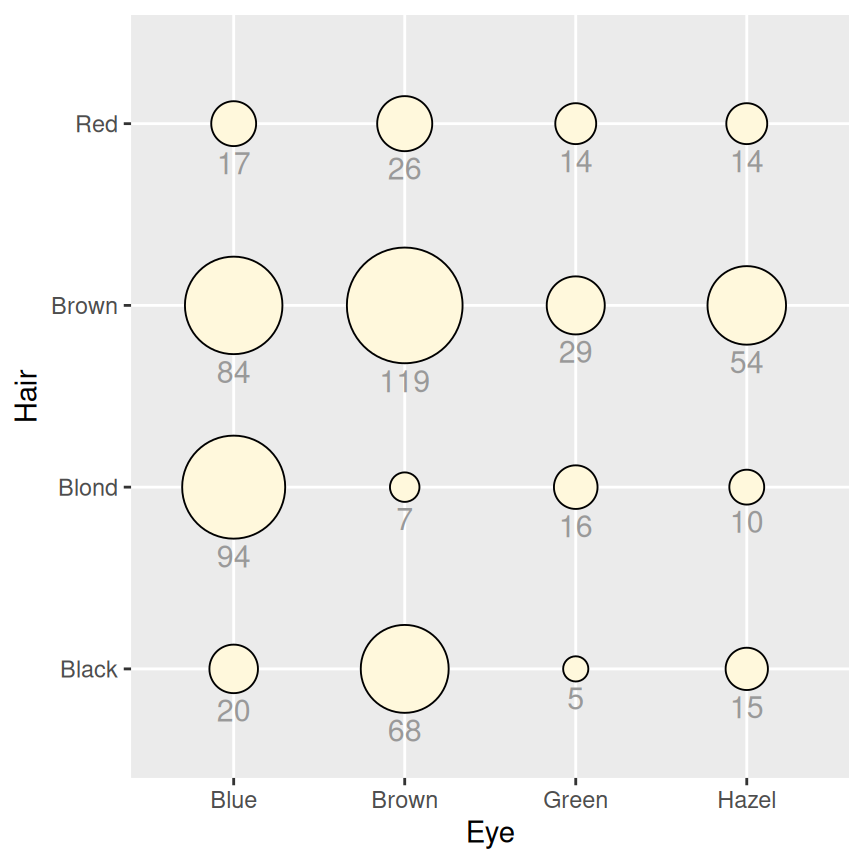
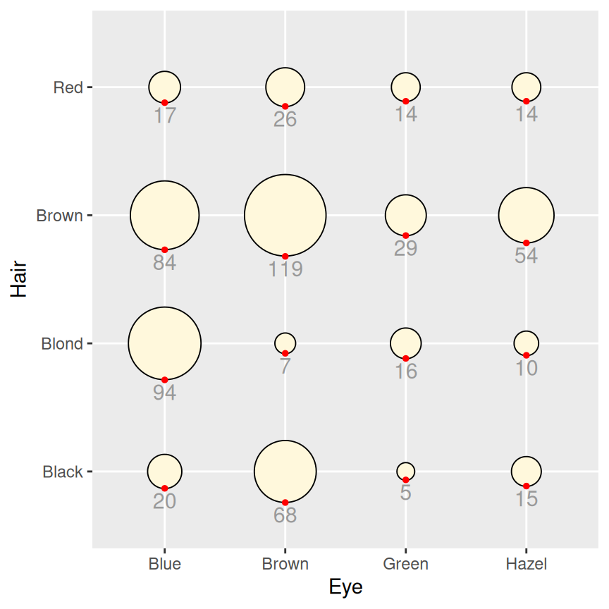
Figure 5.37: Balloon plot with categorical axes and text labels (left); With guide points to help position text (right)
In this example we’ve used a few tricks to add the text labels under the circles. First, we used vjust = 1.3 to justify the top of text slightly below the y coordinate. Next, we wanted to set the y coordinate so that it is at the bottom of each circle. This requires a little wrangling and arithmetic: we need to first convert the levels of Hair and Eye into numeric values, which involves converting these variables from being a character vector to being a factor variable, and then converting them again into a numeric variable. We then take the numeric value of Hair and subtract a small value from it, where the value depends in some way on count. This actually requires taking the square root of count, since the radius has a linear relationship with the square root of count. The number that this value is divided by (34 in this case) is found by trial and error; it depends on the particular data values, radius, text size, and output image size.
To help find the correct y offset, we can add guide points in red and adjusted the value until they lined up with the bottom of each circle. Once we have the correct value, we can place the text and remove the points.
The text under the circles is in a shade of grey. This is so that it doesn’t jump out at the viewer and overwhelm the perceptual impact of the circles, but is still available if the viewer wants to know the exact values.