13.11 Creating a Dendrogram
13.11.2 Solution
Use hclust() and plot the output from it. This can require a fair bit of data preprocessing. For this example, we’ll first take a subset of the countries data set from the year 2009. For simplicity, we’ll also drop all rows that contain an NA, and then select a random 25 of the remaining rows:
library(dplyr)
library(tidyr)     # For drop_na function
library(gcookbook) # For the data set

# Set random seed to make random operation below repeatable
set.seed(392)

c2 <- countries %>%
  filter(Year == 2009) %>%  # Get data from year 2009
  drop_na() %>%             # Drop rows that have any NA values
  sample_n(25)              # Select 25 random rows

c2
#>                Name Code Year         GDP laborrate  healthexp infmortality
#> 1  Egypt, Arab Rep.  EGY 2009   2370.7111      48.8  113.29717         20.0
#> 2             Haiti  HTI 2009    656.7792      69.9   39.60249         59.3
#> 3            Belize  BLZ 2009   4056.1224      64.1  217.15214         14.9
#>  ...<19 more rows>...
#> 23       Luxembourg  LUX 2009 106252.2442      55.5 8182.85511          2.2
#> 24        Lithuania  LTU 2009  11033.5885      55.7  729.78492          5.7
#> 25          Denmark  DNK 2009  55933.3545      65.4 6272.72868          3.4
Notice that the row names (the first column) are essentially random numbers, since the rows were selected randomly. We need to do a few more things to the data before making a dendrogram from it. First, we need to set the row names-right now there’s a column called Name, but the row names are those random numbers (we don’t often use row names, but for the hclust() function they’re essential). Next, we’ll need to drop all the columns that aren’t values used for clustering. These columns are Name, Code, and Year:
rownames(c2) <- c2$Name
c2 <- c2[, 4:7]
c2
#>                          GDP laborrate  healthexp infmortality
#> Egypt, Arab Rep.   2370.7111      48.8  113.29717         20.0
#> Haiti               656.7792      69.9   39.60249         59.3
#> Belize             4056.1224      64.1  217.15214         14.9
#>  ...<19 more rows>...
#> Luxembourg       106252.2442      55.5 8182.85511          2.2
#> Lithuania         11033.5885      55.7  729.78492          5.7
#> Denmark           55933.3545      65.4 6272.72868          3.4
The values for GDP are several orders of magnitude larger than the values for, say, infmortality. Because of this, the effect of infmortality on the clustering will be negligible compared to the effect of GDP. This probably isn’t what we want. To address this issue, we’ll scale the data:
c3 <- scale(c2)
c3
#>                         GDP    laborrate  healthexp infmortality
#> Egypt, Arab Rep. -0.6183699 -1.564089832 -0.6463085   -0.2387436
#> Haiti            -0.6882421  0.602552464 -0.6797433    1.0985742
#> Belize           -0.5496604  0.006982544 -0.5991902   -0.4122886
#>  ...<19 more rows>...
#> Luxembourg        3.6165896 -0.876103889  3.0147969   -0.8444498
#> Lithuania        -0.2652086 -0.855566996 -0.3666121   -0.7253503
#> Denmark           1.5652292  0.140472354  2.1481851   -0.8036157
By default the scale() function scales each column relative to its standard deviation, but other methods may be used.
Finally, we’re ready to make the dendrogram, as shown in Figure 13.19:
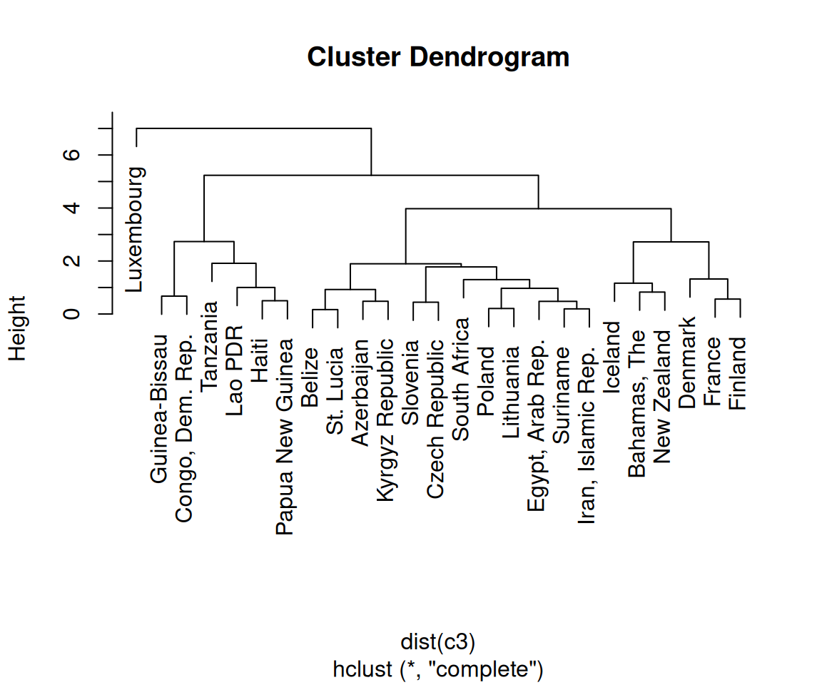
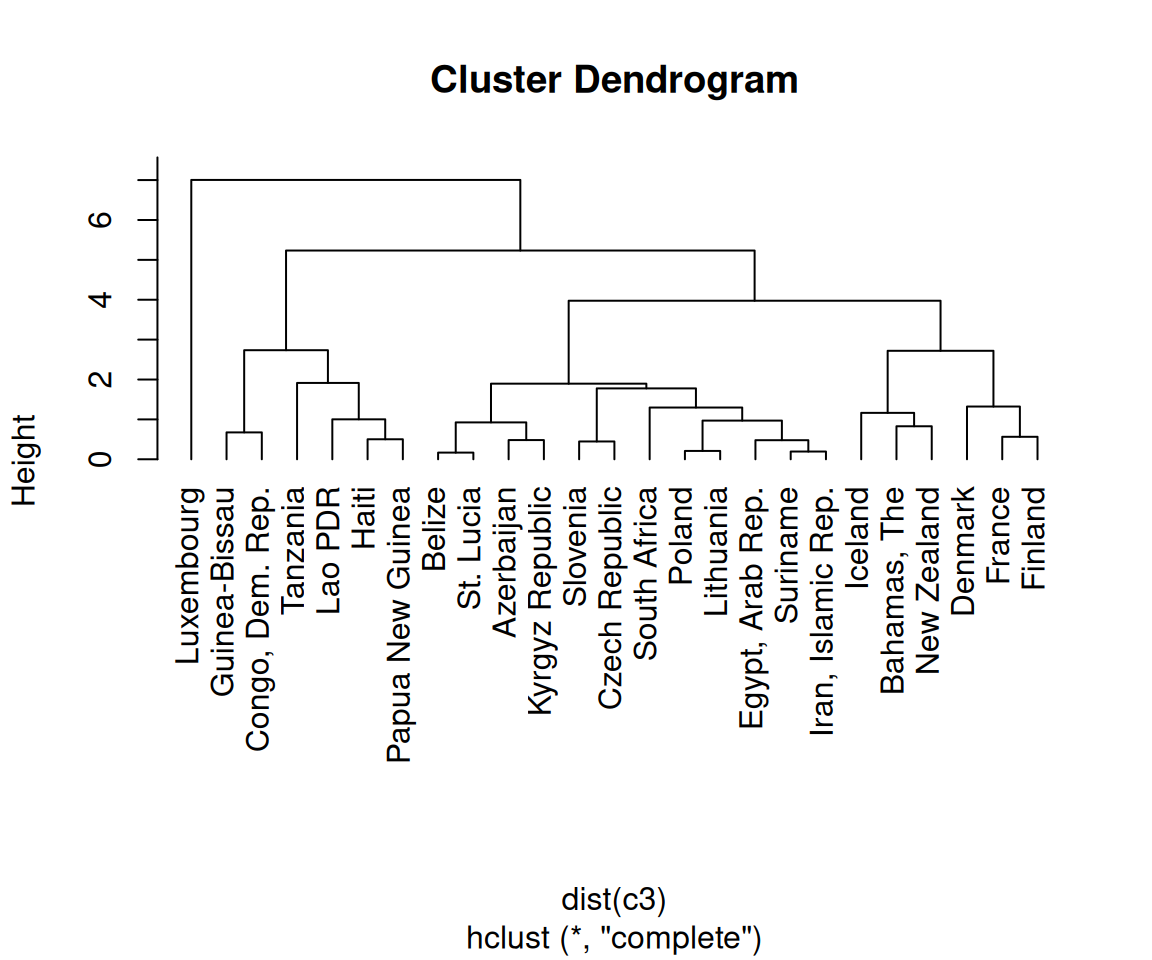
Figure 13.19: A dendrogram (left); With text aligned (right)
13.11.3 Discussion
A cluster analysis is simply a way of assigning points to groups in an n-dimensional space (four dimensions, in this example). A hierarchical cluster analysis divides each group into two smaller groups, and can be represented with the dendrograms in this recipe. There are many different parameters you can control in the hierarchical cluster analysis process, and there may not be a single “right” way to do it for your data.
First, we normalized the data using scale() with its default settings. You can scale your data differently, or not at all. (With this data set, not scaling the data will lead to GDP overwhelming the other variables, as shown in Figure 13.20.)
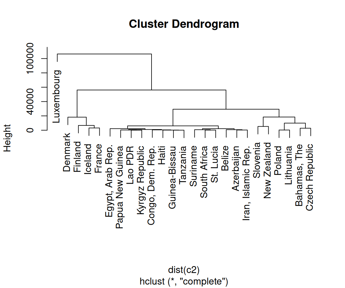
Figure 13.20: Dendrogram with unscaled data-notice the much larger Height values, which are largely due to the unscaled GDP values
For the distance calculation, we used the default method, “euclidean”, which calculates the Euclidean distance between the points. The other possible methods are “maximum”, “manhattan”, “canberra”, “binary”, and “minkowski”.
The hclust() function provides several methods for performing the cluster analysis. The default is “complete”; the other possible methods are “ward”, “single”, “average”, “mcquitty”, “median”, and “centroid”.