6.9 Making a Violin Plot
6.9.2 Solution
Use geom_violin() (Figure 6.22):
library(gcookbook) # Load gcookbook for the heightweight data set

# Create a base plot using the heightweight data set
hw_p <- ggplot(heightweight, aes(x = sex, y = heightIn))

hw_p +
  geom_violin()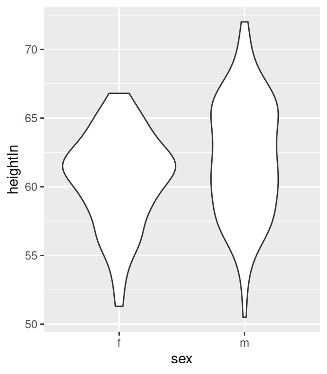
Figure 6.22: A violin plot
6.9.3 Discussion
Violin plots are a way of comparing multiple data distributions. With ordinary density curves, it is difficult to compare more than just a few distributions because the lines visually interfere with each other. With a violin plot, it’s easier to compare several distributions since they’re placed side by side.
A violin plot is a kernel density estimate, mirrored so that it forms a symmetrical shape. Traditionally, they also have narrow box plots overlaid, with a white dot at the median, as shown in Figure 6.23. Additionally, the box plot outliers are not displayed, which we do by setting outlier.colour = NA:
hw_p +
  geom_violin() +
  geom_boxplot(width = .1, fill = "black", outlier.colour = NA) +
  stat_summary(fun.y = median, geom = "point", fill = "white", shape = 21, size = 2.5)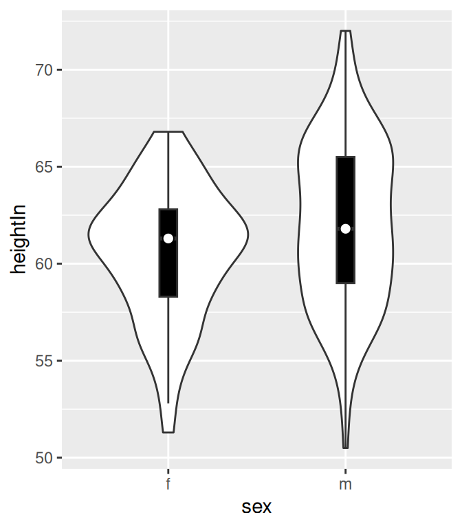
Figure 6.23: A violin plot with box plot overlaid on it
In this example we layered the objects from the bottom up, starting with the violin, then the box plot, then the white dot at the median, which is calculated using stat_summary().
The default range goes from the minimum to maximum data values; the flat ends of the violins are at the extremes of the data. It’s possible to keep the tails, by setting trim = FALSE (Figure 6.24):
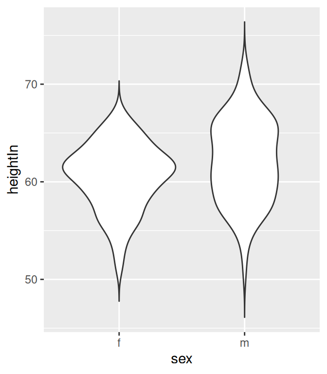
Figure 6.24: A violin plot with tails
By default, the violins are scaled so that the total area of each one is the same (if trim = TRUE, then it scales what the area would be including the tails). Instead of equal areas, you can use scale = "count" to scale the areas proportionally to the number of observations in each group (Figure 6.25). In this example, there are slightly fewer females than males, so the female violin becomes slightly narrower than before:
Figure 6.25: Violin plot with area proportional to number of observations
To change the amount of smoothing, use the adjust parameter, as described in Recipe 6.3. The default value is 1; use larger values for more smoothing and smaller values for less smoothing (Figure 6.26):
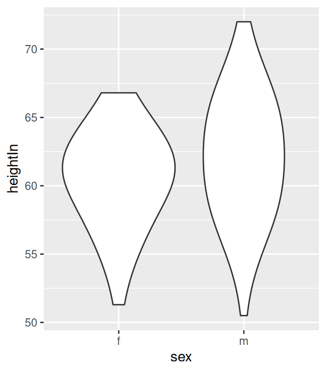
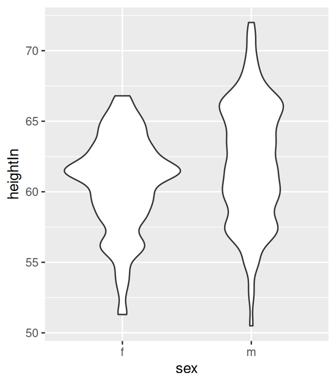
Figure 6.26: Violin plot with more smoothing (left); With less smoothing (right)