3.1 Making a Basic Bar Graph
3.1.1 Problem
You have a data frame where one column represents the x position of each bar, and another column represents the vertical (y) height of each bar.
3.1.2 Solution
Use ggplot() with geom_col() and specify what variables you want on the x- and y-axes (Figure 3.1):
library(gcookbook)  # Load gcookbook for the pg_mean data set
ggplot(pg_mean, aes(x = group, y = weight)) +
  geom_col()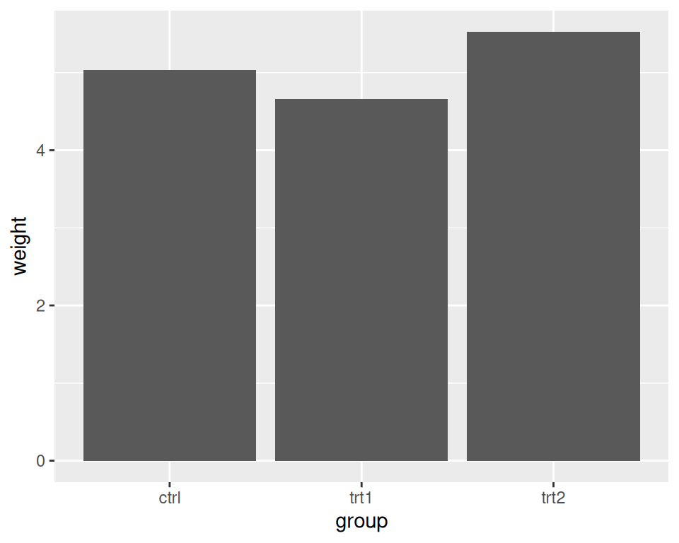
Figure 3.1: Bar graph of values with a discrete x-axis
Note
In previous versions of ggplot2, the recommended way to create a bar graph of values was to use
geom_bar(stat = "identity"). As of ggplot2 2.2.0, there is ageom_col()function which does the same thing.
3.1.3 Discussion
When x is a continuous (or numeric) variable, the bars behave a little differently. Instead of having one bar at each actual x value, there is one bar at each possible x value between the minimum and the maximum, as in Figure 3.2. You can convert the continuous variable to a discrete variable by using factor().
# There's no entry for Time == 6
BOD
#>   Time demand
#> 1    1    8.3
#> 2    2   10.3
#> 3    3   19.0
#> 4    4   16.0
#> 5    5   15.6
#> 6    7   19.8

# Time is numeric (continuous)
str(BOD)
#> 'data.frame':    6 obs. of  2 variables:
#>  $ Time  : num  1 2 3 4 5 7
#>  $ demand: num  8.3 10.3 19 16 15.6 19.8
#>  - attr(*, "reference")= chr "A1.4, p. 270"

ggplot(BOD, aes(x = Time, y = demand)) +
  geom_col()

# Convert Time to a discrete (categorical) variable with factor()
ggplot(BOD, aes(x = factor(Time), y = demand)) +
  geom_col()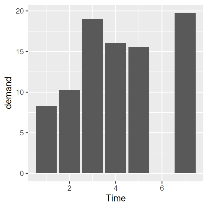
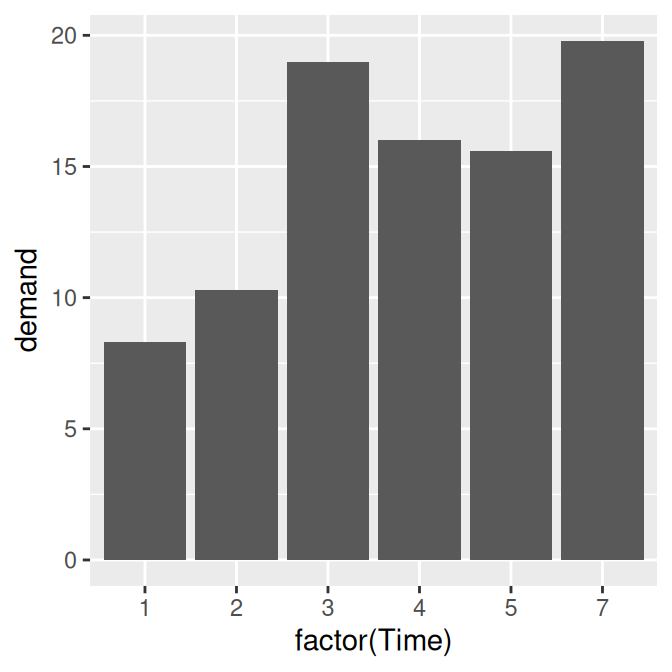
Figure 3.2: Bar graph of values with a continuous x-axis (left); With x variable converted to a factor (notice that the space for 6 is gone; right)
Notice that there was no row in BOD for Time = 6. When the x variable is continuous, ggplot2 will use a numeric axis which will have space for all numeric values within the range – hence the empty space for 6 in the plot. When Time is converted to a factor, ggplot2 uses it as a discrete variable, where the values are treated as arbitrary labels instead of numeric values, and so it won’t allocate space on the x axis for all possible numeric values between the minimum and maximum.
In these examples, the data has a column for x values and another for y values. If you instead want the height of the bars to represent the count of cases in each group, see Recipe 3.3.
By default, bar graphs use a dark grey for the bars. To use a color fill, use fill. Also, by default, there is no outline around the fill. To add an outline, use colour. For Figure 3.3, we use a light blue fill and a black outline:
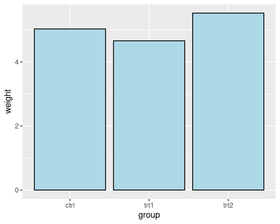
Figure 3.3: A single fill and outline color for all bars
Note
In ggplot2, the default is to use the British spelling, colour, instead of the American spelling, color. Internally, American spellings are remapped to the British ones, so if you use the American spelling it will still work.
3.1.4 See Also
If you want the height of the bars to represent the count of cases in each group, see Recipe 3.3.
To reorder the levels of a factor based on the values of another variable, see Recipe 15.9. To manually change the order of factor levels, see Recipe 15.8.
For more information about using colors, see Chapter 12.