8.14 Using a Logarithmic Axis
8.14.2 Solution
Use scale_x_log10() and/or scale_y_log10() (Figure 8.26):
library(MASS) # Load MASS for the Animals data set

# Create the base plot
animals_plot <- ggplot(Animals, aes(x = body, y = brain, label = rownames(Animals))) +
  geom_text(size = 3)

animals_plot

# With logarithmic x and y scales
animals_plot +
  scale_x_log10() +
  scale_y_log10()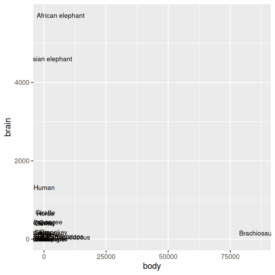
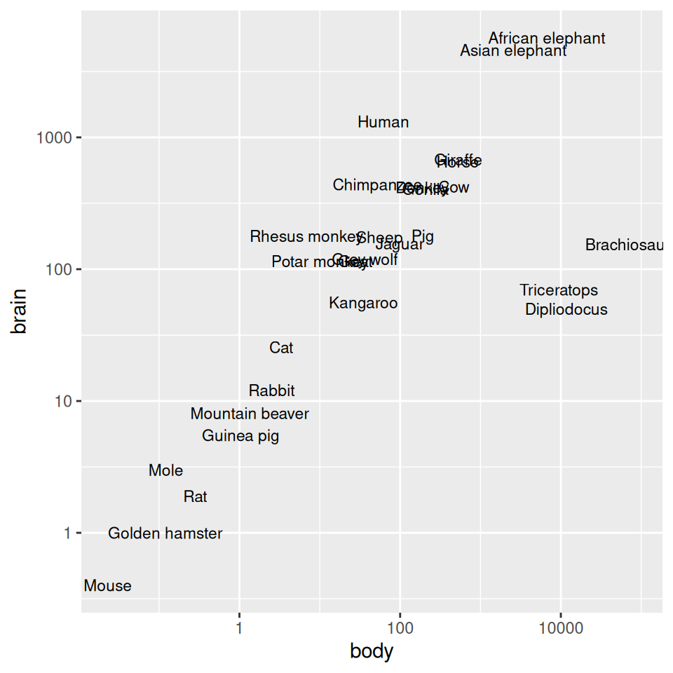
Figure 8.26: Exponentially distributed data with linear-scaled axes (left); With logarithmic axes (right)
8.14.3 Discussion
With a log axis, a given visual distance represents a constant proportional change; for example, each centimeter on the y-axis might represent a multiplication of the quantity by 10. In contrast, with a linear axis, a given visual distance represents a constant quantity change; each centimeter might represent adding 10 to the quantity.
Some data sets are exponentially distributed on the x-axis, and others on the y-axis (or both). For example, the Animals data set from the MASS package contains data on the average brain mass (in g) and body mass (in kg) of various mammals, with a few dinosaurs thrown in for comparison:
Animals
#>                      body brain
#> Mountain beaver     1.350   8.1
#> Cow               465.000 423.0
#> Grey wolf          36.330 119.5
#>  ...<22 more rows>...
#> Brachiosaurus   87000.000 154.5
#> Mole                0.122   3.0
#> Pig               192.000 180.0
As shown in Figure 8.26, we can make a scatter plot to visualize the relationship between brain and body mass. With the default linearly scaled axes, it’s hard to make much sense of this graph. Because of a few very large animals, the rest of the animals get squished into the lower-left corner-a mouse barely looks different from a triceratops! This is a case where the data is distributed exponentially on both axes.
ggplot will try to make good decisions about where to place the tick marks, but if you don’t like them, you can change them by specifying breaks and, optionally, labels. In the example here, the automatically generated tick marks are spaced farther apart than is ideal. For the y-axis tick marks, we can get a vector of every power of 10 from 100 to 103 like this:
The x-axis tick marks work the same way, but because the range is large, R decides to format the output with scientific notation:
And then we can use those values as the breaks, as in Figure 8.27 (left):
To instead use exponential notation for the break labels (Figure 8.27, right), use the trans_format() function, from the scales package:
library(scales)
animals_plot +
  scale_x_log10(breaks = 10^(-1:5), labels = trans_format("log10", math_format(10^.x))) +
  scale_y_log10(breaks = 10^(0:3), labels = trans_format("log10", math_format(10^.x)))
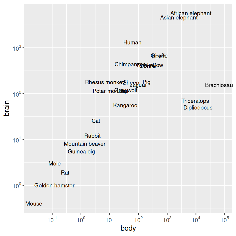
Figure 8.27: Scatter plot with log10 x- and y-axes, and with manually specified breaks (left); With exponents for the tick labels (right)
Another way to use log axes is to transform the data before mapping it to the x and y coordinates (Figure 8.28). Technically, the axes are still linear – it’s the quantity that is log-transformed:
ggplot(Animals, aes(x = log10(body), y = log10(brain), label = rownames(Animals))) +
  geom_text(size = 3)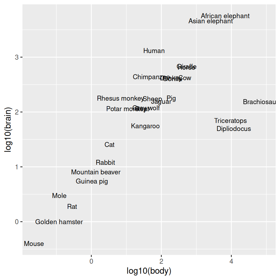
Figure 8.28: Plot with log transform before mapping to x- and y-axes
The previous examples used a log10 transformation, but it is possible to use other transformations, such as log2 and natural log, as shown in Figure 8.29. It’s a bit more complicated to use these – scale_x_log10() is shorthand, but for these other log scales, we need to spell them out:
library(scales)

# Use natural log on x, and log2 on y
animals_plot +
  scale_x_continuous(
    trans = log_trans(),
    breaks = trans_breaks("log", function(x) exp(x)),
    labels = trans_format("log", math_format(e^.x))
  ) +
  scale_y_continuous(
    trans = log2_trans(),
    breaks = trans_breaks("log2", function(x) 2^x),
    labels = trans_format("log2", math_format(2^.x))
  )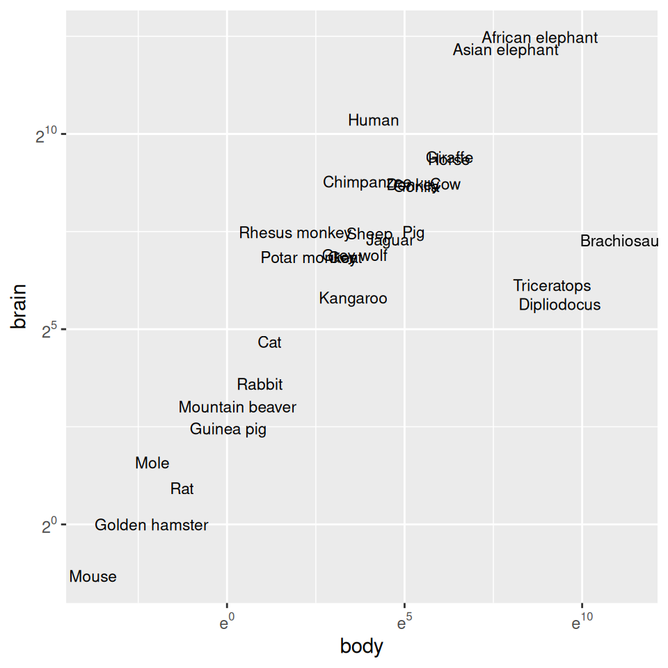
Figure 8.29: Plot with exponents in tick labels. Notice that different bases are used for the x and y axes.
It’s possible to use a log axis for just one axis. It is often useful to represent financial data this way, because it better represents proportional change. Figure 8.30 shows Apple’s stock price with linear and log y-axes. The default tick marks might not be spaced well for your graph; they can be set with the breaks in the scale:
library(gcookbook)  # Load gcookbook for the aapl data set

ggplot(aapl, aes(x = date,y = adj_price)) +
  geom_line()

ggplot(aapl, aes(x = date,y = adj_price)) +
  geom_line() +
  scale_y_log10(breaks = c(2,10,50,250))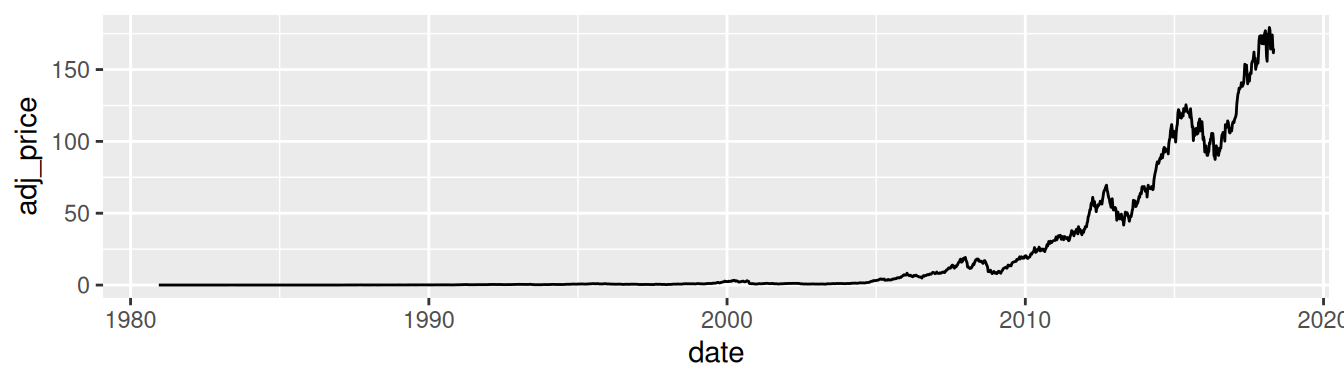
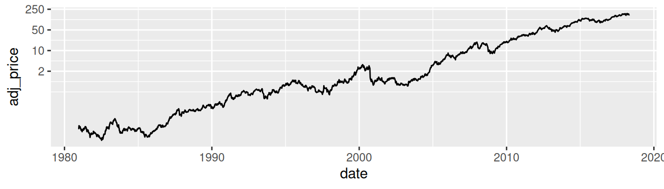
Figure 8.30: Top: a stock chart with a linear x-axis and log y-axis; bottom: with manual breaks