13.1 Making a Correlation Matrix
13.1.2 Solution
We’ll look at the mtcars data set:
mtcars
#>                mpg cyl disp  hp drat    wt  qsec vs am gear carb
#> Mazda RX4     21.0   6  160 110 3.90 2.620 16.46  0  1    4    4
#> Mazda RX4 Wag 21.0   6  160 110 3.90 2.875 17.02  0  1    4    4
#> Datsun 710    22.8   4  108  93 3.85 2.320 18.61  1  1    4    1
#>  ...<26 more rows>...
#> Ferrari Dino  19.7   6  145 175 3.62 2.770 15.50  0  1    5    6
#> Maserati Bora 15.0   8  301 335 3.54 3.570 14.60  0  1    5    8
#> Volvo 142E    21.4   4  121 109 4.11 2.780 18.60  1  1    4    2
First, generate the numerical correlation matrix using cor. This will generate correlation coefficients for each pair of columns:
mcor <- cor(mtcars)
# Print mcor and round to 2 digits
round(mcor, digits = 2)
#>        mpg   cyl  disp    hp  drat    wt  qsec    vs    am  gear  carb
#> mpg   1.00 -0.85 -0.85 -0.78  0.68 -0.87  0.42  0.66  0.60  0.48 -0.55
#> cyl  -0.85  1.00  0.90  0.83 -0.70  0.78 -0.59 -0.81 -0.52 -0.49  0.53
#> disp -0.85  0.90  1.00  0.79 -0.71  0.89 -0.43 -0.71 -0.59 -0.56  0.39
#>  ...<5 more rows>...
#> am    0.60 -0.52 -0.59 -0.24  0.71 -0.69 -0.23  0.17  1.00  0.79  0.06
#> gear  0.48 -0.49 -0.56 -0.13  0.70 -0.58 -0.21  0.21  0.79  1.00  0.27
#> carb -0.55  0.53  0.39  0.75 -0.09  0.43 -0.66 -0.57  0.06  0.27  1.00
If there are any columns that you don’t want used for correlations (for example, a column of names), you should exclude them. If there are any NA cells in the original data, the resulting correlation matrix will have NA values. To deal with this, you will probably want to use the argument use="complete.obs" or use="pairwise.complete.obs".
To plot the correlation matrix (Figure 13.1), we’ll use the corrplot package:
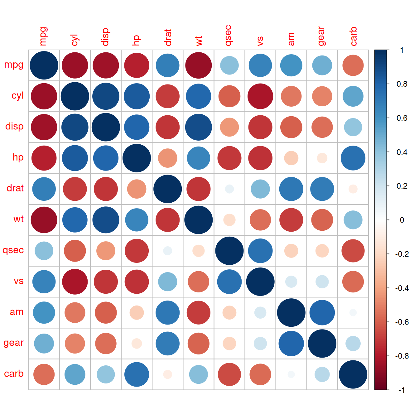
Figure 13.1: A correlation matrix
13.1.3 Discussion
The corrplot() function has many, many options. Here is an example of how to make a correlation matrix with colored squares and black labels, rotated 45 degrees along the top (Figure 13.2):
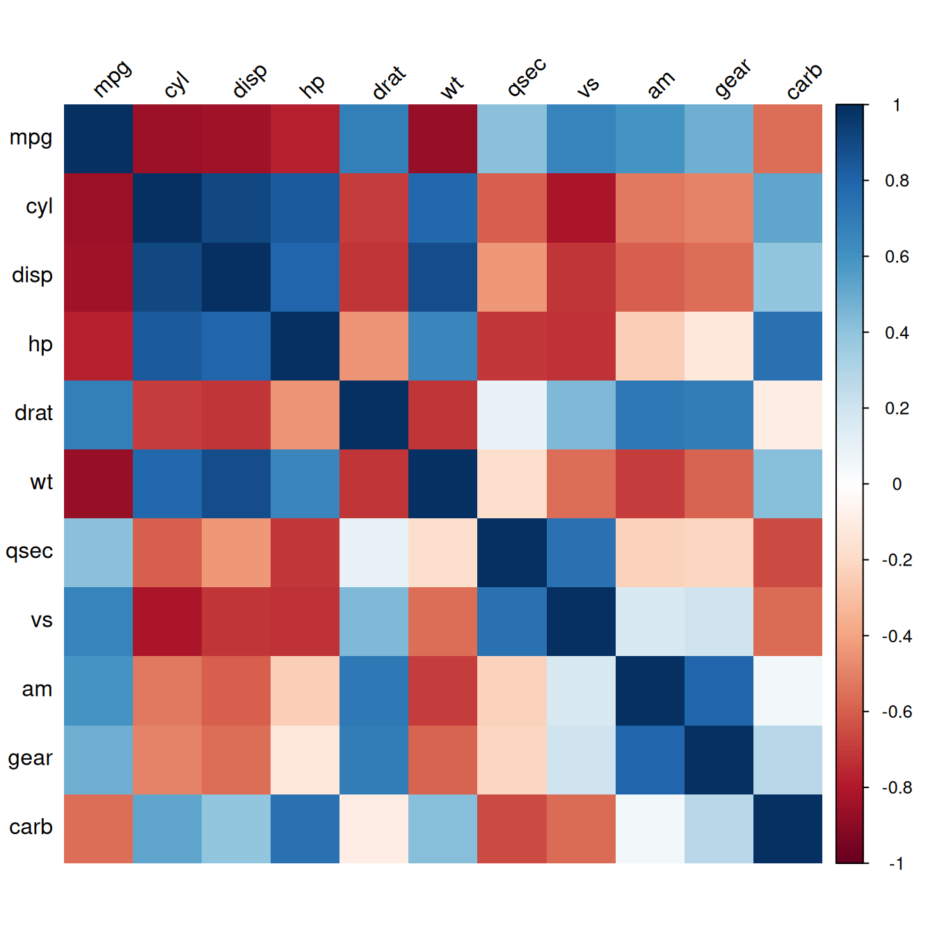
Figure 13.2: Correlation matrix with colored squares and black, rotated labels
It may also be helpful to display labels representing the correlation coefficient on each square in the matrix. In this example we’ll make a lighter palette so that the text is readable, and we’ll remove the color legend, since it’s redundant. We’ll also order the items so that correlated items are closer together, using the order="AOE" (angular order of eigenvectors) option. The result is shown in Figure 13.3:
# Generate a lighter palette
col <- colorRampPalette(c("#BB4444", "#EE9988", "#FFFFFF", "#77AADD", "#4477AA"))

corrplot(mcor, method = "shade", shade.col = NA, tl.col = "black", tl.srt = 45,
         col = col(200), addCoef.col = "black", cl.pos = "n", order = "AOE")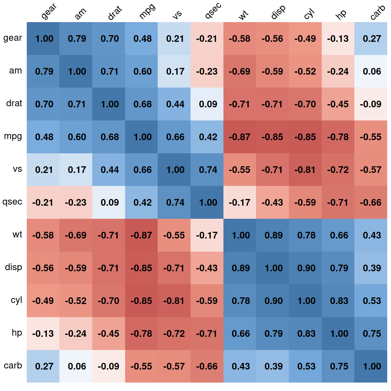
Figure 13.3: Correlation matrix with correlation coefficients and no legend
Like many other standalone plotting functions, corrplot() has its own menagerie of options, which can’t all be illustrated here. Table 13.1 lists some useful options.
| Option | Description |
|---|---|
type={"lower" | "upper"} |
Only use the lower or upper triangle |
diag=FALSE |
Don’t show values on the diagonal |
addshade="all" |
Add lines indicating the direction of the correlation |
shade.col=NA |
Hide correlation direction lines |
method="shade" |
Use colored squares |
method="ellipse" |
Use ellipses |
addCoef.col="*color*" |
Add correlation coefficients, in color |
tl.srt="*number*" |
Specify the rotation angle for top labels |
tl.col="*color*" |
Specify the label color |
order={"AOE" | "FPC" | "hclust"} |
Sort labels using angular order of eigenvectors, first principal component, or hierarchical clustering |